One-Of-A-Kind Paint Molding Ideas
In architecture, molding refers to the distinctive, decorative protrusions that frame our doorways, ceilings, windows, and walls. While the precise origins are unknown, the Egyptians were known to carve figures and symbols into buildings using two distinct methods; one was the cavetto, used at the top of buildings, and the torus, which appeared mainly at the bottom (via Focal Point Products). In modern times, there are more molding types to consider.
Base and base shoe moldings cover the spot where the floor and wall meet, while case molding is primarily used to outline windows and doorways. Crown molding is used for wall-to-ceiling meeting points, while header molding is often used on top of the crown. Other molding or trim options include the chair rail, plinth, and cove moldings. When looking at how to optimize the molding in your space, color can be a great tool. You can opt to allow them to blend into their surroundings, or, you can use color to make them a focal point of their own.
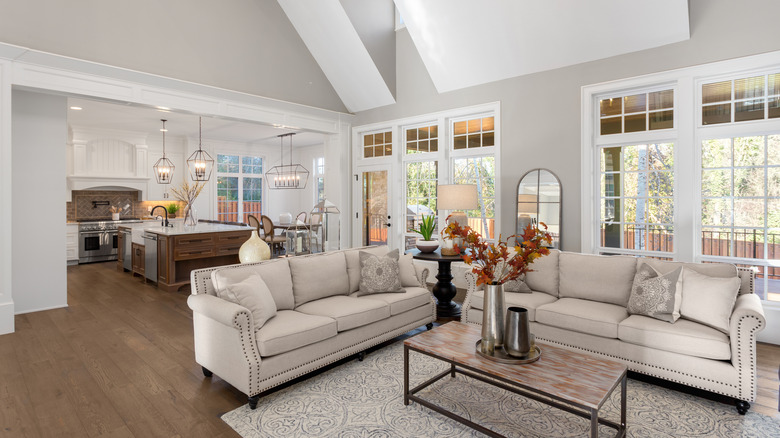
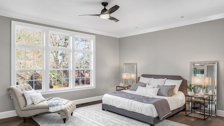
Neutral for a calming space
If you're looking to create a calming room with a minimalist effect, you'll want a seamless, tranquil vibe. For a living area that exudes tranquility, wall and trim in similar neutral colors and earth tones are the way to go. First, select a wall color for your entire space. Early beiges and tans are warm and welcoming while neutrals like creams and soft greys can be cool and comforting.
Then, keep the look simple by aligning your trim with your wall color. You can opt for the same exact color or go for a subtle monochromatic look. Your wall color's paint chip can take the guesswork out of choosing a trim color. For a lighter-hued trim, look a few shades upwards on the chip to select a color. However, if you'd like a darker trim look, simply move a few shades down the chip for a more intense hue. Sticking with the same color formula in varying intensities ensures the trim and wall have very similar properties, creating a low-key yet stylish contrast.
Opt for the classic black-and-white pairing
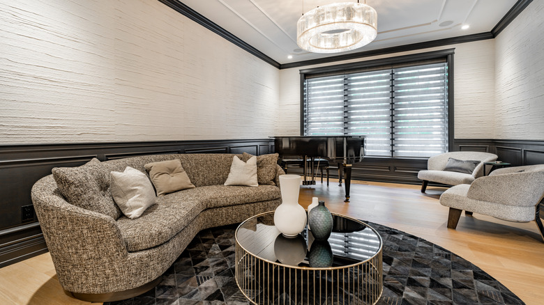
Whether as a mark of chicness in fashion or an elegant option for your interior, black and white is the duo to beat. Why not take the staple white trim look and go starkly opposite with stylish black trim? Black borders on a white wall bring an air of timelessness to your home with an unexpected twist. More practically, dark paint is a great way to mask any imperfections in the boards (via R&J Painting).
Black trim offers more versatility and can fit in with several decor styles. Matte black finishes are a farmhouse staple, making black flat-painted trim an ideal accent. On the other hand higher sheen black painted trim provides a more elegant and glam look. With black trim on white walls, be intentional about placing them to achieve the best results. For example, to visually heighten your space, you can focus your black trim on the crown molding, therefore drawing the eyes upward (via Next Door and Window). Black chair rails are a great way to segment walls. This means that even with two different finishes, each portion of the wall can shine without competing with the other.
Monochrome with dark colors for a simple yet sophisticated look
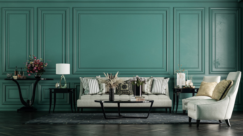
For those with more colorful aspirations, there's a different type of monochrome that might be more your speed. You can create a rich and sophisticated look for your room by focusing on deep, rich colors. When picking a bold color for your space, feel free to start small if uncertain. An accent wall is a great way to ease yourself into the world of bold hues.
However, if you are confident and wish to go all the way, lean into the trend by selecting a vibrant color like a jewel-toned teal for an entire space. Then, echo that shade in the trim for a posh, interrupted look. Or, create a cohesive vibe with multiple shades of the same hue. For example, if going for a deep violet space, paint the trim a lighter shade of purple for a slight contrast that keeps with the overall vibe.
Go for contrasting colors for trim
Who says your trim all needs to be the same shade? The beauty of interior design is that you can make up your own unique rules for your home. To add a ton of character to your space, mix up the shades that you use for various trim pieces. This allows you to make unique elements like an ornate chair rail or detailed window molding stand out from the other trim work. For example, your doorway molding can offer a pop of bold color while the rest of your base trim is cream or white.
You can also use a shade that contrasts with the wall color to make your trim a statement piece all its own. Implement this idea for all of the trim in the room or use it to highlight specific pieces. The best way to identify these contrasting shades is by using the color wheel. With this theory, if your walls are a soft mauve, a sagey trim color will contrast perfectly. Or, if your walls are cornflower, choose a trim paint in a pretty pale yellow, helping the boards stand out from the sea of blue.
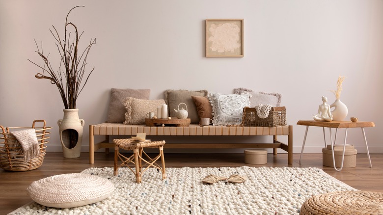
Add character with natural wood
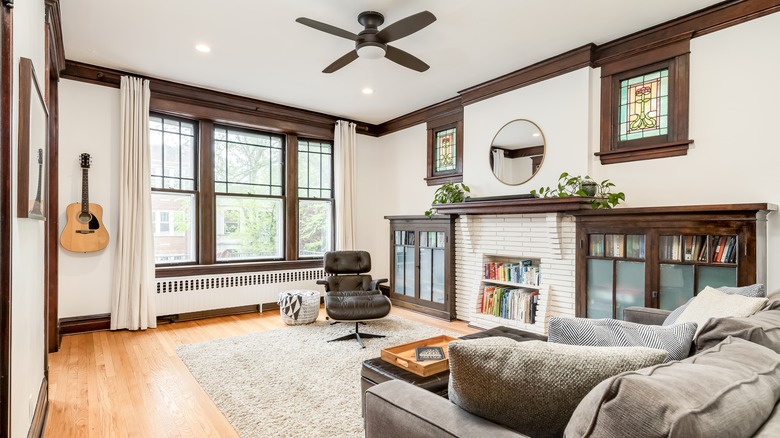
Natural wood trim oozes character and can give your home a welcoming vibe. Selecting the ideal trim for your space can be determined largely by the color of the wood and the shade of your paint. Wood ranges in color vastly depending on the species and the stain used. Mahogany and cherry are typically deep, rich tones with hints of red. Other varieties, like oak and maple, are usually lighter with more yellow and orange tones. You can also go with a neutral wood trim like hazelnut or raw wood with lots of natural color variances.
If you have an airy space in a neutral tone like beige or creamy, dark and dramatic wood trim can provide contrast while still keeping a modern look. If your room features colorful walls, look for wood with undertones that complement the color. For example, if your walls are a mossy green or sage, a maple trim in an orange-ish hue can contrast nicely. However, if you've opted for dark paint colors, look to light trim to brighten and break up the space. Charcoal walls can look stunning and fresh with an outline of white oak trim.
Go for gold
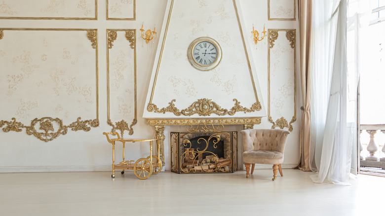
Metallic gold trim is a decadent and fun option for a feel of true opulence and luxury. The hue might feel like an over-the-top choice for your trim. However, there are subtle ways to use gold without it taking on a gaudy look. Small touches of the shimmering hue are all you need to make a grand impact on a space.
One option is to focus this color on one piece like chair rail molding while keeping the other trim work matte and neutral. The thinner trim piece provides a subtle look that's still stylish and glam. When looking for spaces in your home to add gold trim, consider the existing wall paint. In most spaces, gold can act as a neutral, pairing well with a range of hues. If your walls are dark-colored shades like forest green or navy, gold trim can provide a touch of brightness in the space. However, if your walls are ivory or cream, gold-hued trim can inject a more Parisienne vibe.
Wallpapers and molding are a match made in heaven
If you think you must leave your trim plain because the walls feature patterned wallpaper, think again. You can strategically use your molding to elevate the wallpaper in any room. The color of the trim can be inspired by the hues in the wallpaper, either making it pop against the pattern or helping it blend in.
One way to accent the wallpaper is to pull the most prominent or darkest hue from the pattern. Painting your trim in this color allows it to enhance the design while not competing with it. You can also look for the least prominent color in the wallpaper and use it for your trim paint. This subtle accent provides an appealing contrast and makes the pattern pop.
If your wallpaper is monochromatic, use your trim to further highlight the color. For example, if your walls are covered with a floral motif in shades of light to medium blue, paint your trim a deep navy. Or, if your wallpaper is a modern black-and-white design, don't be afraid to add a vibrant pop with a scarlet or ivy-green chair rail.
Stick with the tried and true option: White.
White is a go-to trim color for many reasons. It's clean, fresh, and creates crisp lines. No matter your style, white trim can elevate the overall look by brightening the room and visually separating the surfaces. And if you're sticking with a uniform palette, white, much like the neutrals, offers you a great canvas to build from. It works well with a variety of wall colors from staple naturals to bold and vibrant hues.
Though it may seem you are not getting any variety with white, there is a spectrum of hues to choose from depending on your desired effect. Sherwin Williams offers a shade called High Reflective White (via Love Remodeled). This is the brightest white the paint maker offers, making it an ideal trim color for airy, modern spaces. If you would like a more warm and welcoming vibe, look to creams and milky whites for more subdued trim work. When selecting trim paint, look for a shade of white with the same undertones as the wall color for a polished feel.
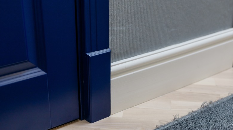
Bet on blue hues
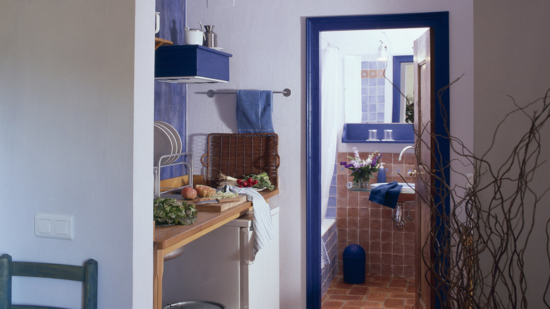
According to a YouGov America survey, blue is the most popular color in the world. Widely credited as a source of tranquility, calm, and relaxation, blue notes in the home are a great way to infuse peacefulness. This color can be a great source of energy, but it doesn't have to be the most prominent color to achieve this. Simple accents, like blue trim, can be a perfect way to add this much-loved color.
Against the backdrop of a white or off-white wall, blue crown molding or window trim can give your room a real spark of energy. The best part is, there are so many shades of blue, you're sure to find one to blend with your style. If you're going for a modern and sophisticated look, veer towards chic shades like navy. However, if your home has a bright and eclectic vibe, play with vibrant options like cerulean or royal blue. Classic and traditionally decorated spaces look stunning with trim painted in soft shades of steely blue or periwinkle.