The Neutral Color HGTV's David Bromstad Swears By To Break Your Beige Habits

Do you often find yourself choosing beige for your home? Whether modern or vintage, the neutral color creates a pleasing backdrop within several types of interior styles. Additionally, beige became the rage for interior walls during the 2000s amidst the predominant surge of house flipping. While the simple, earthy tone typically goes with everything, HGTV star David Bromstad has an alternative neutral in mind, "To break free from your beige prison, I suggest making a big move: paint walls a mid-tone gray," he suggests, per HGTV. Whether you recently purchased a home with an extensive beige interior, or are in need of a revival, gray might evoke the perfect vibe.
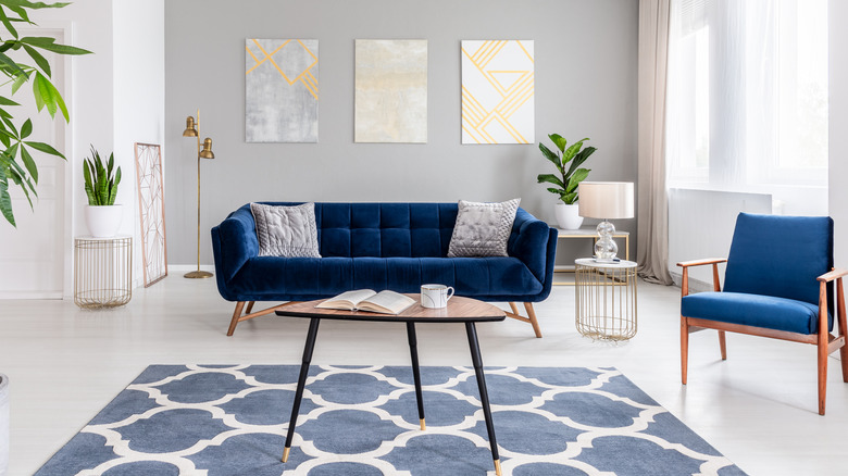
How can you keep from running back to beige? While the sand-like color is both simple and versatile, Bromstad thinks gray may be a little less boring, and a little chicer, "It's a soothing color that will make the space feel sophisticated," he continues (via HGTV). While gray's popularity seems to come and go, it's a shade that can complement other colors within your home decor and furnishings. Gray walls may emanate a different kind of elegance alongside cool colors like teal, navy, and purple, whereas beige typically matches warmer colors like red, yellow, and orange. However you move forward from your beige mindset, the former "Design Star" winner knows how to apply gray paint to walls without getting too radical.
Coat your walls with a versatile, medium gray
Whether you're painting a bedroom or living room, you can explore a world beyond beige while sustaining a similar level of simplicity. While you might consider various shades to distinguish various sections of your home, Bromstad thinks gray is a captivating wall color that can be congruous throughout. "People think painting walls different colors in an open plan will help define the space," he explains, "but it ends up looking disjointed, so use one color" (via HGTV).
A dark charcoal gray can be used to add drama, while a faint gray is light and airy. However, sticking with a mid-hue may offer the best balance and contrast. From cool blue-gray to warm brown-gray, staying within the middle will present the most finesse from your mid-tone gray paint. Once you've set the tone with the right color, Bromstad suggests, "then bring in the blues and plums with upholstered furniture, an area rug, art, and accessories." Other eye-popping colors to add comparison might be vivid yellow, red, black, or white within the elements and structures. Whatever you visualize, don't let go of beige without seizing the gray.