These Are The Best Kitchen Cabinet Colors
There is nothing, truly nothing, like a good kitchen. The site of all that is comforting, warm, and welcoming in a home, it's little wonder why most of us are low-key obsessed with remodeling them to make them the best they can be, quite often at an eye-watering cost. According to Homes & Gardens, the most basic kitchen remodel can run anywhere between $7,000 to $40,000, with higher-end remodeling jobs often costing way more than that. Your kitchen might look pretty, but it'll cost you a bank loan to get there.
And that is why, friends, you should never underestimate the power of painting a kitchen cabinet. Sprucing up your cabinets with a new lick of paint can make your kitchen feel fresh and invigorated at a fraction of the cost of remodeling work. But, as with any paint job, you want to make sure you don't choose a color you will later hate. This is especially true in a kitchen, a space with many immovable appliances and functional aspects. So which cabinet colors work best? Let's take a look in this article.
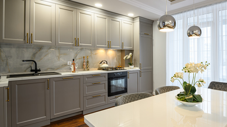
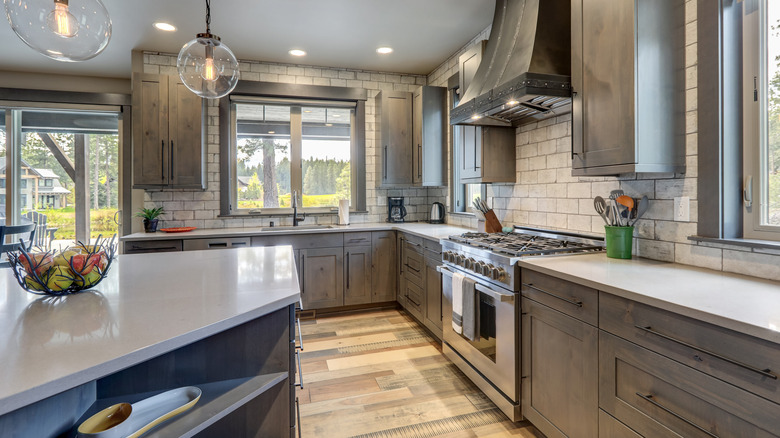
1. Gray may seem plain -- but it's a solid choice
You might turn your nose up at gray as being somewhat boring and bland, but when it comes to kitchens, it's hard to go wrong with gray cabinets. Gray, along with other neutral tones, helps your kitchen retain a classic and clean feel while remaining versatile enough to match with basically any brightly-colored kitchen appliance you want to hurl its way. As The Spruce points out, gray tones can actually deliver a lot of warmth to a kitchen. They can look elegant when contrasted with brighter neutrals like whites, either as countertops or as adjacent cabinets for a dual-shade affair.
Adding in splashes of blue amongst gray cabinets can also add extra color and vibrancy to your kitchen space. A similar effect can be achieved by adding statement cabinet pulls in gold or darker browns to your cabinetry. You can also match gray with unexpected textures like marble, which helps them pop without overwhelming the space. "I felt this space needed the drama of this beautiful marble to raise it out of the ordinary," designer Kayla Pongrac told Livingetc. In short, gray can do it all.
2. Olive kitchen cabinets are surprisingly versatile
For a splash of much-needed color in a kitchen, you can't go wrong with olive cabinets. Olive can work effortlessly in any kitchen and is a shade of true versatility. "It can be a neutral, dropping into the background or it can be the shining star of a color scheme. It's warm, earthy, and mutable — a useful color and real hidden gem," color and paint expert Annie Sloan tells Homes & Gardens. As a shade that is equally at home in a mid-century modern theme as it is in a rustic farmhouse approach, "olive is a bit of a dark horse in the sense that you can easily forget how much interest and sophistication it brings to a space."
With olive green, it's hard to go wrong when it comes to color pairings. The shade works terrifically with other bolder tones like deep reds and blues, but takes center-stage if you're matching it with lighter neutrals. Your imagination is your only limit.
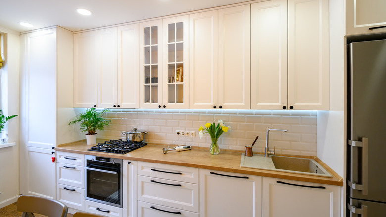
3. White kitchen cabinets are a classic
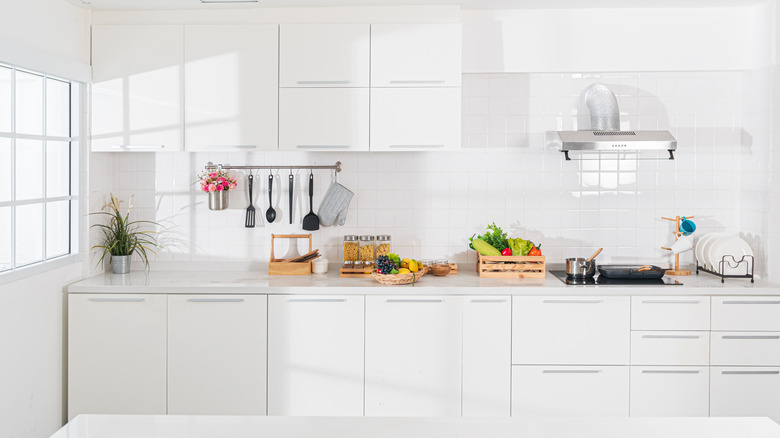
Look, folks, there is a reason why white kitchen cabinets have stood the test of time. They just work. And while white cabinets have been replaced in endless glossy magazines by endless shades of every other color under the sun, they're back with a vengeance. "White has become a popular choice for classical designs," Stephanie Dedes, Charles Yorke's Pirbright showroom designer, tells Homes & Gardens. "It makes cabinetry look very crisp and sophisticated and the space feels instantly brighter yet also very calming."
Crisp and sophisticated? We're on board with that. And given that white goes with basically everything, your options for combining it with different textures, sheens, patterns, and colors in your kitchen are pretty much infinite. However, Leila Touwen, co-founder of the modern kitchen furniture firm Pluck, warns against just using white in a kitchen space. "White alone can look a touch stark. Pairing wood with white cabinetry brings warmth," she says. Pairing crisp whites with golds, brasses, or silvers can also create an instantly luxurious feeling in your cooking space. It can help create a very on-point "Selling Sunset" vibe.
4. Be smart with your undertones with greige
When considering colors for your kitchen cabinets, it's easy to just go with the first shade you see of the color you want. But Design Shop Interiors' Leyla Bowden Jaworski makes the strong point that doing your research is key. "Generally when a paint color goes wrong, it's because the wrong undertone was selected," she tells Kitchn. "Gray isn't just gray — there are blue-grays, green-grays, purple-grays, etc."
This is why Jaworski advocates for a blended mix of gray and beige, or graige. The color not only helps you avoid colors with no undertones, but also offers the perfect blend of two neutrals to give your cabinets more diversity. Specifically, Balboa Mist by Benjamin Moore is high up on Jaworski's list of shades that impress, particularly if you're dealing with existing gold features in your kitchen. "I've found that Balboa Mist can really help tone it down for a more cool, neutral effect. It's literally the perfect shade to complement so many things," she says. Well, consider us sold on that one!
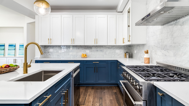
5. Bold blues can make your kitchen sing
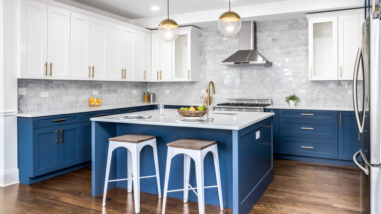
If you want your kitchen to pop, it's not all about having the sleekest design and state-of-the-art appliances. Going big with color is another great way to make it stand out. Bold blues are a perfect way to do this, imbuing your kitchen with confidence and poise while still working well with neutrals and other colors. "Blue is timeless, but makes a statement, which is one of our favorite design combos," E. Interiors' Megan Papworth tells Kitchn. Deeper shades of blue, in particular, work very well if you're going for a bold contrast. We mean, we all love a bit of drama, right?
A deep blue kitchen cabinet is a natural fit with gold fixtures, with gold pulls against blue cabinetry creating a serious feeling of luxury (via Better Homes & Gardens). Pairing blues with bright whites can also help mellow out a kitchen. It stops it from feeling too medicinal or overly sharp, particularly when it's a space that gets a lot of natural light. Using darker blues in low-level cabinets and lighter neutrals above can also help draw the eye upwards, creating a feeling of height.
6. Bring the sunlight in with strong yellows
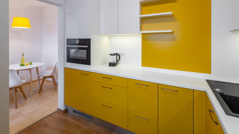
Kitchens should be places of happiness, laughter, and good times. What better way to usher in that feeling than by incorporating some strong yellow into your kitchen via its cabinets? Bold yellow cabinets are basically a shortcut to a sunny sensibility, and it's important to remember that you don't need to go for basic primary-color yellow to achieve this effect, as Elle Decor shows. Yellows can be used in various styles. You can achieve a rustic look by pairing sandy yellow cabinets with darker wood tones, or create a classic aesthetic by combining yellow cabinets with blue countertops.
Slightly lighter yellows, too, can be paired with neutrals to achieve a Mediterranean-feeling kitchen. And if you want to keep things even more subtle, there are a range of yellows out there that have neutral undertones that can help you straddle the line between a sunny effect and a more muted feel. Try a light gold tone, for example. It's a color that goes brilliantly with off-whites and creams, and makes a cooking space look serene and bright.
7. You can't go wrong with black
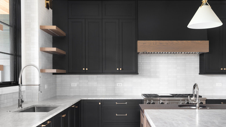
Don't be intimidated by going dark in your kitchen. Opting for black kitchen cabinets is a mature choice that remains fashionable year after year, and which gives your kitchen a feeling of sleekness and class. When it comes to black cabinets, contrasting them with other colors or shades can help your kitchen avoid becoming too dark and dreary, per Good Housekeeping. Pairing black cabinets with white ones is a timeless option. Or, if you want to go bold, try mixing high-gloss black cabinets with walls in a primary color, like yellow.
It's imperative to remember, though, that choosing the right black paint is crucial to the success of black kitchen cabinets, so don't just pick the first one you find. Architect John Mochelle suggests trying The Spruce Best Home Phantom Black. "If you are going for the two-tone look, it works beautifully on base cabinets when paired with upper cabinets in a contrasting neutral color. I also think it is a great hue for kitchen islands because it can hide those pesky scuff marks," he told The Spruce.
8. Off-white goes with anything
Do you like the idea of a clean, crisp kitchen, but are worried about giving it a bit too much brightness? We can understand that. While ideal for creating feelings of order and cleanliness, using whites in a kitchen can risk your space tipping into a hospital-like feel. That's why the clever use of off-whites could be a perfect choice. Off-whites can help to simultaneously elevate a room's brightness while mellowing out overly white tones. Plus, it pairs well with pretty much everything.
Pick a white color that shifts shades to get the best of both worlds. "Here on the cabinets we used Hardwick White by Farrow & Ball, which is a clean off-white that can look like a traditional gray in some lights. But it has chalky undertones that, in a sun-filled room like this, appear much brighter and more contemporary," Ben Hawkswell, senior designer at Roundhouse, told Homes & Gardens about a remodel. The most important thing, he says, is to test your paint color in your kitchen before you commit wholeheartedly to painting all of the cabinets. While this is vital for any paint job, it becomes even more important with off-whites due to their susceptibility to being changed by light conditions.
9. Be brave by going pink
Okay, we've got to be honest. We can get a little bored of seeing the same colors in kitchens over and over again. So who could blame us for wanting to mix things up a little? And if you feel the same, going for pink cabinets in your kitchen could be the perfect way to bring out the sense of life and vitality that your house deserves.
Now, at this point, it's important to mention that we're not advocating solely for a hot-pink kitchen (although using statement pinks can serve to make your cooking space totally unique, as seen on Ideal Home). But muted, light and dusty pinks are all tones that can give your kitchen a feeling of elegance, class, and which help to accentuate the natural light in a space. It needn't be the only color in your kitchen, either. Although lighter pinks pair very well with light neutrals, pink and green are natural bedfellows when it comes to kitchen decor, especially when they're used intelligently on different levels. And if you want to truly live your Elle Woods fantasy by decking out your kitchen in fuchsia, bubblegum, and magenta tones, then frankly, why shouldn't you? It's your kitchen, after all!
10. Orange kitchen cabinets are here to stay
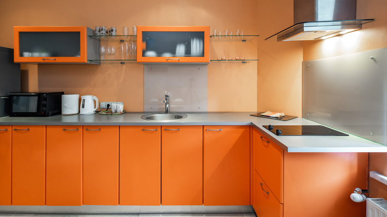
Using orange for your kitchen cabinets might seem daunting, but used smartly, it's a brilliant color option that can create a unique feeling in your home. With the proper use of orange, you can make your kitchen feel instantly warm and comforting. Tones that evoke the sunset or autumnal treescapes work especially well in kitchens, per Elle Decor. A pastel orange is surprisingly effective on kitchen cabinets, particularly when combined with a gloss finish. This could give your kitchen a decidedly '70s feel, particularly when paired with vintage furniture or touches.
Burnt orange, as well, is a classy move for kitchen cabinets and evokes a retro vibe. When used with confidence, this shade works particularly well with brass pulls or fixtures and darker wood tones, and can be beautifully offset by lighter patterned tiles in neutral shades. Orange cabinets might not be for the faint-hearted, but they're truly memorable.
11. Keep it classic with wood finishes
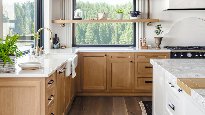
Sometimes, it's best to work with what you've already got. And while it's tempting to cover up your cabinets with an array of flashy colors, favoring the cabinetry's natural wood tones and keeping them proudly on display is a choice that has not only stood the test of time but remains popular. "I'm really happy to see that wood cabinets are making a comeback and designers are exploring options beyond a painted finish," Liz Foster of Decorist told Elle Decor. Specifically, she pointed towards the joys of the "extra texture that wood grain cabinets bring to what could be a sterile, cold space." We'd have to agree. Wood finishes can bring a serious sense of warmth and history to a kitchen. And if you're decorating your home in an antique style, they're a no-brainer.
Despite this, Foster says that it's vital to consider the type of wood you have. "The choice of wood species and stain are still very important, as a honey-toned maple is drastically different in look and feel to a white oak cabinet," she states. As such, consider how a wood tone would work in the room you have.
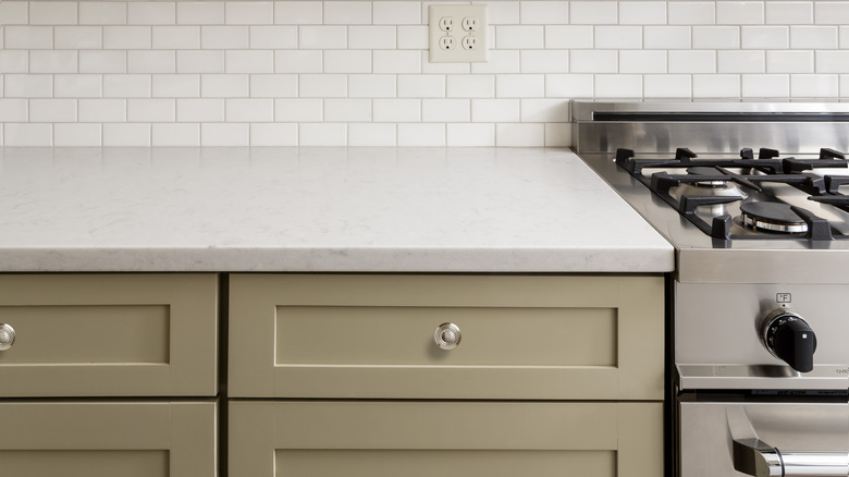
12. Taupe is a versatile choice
Let's talk about taupe. This undervalued gray-brown may not be as well known as some of its flashier color cousins, but when it is used on cabinets, it can add a serious touch of elegance to your kitchen. Evoking images of warm coffee and natural settings, pairing taupe occurs most effectively when you take note of the undertones in your specific paint selection, as per The Spruce. Taupes generally contain undertones of reds, pinks, and yellows, as well as stronger gray notes.
While you might assume that this means that taupe should be paired with bolder colors (and indeed, it can be), generally, taupe works well with lighter neutrals, like off-white countertops or backsplashes. Given taupe's organic tones, it also works excellently with natural flooring and is super at-home in kitchens decorated in a more antique or farmhouse style. Bear in mind, too, that taupe can be pretty light. The Smokey Taupe 983 from Benjamin Moore, for example, can almost look off-white in certain lights and can pair very well with a slightly darker gray.
13. For an ocean feel, baby blue is best
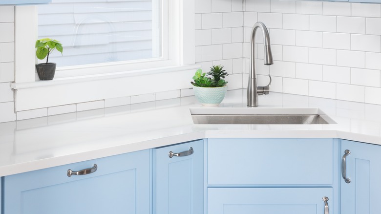
Baby blue gets a bad rep, folks. While this shade of blue traditionally evokes images of childhood and innocence, using it in a kitchen can leave you with a unique space that's both fresh and deeply comforting. As the designer for luxe kitchen brand Neptune, Claire Birkbeck, says to Homes & Gardens, opting for baby blue leaves you with a "restful space that won't shout for attention," and which can operate in the same way that a neutral might but with just a little more, well ... pop to it.
Baby or powder blues are subtle enough to be paired with darker, stronger colors, like dark greens or darker blues. Kitchen designer Tom Howley recommends "combining blue kitchen cabinets with a white work surface and dusted oak interiors," to create a "warm, welcoming room" that also remains fresh-feeling. The bright blue shade also reminds us of the seaside during the summer – and that's rarely a bad image to have in your kitchen, particularly during the depths of the colder months.