The 4 Best Colors To Paint Your Interior Doors
Are you someone who appreciates color in its many varieties but nonetheless leans toward light neutrals in your decor? You find them soothing, easy to design around, and generally pleasing to everyone. No one can argue with those reasons. But there is a logical and strategic way to introduce color and drama into your home environment. And Real Simple says it's one of the most striking paint trends to emerge of late — painted interior doors. It's not at all unusual to see bold and subtle hues played across the entrances of our homes. Stroll through the neighborhood and find bright exterior doors that wow with vibrant or welcoming shades and front door/shutter pairings the likes of a charmingly matched hat, belt, and shoe. Seaside homes dazzle with lavender, hazy aqua, and maritime navy portals.
Inside, it's another story. There, the doors are generally whatever particular shade of white the manufacturer thought would sell best. It's time to give them, and color, a second chance. Online paint purveyor Clare explains that painting an interior door is a bite-sized project easily accomplished in a weekend. And Real Simple notes that because so little product is needed in comparison to covering entire walls, it personalizes your space in a super economical way. Plus, paint protects and extends the lifetime of your doors. We've rounded up the shades that designers and people in the know recommend. Come on in, and we'll show you!
1. Blue
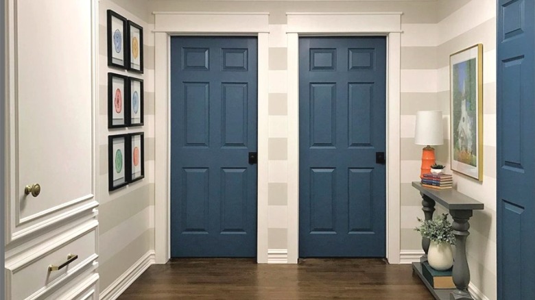
We don't want to talk you out of going bold with your door, so maybe we shouldn't mention that some consider blue a neutral. Lifestyle company Gray Malin claims that blue works well with almost every color, earning it their confidence as a design standard. The brand notes that adding a small amount of color in interiors is uplifting, and there are many uplifting blue hues to choose from. It's officially most people's favorite, according to Artsy, and across its many shades conveys calm, steadiness, and assurance. Furthermore, it has associations with things that feel expansive such as the sky and sea. Because of this and how often we are exposed to it, Gray Malin explains that blue isn't distracting the way some bolder hues can be. As in nature, it becomes a backdrop for enhancing other colors and objects.
Real Simple suggests choosing a hue for the doors the same way you approach any interior paint decision — determine the kind of feeling you want your home to exude. Strong colors will create an atmosphere of vitality, while softer tints will set a more tranquil mood. Deep shades are classic and welcoming if not too dark. Since there are so many types of blue, put them into these categories: brights, lights, and medium to inky tones. Select a greyed version if the color still seems too intense a commitment. Interior doors are the perfect place to sprinkle in this soothing hue.
2. Green
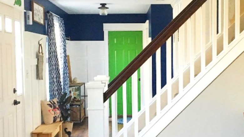
Green is an option not too dissimilar from blue for its ability to bring nature inside. According to Color Psychology, green has the most soothing effect on the human eye and is regarded as peaceful, balancing, and grounding. The Design Sheppard explains that its effects are altered depending upon the shade. For example, yellow-green tones convey freshness and growth, while rich emerald is considered luxurious. Per the design blog, try emerald doors anywhere in the home you'd like to communicate an elegant air, such as the entry, a library, or a dining room. And though it may be enticing to attempt to boost your morning wake-up with bright yellow-green, avoid it in the bedroom where the high energy could impede rest.
This harmonious color mixes well with others. However, the outlet suggests that staying within the same temperature — either a cool or warm undertone — will help ensure the design doesn't overwhelm. That said, a warm sunny yellow plays wonderfully with cool navy blue because a mixture of the two primary colors creates green. Once again, shades that are subdued to include a bit of grey may be easier to live with and decorate around. Room for Tuesday recommends swatching first before painting the entire door and going with a semi-gloss finish, which is both practical and pleasing. The designer and DIYer uses the combination of a brush and a high-density foam roller to apply self-leveling paint.
3. Black
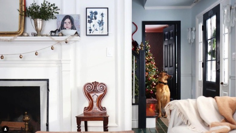
For a graphic and classical addition to your decor, there is nothing like a jolt of black. Per Real Simple, second to white, it's the preferred paint application for interior doors. A no-brainer in design, the outlet explains that black doors are simultaneously timeless and a statement. They complement every style, including traditional, modern, maximalist, and farmhouse. According to Chris Loves Julia, they were the perfect solution for the designer's modern cottage, and she lamented waiting so long to have painted them. As black often appears in elements throughout a home, such as in light fixtures and hardware, doors in the same color will feel cohesive. In Chris Loves Julia's home, the stair banister and window casings were already black, making it a natural choice.
Hadley Court calls black ... you guessed it, a neutral. But, even better, because in her opinion, it is transformative, contributing glamor and making builder-grade doors appear more expensive. She notes that black doors are an instant focal point and add an impression of height to a space, and from a practical perspective, they disguise dirt. Warm brass is complementary hardware and Hadley Court's favorite, yet anything goes. Consider matching the metal and finish with the feeling of the preferred style in the home; antiqued for classic design, matte and oil rubbed for farmhouse and rustic decor, and polished for modern and high-drama spaces.
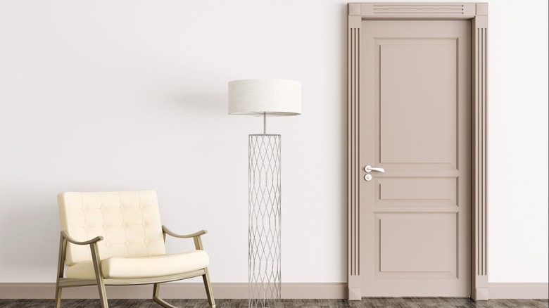
4. Greige
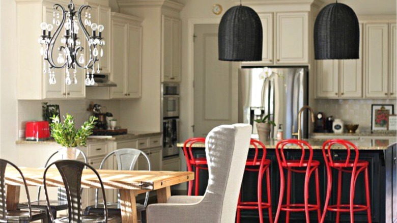
Neutral paint colors are justifiably a staple in decorating. Clare recommends a fresh grey-beige for a minimalist take and suggests that layering with additional tonal whites, such as in the wall color, furniture, and cabinetry, creates a depth of design one tint alone could not. Another benefit to the muted tint is that it doesn't compete for attention, allowing other elements in the space to be the focus. Because it provides room to step into some bold decorating decisions, painting doors a subdued mushroom is not necessarily a dismissal of color. Our Fifth House chose the neutral for her pantry door for its discreet presence in her kitchen, explaining that she wanted the red stools and lighting fixtures to remain the important items visually. Function was another key consideration since the previously white high-traffic door too readily displayed smudges and fingerprints.
Though opinions vary on whether all interior doors and trim should match, an accommodating grey-beige makes that an option. Our Fifth House noted that while her doors are not all in the same shade, they are different values of a particular neutral palette. Keep in mind that one paint choice will create design uniformity and continuity, whereas using dissimilar tones will garner attention. Some further propose a distinct color for each side — one of them being a neutral tone opens the door for any other color to make its way into the scheme.