HGTV's Home Town Unveils The Perfect Color Palette For Mid-Century Homes
Erin and Ben Napier of HGTV's "Home Town" are no strangers to renovating mid-century homes. The couple has transformed over 100 properties in Laurel, Mississippi during the many seasons of their highly-rated show, and several homes have had this specific style. With Ben heading up the woodworking and construction sides of the projects and Erin at the helm of the interior design, the pair are experts at nailing the ideal mid-century paint color and wood tone palettes. As Erin and Ben show us in their "Home Town" mid-century renovations, the perfect color palette for this style is use grounding neutrals, a nature-inspired hue, and pops of fun, retro color to complete the look.
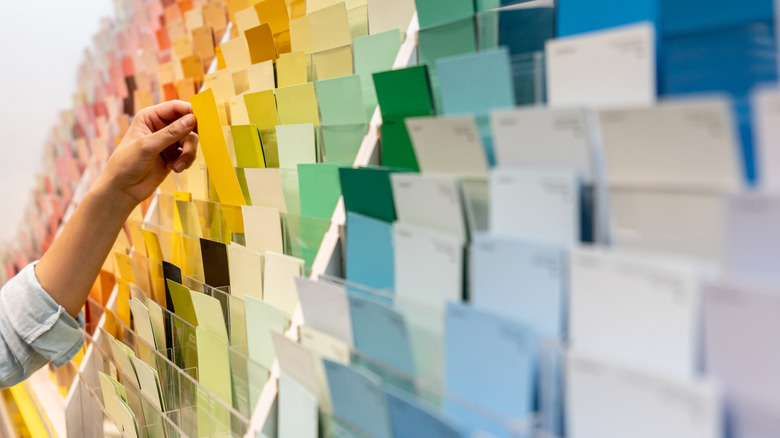
As the name suggests, mid-century design originated in the middle of the 20th century, beginning after World War II and lasting through the 1970s. This period of optimistic yet minimalist design was focused on creating contrast through lines, forms, textures, and materials, as well as seamlessly combining indoor and outdoor lifestyles. Innovative manufacturing and new idea sharing throughout the globe also placed an emphasis on utilizing colors and materials in exciting and inventive ways. So what does this mean for choosing the perfect color palette for your mid-century modern style home? Mid-century colors embrace a beautiful juxtaposition between natural earth tones and vibrant, energetic colors with a focus on creating balance through contrast and opposition.
Contrasting earth tones with lively hues
When picking paint shades that are perfect for a mid-century modern style, look to nature to bring the outdoors inside with muted earth tones like brown, tan, gray, mustard, pale yellow, rust, terracotta, olive, and sage, as well as warm wood tones like walnut and teak. Next, add pops of playful, saturated colors like bright orange, pink, red, chartreuse, teal, emerald, and blue. Finally, be sure to introduce plenty of additional contrast with black and white tones.
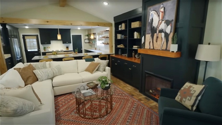
In the mid-century renovation during Season 7, Episode 16 of "Home Town," Erin Napier chose a wall color like red clay for one room in order to tie in the original brick floors and bring the organic hue to other parts of the home. To create additional contrast, she painted the other rooms white. Then, she covered the fireplace built-ins and kitchen cabinets in a black hue with green undertones that were rooted in nature. Finishing off the space with a variety of wood tones and pops of warm desert colors, this transformation has a true mid-century feel. Similarly, in Season 1, Episode 8, the Napiers use an airy white backdrop for the living space of a 1955 bungalow. Then, they include a vibrant pop of blue on the kitchen cabinets and accents of red and green throughout. The exterior is painted sage to blend with nature and incorporates natural wood siding to tie in the wood tones featured throughout the interior.
How to implement mid-century colors into your own home
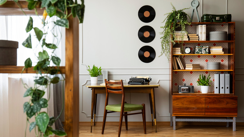
According to Laurel Mercantile Co., Erin and Ben Napier's website, starting with small items in bright colors like decor, pillows, or artwork can help ease you into choosing bold hues for your home without overcommitting. Additionally, to achieve the real mid-century feeling with your color choices, maximize natural light to showcase the color palette in its true form and give that mid-century feeling of airness. Also decorate with indoor plants, as natural green in living form is a necessity in mid-century color palettes to effortlessly bridge the gap between earthy muted tones and vibrant hues.
The Napiers also suggest using certain mid-century colors in each of your rooms. When a guest enters your house, the first space they see is often your living area, so use this room as an opportunity to establish your unique character and embrace pops of fun mid-century color through accent walls or furniture. In the kitchen, cabinets are the perfect opportunity for contrast or color, such as with Erin's selections of royal blue and green-black in two of her mid-century renovations. Balance this bold look with a light neutral wall color to keep the space feeling harmonious. Bedrooms are a place of relaxation, so stick with your favorite calming earth tones, but don't be afraid to incorporate darker natural hues to add depth to your peaceful space.