Our Design Experts Wave Goodbye To These Paint Colors In 2024

Paint is one of the most cost-effective ways to introduce color and personality into a space. A fresh palette can update a tired room and level up the mood of your entire home. But picking out just the right hue can be hard. With thousands of shades to choose from, how do you select the perfect one for your space?
One of the best places to start is by isolating which paint colors are on the way out. The last thing you want to do is paint out your house in a shade that's overused and will instantly date your home. And the good news is you don't have to be an interior design guru to know which colors have had their time. House Digest conducted exclusive interviews with a collection of design experts to find out which paint colors homeowners should avoid in 2024. Instead of guessing what hues are hot and which are not, keep reading to get the lowdown from industry experts who have their fingers on the pulse when it comes to interior color palettes.
Colors from the pastel Danish trend are becoming overplayed
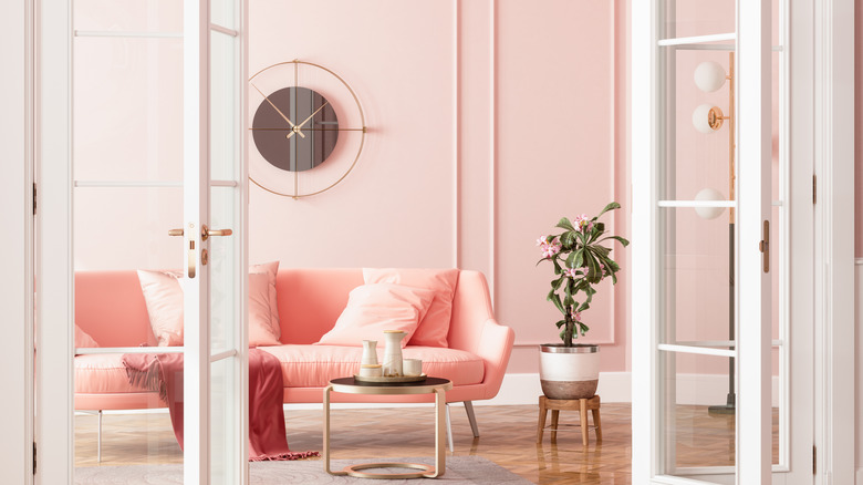
Soft pastels popping against plain backdrops and simple Scandinavian furniture is a fun, funky look that has been dominating Instagram feeds. But Dani Dazey, Owner and Designer of Dazey of LA and Dazey Den, feels that the pastel Danish trend is past its heyday. During an exclusive interview with House Digest, Dazey said, "I don't like to discourage the use of any particular color if it's one that someone loves and wants to use in their space. However, I do feel like the pastel Danish trend has been a bit overplayed." She went on to explain that this specific palette also extends to "spaces that include solely baby pinks, baby greens, and soft lavenders."
So what should you do if you love pastel tones but don't want to implement a tired color scheme? According to Dazey, you can still incorporate pastels, but you might want to inject a dash of maturity by teaming them up with some stronger shades. "A way to make these colors work in a more dynamic way is to mix them in with deeper and darker colors! I see more saturated, moody, and muted colors starting to take over," says the designer. For instance, pairing pastel pink or coral with a dark muted salmon, shades of terracotta, or even burgundy could create some serious dimension.
Magenta has had its moment
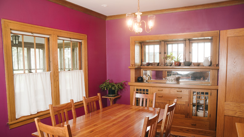
If you're feeling like 2024 is the year for a magenta accent wall, you might want to press pause on this paint color idea. "Magenta was Pantone's color of the year for 2023, and it came in so strong we saw it everywhere, from interiors to fashion. We were so immersed in it, to the point where I painted an entire room in Bilal Rehman Gallery from ceiling to baseboards, magenta," revealed Bilal Rehman, Interior Designer, Founder, and Owner of Bilal Rehman Studio, in an exclusive interview with House Digest. According to Rehman, magenta may have been big a few months back, but it's too strong a shade to be timeless. "She had her moment, but the level of intensity isn't matching what 2024 is giving."
If you're looking for a color with more longevity, Rehman recommends dusty shades, saying, "I see my clients leaning more towards muted tones they can grow with." Earthy colors can be a great way to go, as they are inherently calming and tie in perfectly with the organic modern aesthetic. If you're after something more daring, you can take inspiration from Pantone's new color of the year, Peach Fuzz. Or maybe you were initially drawn to magenta for its inherent drama? If so, a deep, dusky red like BEHR's Dark Crimson could be a good alternative. Shades like oxblood and burgundy have been burning up the runways, and are busy spilling into interiors. And for those who want a toned-down, moody touch of purple, something like Oriental Eggplant (also by BEHR) could be the perfect pick.
Emerald green isn't fresh anymore
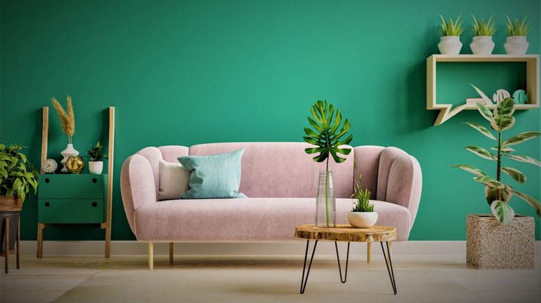
Green has had a strong grip on the interiors world for some time, with emerald tones being especially popular. Bilal Rehman revealed to House Digest, "Emerald green was all the rave because it fits into so many different interior aesthetics. It looked like everyone who wanted a bit of a darker and moody space immediately reached for emerald green." But this sexy, versatile shade is slowly losing some of its shine. "It just became so overused to the point where now it no longer has its luxe-rich feel; it just feels overly trendy."
Fortunately, there are acres of other green shades that still feel fresh in 2024. Earthy greens like Beverly from Farrow & Ball can be ideal if you're seeking soft, muted tones that have lots of longevity. Shades of sea foam and mint greens, such as Garden Room by BEHR, can help inject happy, soft vibes. Teal is also trending, as well as the perennially popular forest green.
Struggling to decide between all these verdant variations? If you want a color that's very — ahem — evergreen, the more muted shades may be your best bet. Muted tones tend to stand out less and blend in with the rest of the room. But bright tints might be a better option if you're creating a very clear color palette that features pops of jewel tones and pure whites. Also, think about the mood you want to create. Muted colors can be quite calming, while brighter tones with more white may feel more stimulating and airy.
Gray is going out of style
If you keep up with trends, you've probably noticed that shades of gray have been the default paint color for close to a decade, soaking into everything from walls to wardrobes. As Rehman explained to House Digest, "Every builder, house flipper, and Airbnb host had a love affair with gray in 2023." Now, going with gray could seriously date your space. Besides firmly timestamping your home in the 2010s, gray can also be an unforgiving color to decorate with. According to Rehman, "It doesn't look good on your floors, walls, bedspreads, anywhere! It sucks the life out of every space it's in and immediately introduces a cold and sterile tone."
If you still have a soft spot for gray, here's some good news. There is a big selection of trendy alternatives to dated gray that can give you a similar vibe but in a more current colorway. For instance, if you love a slate gray, BEHR's color of the year for 2024, Cracked Pepper, could be perfect. This soft black has a blue undertone and feels like an evolved version of the very dark grays that have been so popular. Alternatively, if you prefer light tones, you can embrace the beige trend, or get the best of both worlds and select some type of taupe, such as Edgecomb Gray by Benjamin Moore. Finally, don't forget that there is an entire world of undertones in pale paint. Choosing a light-colored paint with the right undertone can help you tie in (or tone down) other finishes and balance lighting temperatures.
Bright whites are waning
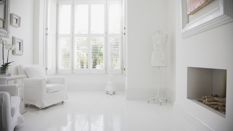
Speaking of light paint colors, bright whites are also on the way out. In an exclusive interview with House Digest, Ashley Banbury, Color Marketing Manager at HGTV Home by Sherwin-Williams, said, "As we continue to turn toward our homes as a respite from the outside world, we are seeing a shift from bright, cool white tones." White is, by nature, a very timeless color, but choosing a white paint with gray or blue undertones could date your space and make it feel like you're firmly stuck in 2018.
To avoid this, Banbury says people are leaning "toward softer, more off-cream hues like Pearly White (HGSW7009) and Shoji White (HGSW7042) that provide a sense of comfort and warmth." Selecting the perfect shade of white can be deceptively tricky, so make sure you get plenty of swatches. Take them home, get them up on the wall, and observe how they look in your space at different times of the day. To compare larger areas, get some samples and paint a few test patches. If you're painting a south-facing room that gets a lot of warm light, you may find you can go cooler with your paint shade. On the other hand, a north-facing room will usually need a warmer-toned white to counteract the cooler light it receives. You might also want to factor in the color of other finishes, such as flooring. A Brazilian cherry wood floor will most likely throw red or pink tones onto your walls. A slightly cooler white with green undertones can counterbalance this, such as the aforementioned Shoji White by Sherwin-Williams or Chantilly Lace by Benjamin Moore.
True navy blue is fading
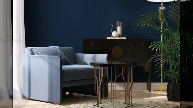
Dark blue paint colors are a great option if you're looking to create a sense of calm and grounded tranquility. But before you head to the hardware store, you may want to look for a more nuanced shade instead of turning to true navy blue. Ashley Banbury told House Digest that, "As the desire for moody hues continues to grow in popularity, true navy blues are phasing out." If you want to channel a feeling of sophistication, she recommends taking inspiration from the darkest and stormiest blues in the paint aisle. According to Banbury, "Deep blue tones that almost appear black like Cyberspace (HGSW7076) are being incorporated into more décor choices." This drama-laden hue is undercut with gray tones, giving it a classy, current vibe.
This is just one of the many options you can choose in place of a true navy blue. Benjamin Moore's Polo Blue is an almost-black navy and has very minimal undertones. In the Midnight Hour is another amazing dark blue from Benjamin Moore, this time laced with subtle currents of teal.
And before you make a final selection, here's a hot tip: Moody paint colors tend to look even darker on small swatches. You might end up thinking all of these dark blues are basically black. To give your eye something to compare them to, grab a pure black sample as well. By placing this on top of the swatches, you'll get a better idea of their true tone.
Bright reds are a bit much
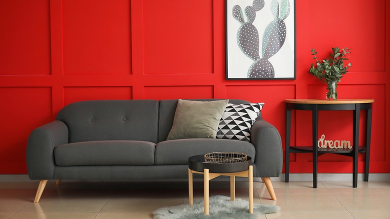
Red is warm, eye-catching, and exciting, but not all shades of scarlet will work well on your walls. Very bright reds can be overwhelming and even stressful to look at, especially in large doses. According to Ashley Banbury, "While red remains a popular color choice for many home spaces, intense bright reds have given way to more traditional burgundy tones like Dark Auburn (HGSW6034)." This masterfully muted color from HGTV Home by Sherwin-Williams marries the alluring richness of red with the tranquil, grounded nature of brown.
If you want to bring some warmth into your home through paint, look for nuanced shades of red that aren't overly intense, such as terracotta, oxblood, and merlot. Borscht by Sherwin Williams is another beautifully balanced shade of rusty red that borders on brown. Tonester Paints also makes a drama-rich dark burgundy called Lost Souls. If you want a medium depth, Fox Red by Farrow and Ball has an earthy, organic feeling that isn't overly dark.
Are you afraid that even a muted red wall paint will make your space feel too warm? Keep in mind that you can temper the warmth with cool metal accents in chrome. Another way to tone down the intensity of red is to limit its area. For instance, instead of painting out your living room, test drive the color in a smaller space, such as a powder room or study.