5 Tips To Help You Pick The Right White Paint For Your Space
If you've ever moved into a house and attempted to touch up or color match a white ceiling or trim, then you know "white" doesn't ever just mean "white." With so many possible shades and tints, buying a can of white paint on a whim and expecting it to match an existing shade in your home is unrealistic. Furthermore, homeowners who give their walls, ceilings, trim, or doors a facelift with a new coat of white paint are often surprised to find that the color they have chosen looks different than the one they were envisioning for their space. So what gives? What is it that makes white so tricky?
According to Art in Context, while most shades are made by adding various amounts of black pigment to a pure color, white works a bit differently. White paint shades all belong to the white color family, but there are countless variations of the color that can be created by subtle differences in both hue and saturation. These variations can create paint samples that look like a pure white at first glance but appear more ivory, eggshell, or cream when compared to other whites or when taken home and put on your wall.
Additionally, because white paint is so reflective, things like lighting and the other colors in your space can affect how your chosen paint color translates. Following these five tips can help ensure you choose the perfect color every time.
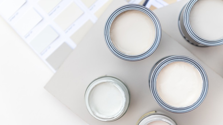
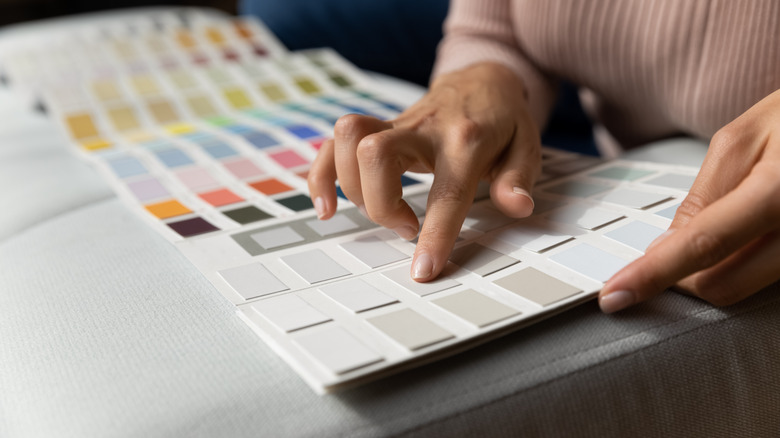
Take home samples
Because there are so many different shades of white with subtle variations in tone, it can be difficult to notice the slight variations between multiple shades until you get each of them up on your wall and are able to compare them side by side.
Not to mention, the lighting in your own home is a lot different than the fluorescent lighting at the hardware store, and therefore liking a particular color swatch while shopping in the bright lights of the paint department doesn't necessarily mean you will like it in your space on your walls.
"Start by getting a lot of the little paint swatches, more than you think," says interior designer and assistant professor at the University of Louisville, Laura McGarity, via NBC News. "Don't be shy. Don't take two or three, that's not enough. Take home eight to 15 swatches. You can eliminate half off the bat when you get home."
Once you've narrowed your choice down to two or three swatches, she then suggests buying a pint of paint in the colors that survived the elimination process and testing them on a small area of your wall before committing to a full gallon. While many people skip this step, it can help save a lot of headaches later should you paint an entire room just to discover you hate the way the color reads in your space.
Compare samples at different times of the day

Once on your walls, the color of your paint can look drastically different at different times of the day due to the position of the sun in the sky and the way it shines through your windows. The direction your windows face and the position of the room will play a role in how your white paint looks on your walls.
According to Lights, if your room faces north, your window will let in a warm, soft light — meaning darker shades of white will appear darker, while lighter shades will appear muted. If the room you are painting faces south, the light coming in through the window will be much more direct and intense, therefore making your walls appear brighter — particularly stark whites.
Morning sunrise will cast shadows on the walls of west-facing rooms, with evening bringing a warm light that will highlight any yellow undertones in your paint. Rooms that face east will feel cooler in tone — particularly in the evenings — and will allow in lots of bright light in the morning.
Knowing the amount and type of natural light your living space receives at various points in the day will help you best decide the kind of undertones you want your white paint to have — determined by whether you want to cancel them out or play them up.
Assess your natural lighting
Instagram, Pinterest, and other photo-sharing platforms are popular go-to's for design inspiration. However, it's important to note that the homes on your feed are likely beaming with natural light, which makes the room feel brighter and bigger — a sought-after feature that your own abode might not have.
Not only does the natural light from the sun that comes in through your window help brighten up your space, but Five Star Painting says that it also helps you see your chosen paint color in the truest and most accurate light. Therefore, if you don't have a lot of windows in the space you're painting, it might not be the best idea to order a gallon of paint based on the color shared by your favorite design blogger in an Instagram caption.
Assessing your own living area and determining how much natural light floods through your windows throughout the day can help you determine which range of white shades you should be shopping for and be realistic about how you can expect the end result to look.
True white paint is so reflective in natural light that if you have a lot of windows in your home, Laura McGarity suggests via NBC News opting instead for something more off-white to avoid it being blindingly bright. If your home lacks windows, stark white paint can help brighten it up.
Consider your artificial light source
Even if your home is not blessed with a ton of natural lighting, you can still take advantage of white paint's highly reflective quality by using artificial lighting to mimic the warm, soft light from the sun.
If you are looking to warm up your space and want your white paint to help do so, using standard soft white LED or incandescent bulbs in conjunction can help play up some of the warmer tones in the paint (per Lights). If your living space doesn't see a lot of sunlight and feels cold and sterile as a result, choosing slightly off-white paint with warm yellow or orange undertones and light bulbs that complement those tones can help warm it up. On the other hand, if you are in a room that relies on a lot of lamps or overhead lighting and are afraid of the space looking too yellow, choosing white paint with fewer warm undertones can prevent them from being accentuated.
Fluorescent bulbs have the opposite effect and tend to play up cooler undertones. If you are painting an area where you may use these kinds of bulbs, such as a kitchen or workspace, be aware that whatever shade of white you choose will likely look very stark white or even blue, depending on the shade. If you want these rooms to feel warm and inviting, avoid choosing white paint with a lot of cool undertones and opt for something warmer.
Consider your surroundings
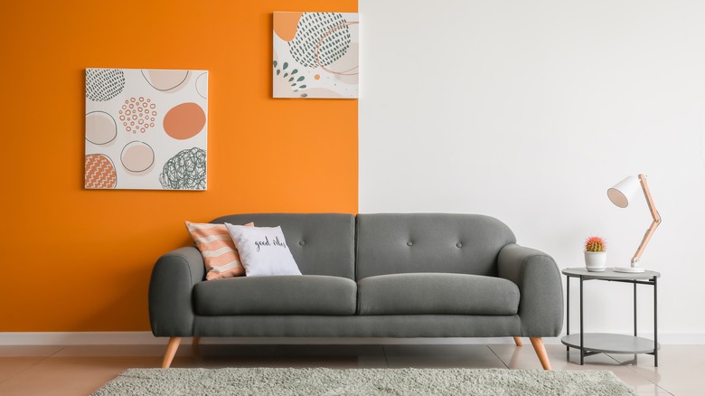
Just like a stark white room reflects natural light, it's important to note that the light the shade naturally reflects is enough to make your walls subtly read as any other color in the room.
If the green in your velvet couch or the gray in your accent wall aren't colors that you want to be amplified and reflected around the room, you are better off using a slightly off-white color that won't be as reflective. If you still love the idea of using true white paint, it's best to save it for a room with a lot of other stark white or a color you don't mind reflecting off the walls.
When looking for a shade of white or off-white paint that complements your furniture, Laura McGarity suggests via NBC News finding a paint swatch in the store that most closely matches your furniture at home. Sticking with this undertone and selecting the lightest possible shade will help you select a complementary shade — giving your space a cohesive look.