14 Lessons Homeowners Can Learn From Chip And Joanna Gaines' Massive Hotel Reno

Chip and Joana Gaines have been making waves and wowing viewers for years, but their renovation of a 1920s hotel in their hometown of Waco, Texas might be the most ambitious project of their careers. The original question in everybody's minds was: Can the pair complete this massive renovation successfully, or will this be the one fixer-upper that gets the better of them? In the April 2023 trailer of the show covering the project, "Fixer Upper: The Hotel," Chip said: "When you think about a 50,000 square foot remodel, this is the big leagues ... I think Jo and I are out of our element to some extent, but we're up for the challenge." The nostalgically named Hotel 1928 opened its doors that November.
Unlike their other projects, this time around, the end results of the renovation are available for anyone to experience. Not surprisingly, the rooms booked out before opening day drew to a close. Since then, Magnolia fans, bloggers, magazine editors, and seemingly everyone in between have made it their business to turn off the I-35 and pay a visit to this masterful remodel.
Of course, staying at Hotel 1928 isn't just a hospitality experience. Yes, amazing coffee and thoughtful touches (hello, embroidered slippers) come with the territory, but so does some seriously mouthwatering design. And if you want to save yourself a trip and $375 a night, simply sit back and let us walk you through some of the most impactful lessons you can draw from this magnificent makeover.
Black and white doesn't have to be boring
Maximalist décor might have taken over our social media feeds, but this doesn't mean you can't create impactful, exciting designs with a very neutral base. Joanna Gaines has long been a fan of paired-back color palettes, saying in an interview with 7 News Miami: "I love the contrast of black and white, and I think it's timeless, and no matter what style or genre, black and white can fit into that. I love to implement color with rugs and pillows and art."
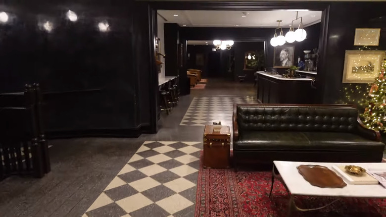
This approach is very evident in the design of Hotel 1928. From the moment guests enter the luxurious lobby, they're greeted by simple white walls and black accents. This backdrop continues throughout the hotel, appearing in multiple finishes, down to the terrazzo tile, and is the perfect canvas for Joanna's tasteful selection of furniture. Small and rich moments of color from books, rugs, and upholstery pop against the neutral walls and architecture, ensuring that the design is anything but boring.
Not only does this approach look amazing, but it's also easy to imitate. Start by choosing the right shade of white paint for your space. You'll also need to decide whether you want a true black or one with some undertones. Here, you can take another tip from Joanna. When selecting paint for the hotel restaurant, she said (via Realtor.com), "I always tell people with paint, make sure you see it in all different lighting." After paint selection, all that's left to do is liven up your space with some sumptuous décor.
Mixing patterns isn't just for maximalists
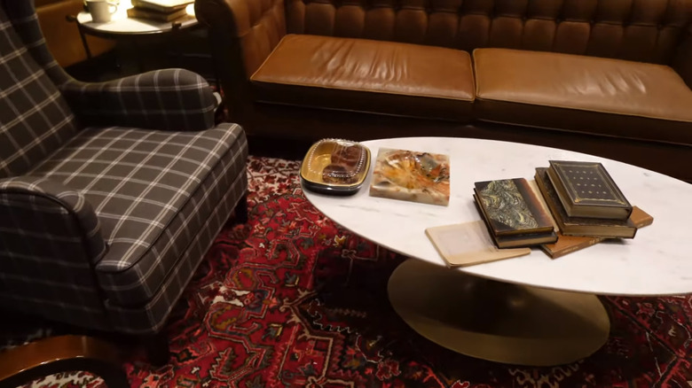
Rowdy pattern play is a staple part of maximalism, but this doesn't mean you shouldn't mix patterns if your taste is more streamlined. Hotel 1928 toes a beautiful line between simple design and interesting details, balancing art deco chic with traditional elements, all while maintaining a contemporary feel. One of the ways Joanna Gaines has channeled the past to create a welcoming atmosphere is through tastefully combining patterns. For instance, the library features two large, red Persian-style rugs. A couple of gingham wingbacks in gray create a cozy clash and a collected feel. From the foyer, black and white checkerboard tiles lead into the coffee shop, which also features a Persian print area rug. In the bedrooms, the color schemes are softer and the patterns less conspicuous, but once again, the patterns in the carpet combined with the subtly striped wallpaper add dimension to the design.
Hotel 1928 is proof that mixing prints can elevate a space without being overwhelming. If you want to channel this effect in your own home, here are some expert tips on how to perfectly mix patterns. First, envision how you want to feel in the room. Maybe you want to introduce the comforting, old-world vibe of small-scale florals. Or perhaps you want to inject some energy with larger, more abstract, or organic motifs. You can also use patterns to trick the eye, such as installing stripy wallpaper to make your ceilings feel taller. The architecture of your home can also help guide your choices. For instance, a historic house will be better suited to vintage prints, while a home built in the '50s will lend itself to more modern, geometric designs. Once you know what you want to achieve, start with a base pattern and build on it.
Tile rugs are terrific
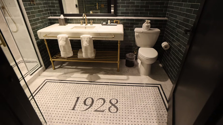
Not that the world needs any more evidence, but Hotel 1928 is living proof that tile rugs can be a stunning design trick. In the bathrooms, Chip and Joanna Gaines decided to install a mosaic tile rug onto the floor, featuring white and gray tiles with a black border, black dots, and the number "1928" in the middle. This creates an instant focal point in the bathrooms, which feels both on-brand and opulent. Besides making a statement, tile rugs can also help demarcate areas. Joanna Gaines has leveraged this trick in a lot of the common spaces. For instance, squares of checkerboard tile bordered in solid black define different seating zones in the coffee shop. Mosaic tile designs help give definition to both restaurants, visually separating different parts of the floor plan.
If you are undertaking a reno or replacing tile, adding a custom pattern like the ones in Hotel 1928 can help elevate and define your space. You can create a rectangular tile rug design in an entryway, bathroom, or living area. Penny tiles lend themselves perfectly to this concept, as it's easy to create patterns with contrasting colors, but square and rectangular tiles will also work. If you don't want to create a tile "rug" effect, you can also consider doing a border around the edges of rooms for a custom look. Not retiling any time soon? You can fake the effect for a fraction of the cost with a faux tile vinyl mat, such as this vintage mosaic design from Rugs Direct or this Victorian version from Etsy.
A contrasting mantel will make your fireplace pop
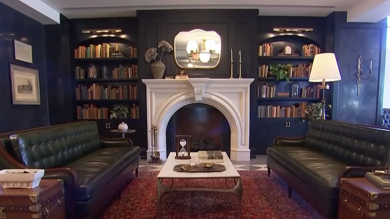
Fireplaces are beautiful focal points that can instantly make a room feel both inviting and upmarket. In Hotel 1928, Joanna Gaines demonstrated how you can make a fireplace pop with clever use of color. In both the café and library, the former HGTV star chose a stormy wall color, bordering on black. By opting for white mantels, she turned the fireplaces into an attention-grabbing feature that centers the rooms and gives the eye something to immediately land on.
If you want to hype up your hearth, don't feel like you have to go dark with your wall color. A black mantel will create the same contrasting effect against a white or pale-toned wall. In fact, Joanna Gaines has already pulled this reverse trick in her bedroom, telling Country Living, "For a bold contrast, I went with a traditional black trim and antiqued glass over the mantel."
And paint isn't the only way to put emphasis on a hearth. There are tons of fireplace makeover ideas you can take inspiration from, such as installing cute tile or adding a shiplap accent. If you want to keep the creamy, Parisian look of an ornate plaster fireplace, you can still make it stand out by adding a dark grate or tiling the interior in a contrasting shade.
Symmetry is stunning
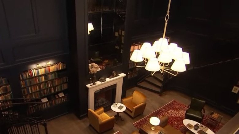
Symmetry is a simple concept that serves a core role in great design. Symmetrical arrangements help to create balance in a room and can direct your eye to key elements. On a psychological level, it can be calming and comforting to the senses. Joanna Gaines is definitely wise to the power of symmetry in interior design and has harnessed it repeatedly in Hotel 1928. The library is a perfect example. Twin staircases lead the way down to what used to be the building's coal cellar. Matching bookcases flank a fireplace in their center, making this even more of a focal point. The furniture arrangement is also full of symmetry, with two matching rugs dividing the room and grounding balanced sofa and armchair groupings.
If you want to inject more symmetry into your own home, look for automatic or architectural focal points. If you have a fireplace, you can place two sofas perpendicular to it, facing each other (like Hotel 1928's café), flank it with matching accent chairs, or use an IKEA hack to DIY gorgeous built-in bookshelves on either side.
Don't have a fireplace? No problem. Two matching table lamps on either side of a sofa can create visual balance, two similar-sized pieces of art on either side of a doorway — the list goes on and on. You can also use furniture and art to "fake" balance in a room that lacks architectural symmetry. For instance, if you have a window that's off-center, a large painting or a grouping of art, strategically hung, can trick the eye and make it feel like the window isn't obviously out of place.
You can totally use area rugs on top of wall-to-wall carpet
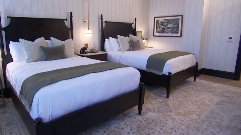
Are you stuck with wall-to-wall carpet and wish you could rather have area rugs? Well, you can use both, and it can look great. Joanna Gaines proved that area rugs can totally be used on top of carpet in Hotel 1928. Granted, this wasn't her initial choice. Originally, the reality show designer wanted to have concrete floors in the bedroom, with large rugs in the center for some coziness. But she and Chip Gaines had to work within some stringent guardrails set in place by the Texas Historical Commission, which said wall-to-wall carpet had to be present in most of the rooms. To work around this, Joanna decided to have custom carpeting made, which featured her area rugs in the center with skirting added on.
If you already have plain wall-to-wall, layering an area rug on top can help add visual interest and ground furniture pieces. In living areas, rugs don't just serve up some softness underfoot, they can also demarcate the seating and eating zones. Placing a rug underneath the foot of your bed can inject that extra cozy factor, add texture, and give you an opportunity to add pattern or color to your space. Speaking of color, make sure you like the combination of your existing carpet and any loose rugs. If your wall-to-wall carpet has a muted tone, opting for dusty colors in your area rugs can help make the pairing feel cohesive. If you can find a rug that contains a very similar shade to your carpeting, even better.
Original details are worth more than gold
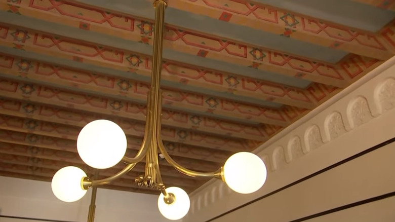
Replacing painfully dated finishes can feel like a breath of fresh air, but be careful of getting too carried away, especially if you're dealing with a historic home. Keeping as many of the original features in the Hotel 1928 building as possible was a top priority for Chip and Joanna Gaines, and their respectful approach most certainly paid off. In an interview with Central Texas Local News, Joanna Gaines said: "We want to preserve a lot of the historic elements of the building. There's just some beautiful trim work, windows, things that are just killer — the ballroom. You can just walk in and see it and imagine what it was." With renovations wrapped up, it's clear that the Gaineses stuck to their original vision. Many of the old architectural details are still in place, including areas of original flooring and the historic ceiling mural in the foyer.
Not many of us are blessed with original Moorish architecture or ceiling art, but if you're renovating, take time to think things through before you rip out, paint over, or eradicate. Elements to most certainly keep include old molding, fireplace surrounds, and doors. Even old tile can sometimes be worth saving, especially if you can update it with fresh grout. Re-grouting tilework can revitalize a bathroom and leave you with a space that's highly unique and authentically retro.
Smoky mirrors are a fantastic way to channel vintage vibes
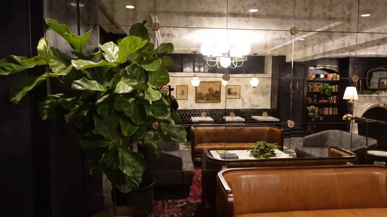
If you're a lover of vintage décor, then you'll definitely want to steal this idea from Joanna Gaines. The talented designer and renovator strategically installed mirrors in multiple places throughout the hotel common areas, such as above the library fireplace and within the café area. But instead of using regular glass, she opted for smoky mirror panes that perfectly mimic the look of an old-looking glass. The antiqued mirror she chose lends the perfect vintage vibe. This is just one example of the thoughtfulness that went into a lot of Hotel 1928's interior design.
If you're thinking of installing a floor-to-ceiling mirror in an older home and are worried that it will look out of place, consider going with a gray mirror instead. If you just want to use framed mirrors as décor, trawl some thrift shops or flea markets to see if you can pick up any fittingly old finds. Just be careful of installing vintage or smoky mirrors in an area where you need a clear reflection, such as over a vanity — unless razor cuts and patchy makeup aren't a concern.
Old and new furniture pieces can pair perfectly
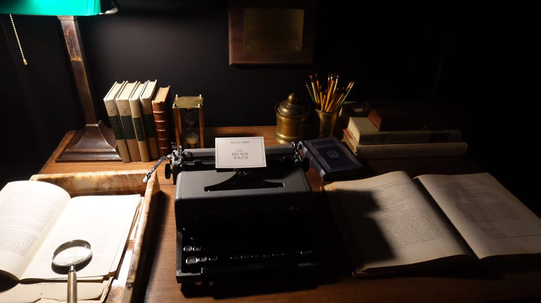
Skillfully mixing old and new furniture is one of the surest ways to up your design ante, and Joanna Gaines has shown she's a master of the art. Hotel 1928 has a very classic vibe, which is partly due to the tasteful collection of antique and vintage pieces it holds. These finds are peppered about the hotel, starting in the lobby with an old apothecary unit. The library is home to none other than author Larry McMurtry's very own typewriter. The gift shop houses an antique cash register that was on offer at an estate sale within Waco. Because it is, after all, a hotel, the Gaineses did have to incorporate new pieces, especially in areas like the dining room. But they did an admirable job of keeping things cohesive while weaving in an art deco aesthetic with modern items.
If you want to create a collected effect in your home that also feels current, here are a couple of tips. Start by deciding what balance of old versus new items you want. If you love traditional design, throwing in just a few pieces of simple, contemporary furniture can give your space a fresh edge. On the other hand, if you're aiming for a transitional feel that leans more modern, reverse the ratio and go for a majority of clean-lined, new items, mixed with a sprinkling of antique or vintage gems. Working out a loose color palette can help to tie everything together and guide your buying decisions. Echoing shapes across a room can also create visual continuity.
Sometimes you shouldn't update an exterior
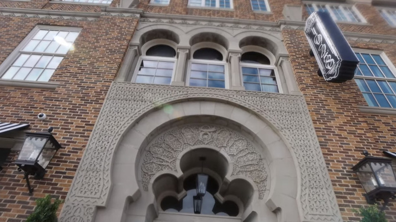
Updating a building's exterior can quickly bring it into the 21st century, but sometimes this might not be what you want. Chip and Joanna Gaines did very little to the outside of the old Karim Shriners building when they renovated it into Hotel 1928. Instead of painting the exposed brick, they left things as is and gave it a good 'ol power wash. Besides adding the sign and some black and white awnings, the exterior looks almost the same, which is a good thing. The original brickwork is laid in meticulous patterns, and covering that up with paint would have erased a beautiful architectural element, and some of Waco's history with it.
If you're toying with the idea of painting over exterior brickwork, take a step back and make sure you're not going to be taking away irreplaceable charm. Pressure washing your exterior walls could be all that's needed to give your house back its original sparkle. Another way you can refresh your home's exterior is by painting the window trim. Joanna and Chip Gaines did this during the hotel's renovations, and the new bright trim and frames took away the building's "sunken eye" look.
Books can be beautiful décor
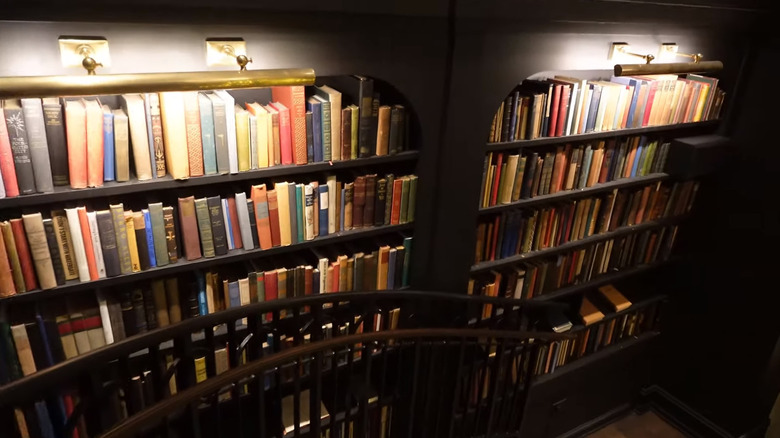
The library at Hotel 1928 lives up to its name, housing over 8,000 vintage books from the '20s and '30s. Chip Gaines bought these in bulk when he purchased Booked Up, Larry McMurtry's bookstore. The colorful spines create an arresting display. They add richness and depth to what otherwise would have been a blank wall, and their red, yellow, blue, and green spines echo the tones of the library rugs and upholstered furniture.
These shelves serve as a beautiful reminder that books can make for amazing décor, especially if you display them en masse. Vintage tomes were covered with vibrant book cloth, which can complement many of the color schemes that are so popular right now, like forest green. If you're worried that too many colorful spines will clash with your décor, try grouping them by shade. This can create a rainbow effect that will tie in with most accent pieces. The great thing about books is they're easy to move, so you can swap them in and out of rotation in different rooms to liven up the color palette. If you have any particularly attractive covers in your collection, you can even put them on display by installing a magazine shelf or picture rails.
Contrasting beams can help make a large room look less bare
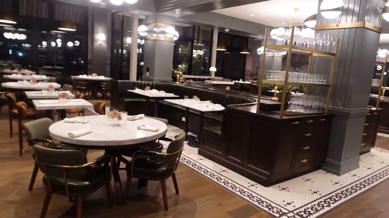
Original beams are definitely architectural details to be celebrated, and the Gaineses did just that during their hotel renovation. The most striking example is in one of the hotel's three eateries, The Brasserie. Here, Joanna Gaines wanted to highlight the bulky beams that transverse the restaurant, saying in the second episode of "Fixer Upper: The Hotel," titled "New vs. Old" (via Realtor.com), "We're taking the original structural beams, and then we're going to contrast those with darker, richer colors." For the job, she chose a subtle green that makes the beams and matching columns stand out.
Most of us don't have massive Moorish beams and pillars to work with in our space, but if you do have any interesting architecture, there might be ways to highlight it. If you're refinishing original wood beams, go for a light ceiling color to make them pop. If you don't want the wood tones, paint them in a dark hue. Painting out interesting elements in contrasting shades is an easy trick and pretty painless to reverse if you don't like the effect. For instance, if you have an arched doorway or a recess, adding some color to these areas will help make them stand out. You can also hype up special features with well-placed lighting, both inside and on the exterior.
Wallpaper is the way to go
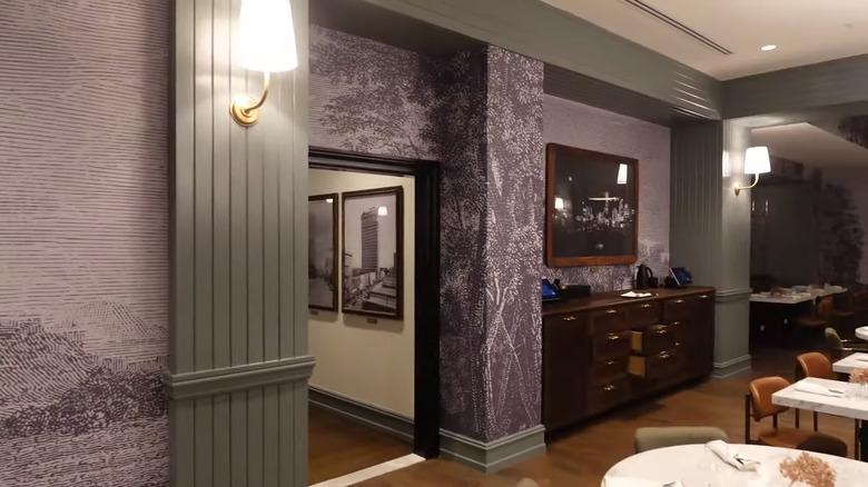
Wondering whether or not to wallpaper? Take this as your cue. Joanna Gaines created some dreamy wallpaper moments in Hotel 1928, beginning in The Brasserie and ending in the well-appointed rooms. In the restaurant, she chose a monochromatic vintage-style forest pattern to wrap the walls. This neutral yet graphic motif adds heaps of nuance to the space while also tying in seamlessly with the color scheme and adding a touch of romance. In the bedrooms, she went with a subtle stripe in cream to warm up the walls and add visual texture.
Both of these ideas are more than worth stealing if you're considering creating a wallpaper moment. Sticking with neutral colors like black, white, and cream can help ensure that the wallpaper doesn't feel too overwhelming. But if you're yearning for a bout of color, feel free to opt for a bolder design. Small spaces like pantries or powder baths can be ideal areas to test drive a daring wallpaper choice. If you really want to play things safe, you can even wallpaper the inside of a closet to get a taste of how it feels in your space. Other innovative ways to use wallpaper include applying it to the ceiling, behind a bookshelf, or inside a dresser. If you're not totally convinced that wallpaper is the way, go for a removable, renter-friendly option that's relatively easy to take down if you tire of it.
Historical photos can make for incredible art
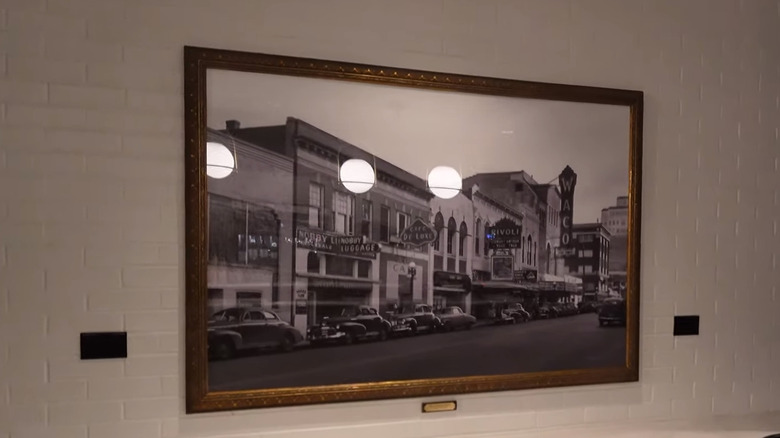
Hotel 1928 is chock full of thoughtful touches, but one of the most impactful has to be the historical photographs of Waco that line the walls. The images, mostly in black and white, follow you from the foyer into the common areas, down the passages, and along the staircases. The majority of them were taken before 1950, and small gold information plaques are mounted underneath the photographs. Not only do these images honor the town's past and give visitors a glimpse into its history, but they also show how old photographs can make for arresting artwork.
If you want to recreate something similar in your home, scour some albums for old family photos. You can also track down vintage pictures of your neighborhood or hometown to print and frame. One of the secrets to a perfect gallery wall lies in creating a theme. For an eclectic vibe, feel free to mix and match frames in different sizes and finishes. If you prefer a more formal or simple feel, go for a grid layout with identical frames and generous matting.