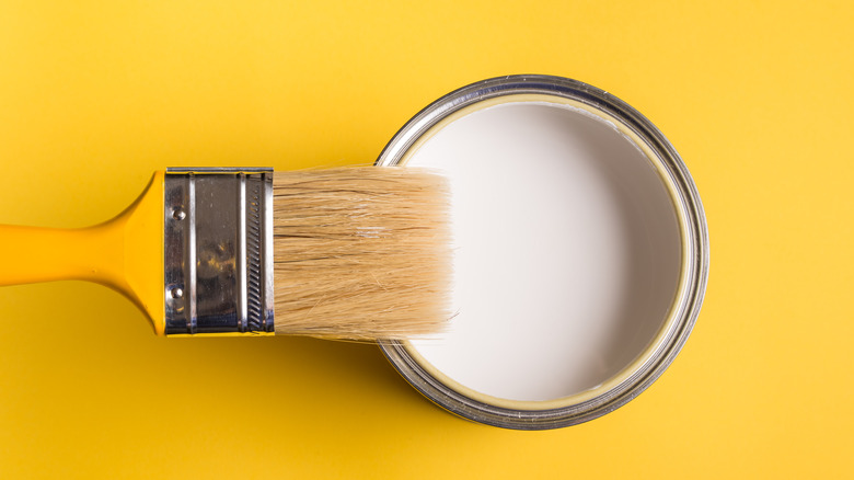
There's More To Choosing White Paint Than Meets The Eye
White paint is a perennial favorite, with a survey from Ace Hardware and Benjamin Moore revealing that almost 1/3 of people choose white as their top pick for wall colors, as per The Family Handyman. White has gone in and out of style over the centuries, and it's currently trending in a big way, with white walls featured in countless popular social media posts. In 2017, The Wall Street Journal even found that photos featuring white or neutral walls actually had an 18% higher engagement rate.
"There are a lot of great reasons for why people are drawn to white," Designer Leigh Spicher told Real Simple. "It's also fair to say that it just goes with anything." Choosing white paint, however, is no easy task. Homeowners have to consider a number of factors before committing to a shade. Read on for more helpful tips on how to choose the best white interior paint color for your space.
Consider the color's undertones
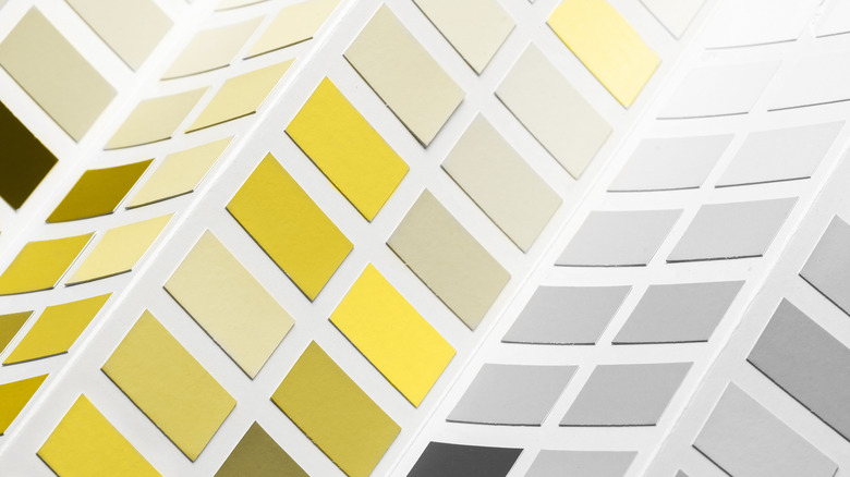
While it's easy to assume that all white paint is essentially the same, it's actually available with a kaleidoscope of undertones. According to Houzz, shoppers can find white paint with green, gray, blue, yellow, orange, or red undertones, all of which have a strikingly different effect when used to paint a room. "I think that's that foundational place to start talking about white paint colors: 'Do you want warm or do you want cool in your home?'" Designer Leigh Spicher told Real Simple.
But how can shoppers tell what a white paint's undertone is? When looking at swatches in the hardware store, all of the white shades can appear nearly identical. One trick recommended by designer Kelly Wilkniss is to hold the swatch up to a piece of white paper. "The undertone will reveal itself immediately. From here, you will be closer to determining your white choice based on the undertone," she told The Family Handyman.
Work with natural light

Your home's position and surroundings have a major impact on the quality of light that comes through your windows. In the Northern Hemisphere, south-facing rooms tend to receive the strongest natural sunlight during the day, according to Houzz. Since this light is naturally warm-toned and brings red or yellow-tinged light into the space, a cooler white paint may be the best option to balance it out. North-facing rooms, on the other hand, get a cooler-toned light that can look blue or gray. Consider bringing in white paint with a warm undertone to temper the effect.
If you live in a cold climate where the light outside is often bright and cool, bring warmth into your home by using white paint that includes warm pigments. In fact, neuroscientists have even studied the effects of color on the brain and found that perceiving warm colors actually make people feel warmer (via Houzz).
Factor in your furnishings
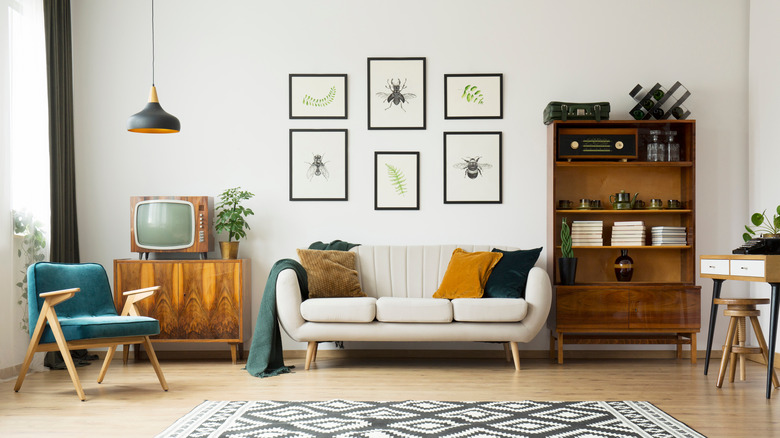
While we've discussed how natural light from outdoors can affect the appearance of your white paint, it's also important to consider what's already in your home's interior. Unless you're starting with a completely blank canvas, you must factor in the color of your flooring, furniture, art, and more before choosing a shade of white. If much of what's in the space is warm-toned, it's best to go with a warm white paint, whereas cool-toned furnishings need a white that matches.
Designer Alison Davin told Remodelista that she bases her choice of white on the client's existing furnishings. "If neutral, I go with a warmer white. If there is a lot of color, a cooler white," she said. In fact, your decor can change the way you perceive the white color you chose for your walls. "Sometimes getting a 'warm' white doesn't actually come from the paint, it comes from the entire assembly of the space," Ian Read, a San Francisco architect, told Remodelista. If you tend to display lots of art on your walls, consider creating a gallery effect by choosing a bright, cool-toned white that will make the colors of the prints or paintings pop.
Try popular picks

Most paint brands have some tried-and-true white paints that they'll recommend again and again because of their popularity and versatility. These are their classic paint colors. Sue Wadden, director of color marketing at Sherwin-Williams, recommends the brand's most popular shade of white, Pure White SW 7005, as a "foolproof" pick. "It's a timeless white that doesn't lean too cool or creamy, so it acts as the perfect neutral backdrop for any interior space," she told Better Homes and Gardens. "I love this color to brighten up a kitchen or living room, especially when paired with different paint colors, textures, finishes, and artwork."
Patrick O'Donnell, Farrow & Ball's international brand ambassador, recommends Wimborne White No. 239 as a soft, neutral option because, as he told Better Homes and Gardens, "it has none of the cooler, blue undertones you get in many generic whites." Those seeking a cooler shade to balance out colorful artwork or furnishings will appreciate the shade Fresh Kicks from Clare. "If you aren't sure what look is best for your space, you can never go wrong with a clean, true white," Nicole Gibbons, the brand founder, told the magazine. "A true, neutral white wall paint like Fresh Kicks is best for creating a crisp, gallery-like feel that helps bold colors and bright accents pop."
Test it out
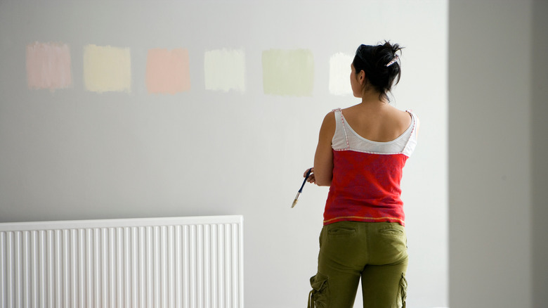
Nowadays, we're all used to shopping online, but when choosing a paint color, your phone or computer screen isn't the best tool to accurately represent a shade. Look at swatches in person, but make sure to test your top picks on your walls before committing. The way a color looks on a tiny swatch may end up being completely different than how it actually appears on your walls. That's why when testing out colors, Ian Read suggests painting a huge swatch. "Colors shift from ceiling to wall, wall to wall, room to room. It is all about direction of exposure, proximity to windows, and artificial light," he told Remodelista.
Designer Amy Alper told Remodelista that using a movable panel is the best way to see the color represented in different parts of the room. "It makes more sense to paint a large panel so you can move it around. The same color will appear differently on different walls in the same room, depending on the amount of light on that particular wall. Take note of the paint during the day and evening, in natural light and artificial light." That way, you will get the most accurate representation of the hue.