TikTok's Color Design Trick To Make Your Home Look Like It Was Designed By A Pro
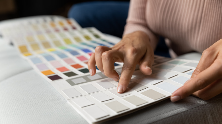
You would think that after watching a bunch of home designs shows it would be easy to decorate your space. After all, it's your home and you know what you like. However, when you place all your decor together it's easy for things to clash, especially between other rooms. The truth of the matter is interior design is a job because it takes skill. Skill a few hours of HGTV won't give you. Fortunately, the experts are spilling their secrets on how to professionally design your space all on your own. Claire, an interior advisor, shared on TikTok her method for picking colors within a home's design, from the shade on the walls to an accent rug — and all you need is a paint color chart.
A paint color chart organizes hues in a specific manner based on how the shades complement each other. If you use it as your starting guide, you can find primary and secondary colors, as well as neutrals that all pair flawlessly together. You only need to select one primary color, and choose your secondary colors from those in the same column or row.
Paint charts are free at your local paint store or you can download them online. This TikTok design trick is an easy tip to create a cohesive color palette for your home. You can be confident that the colors you style will harmonize, whether you're using lots of electric shades or subtle pastels.
Use a paint color pamphlet to pick all the colors in your home
For this TikTok design trick, you want to pick five to seven colors from the paint chart. It might sound like a lot, but these will be the only colors in your interior styling, including furniture and accent decor. If you love color and dimension, you'll probably have seven shades to choose from, but if you're more minimalist, five colors will work.
Once you have your color chart, you'll need to pick one hue you absolutely love. This shade will determine the rest of the selection, so it is critical. However, just because it's the foundation of the design doesn't mean this will be the shade on every wall or the main color of your home. Go for it, and guess what, if you aren't sold on your picks, you can always start over and select a new color lineup.
Now, you're going to pick the other four to six colors. Only select shades in the same vertical column or horizontal row as your first color. The shades in the column are the same hue, meaning they have the same composition of red, blue, and yellow, but have different values, aka levels of black or white. Shades across the row are all complementary and will pair perfectly together. According to TikTok, along with your chosen shade, you want at least one neutral and one pop-of-color hue. The other choices can be whatever catches your eye on the column and row. When you have all your colors, it's time to decorate.
How to incorporate multiple colors in your interior design
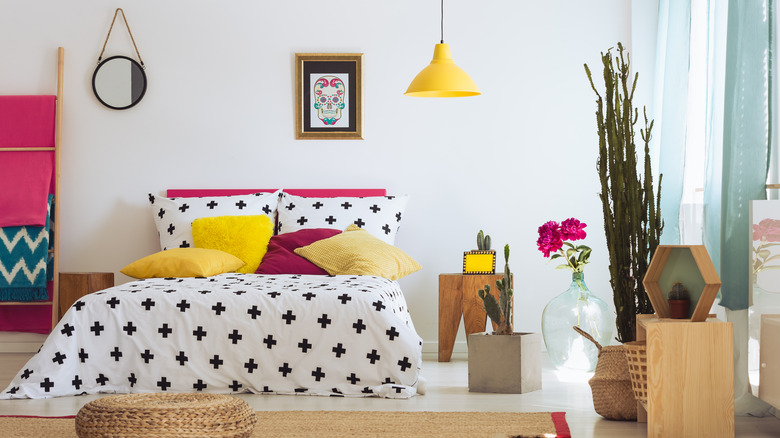
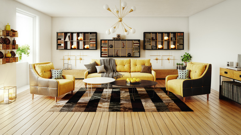
From the five to seven colors picked from the color chart, two or three can be actual paints — something for the walls, ceilings, and trims. You can paint all these areas in your home the same colors, but as long as you're strictly keeping to the color scheme, you can switch things up in each room and still have cohesion throughout your entire space. The other shades in your color lineup should be incorporated with your furniture and accessories. Use bold colors in your home design for statement walls if you want a dynamic look, or in small pieces like pillows and vases for subtle style.
For example, let's say your first color pick was ocean blue and you selected a sky blue in the same column. Then, a slate gray and coffee brown for neutrals, and pumpkin orange for the bold shade, all from the horizontal row. You can paint the walls and trim sky blue, make the ceilings gray, and have a mix of brown, blue, and orange furniture and decor.
Adjust the amount of neutrals or bold colors in your lineup based on your personal taste. It also helps to use the timeless 60-30-10 color rule when decorating your home to balance which hue will be the lead, who plays back up, and the shades that pops up here and there. With this TikTok color design trick, your home is sure to be cohesive and you don't have to fear decorating with the rainbow.