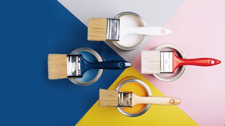
Tips On Creating A Cohesive Color Palette For Your Home
We may receive a commission on purchases made from links.
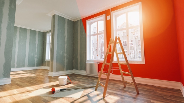
Designing the interiors of your home can be an exciting and creatively fulfilling experience. It can also make you feel like you've got a million problems to solve, from where to start to what you want the end result to look like. You'll quickly find that color — which ones, how much of them, and which shades — plays a huge role in determining the look and feel of your space. How can you create a color palette for your home that is both cohesive and pleasing? It's easier than you might think.
One of the best pro tips is to determine which flow-through color you want early on. Imagine yourself "flowing" through and around your home, and visualize connecting walls and/or spaces painted in the same color. Having this flow-through color, which is essentially your "main" color, be the same throughout your home, creates a kind of anchor or base. From there, you can add flourishes and accents as you please, but this main color, carried around in different areas, will give a feeling of visual cohesion to your home.
Your flow-through color doesn't have to necessarily be a neutral, as JK Paint & Contracting LLC, an Oregon-based firm, notes. Consistency is key here, especially in homes with open floor plans.
Color tints provide variation in a cohesive color palette
After you've settled on your flow-through, or main, color for your home, you may find yourself wanting to mix things up a little. To keep your space's overall look tied together, though, opting for different tints of the same color is the way to go. Tinting a particular paint color simply means that some amount of white has been to the original shade or combination of shades, resulting in a new color that is paler. Selecting one or more tints of your flow-through color for certain spaces or accents will give your home variation visually while still adhering to the larger cohesive look.
Let's say you've selected a strong green paint as your bold flow-through color, but you don't want it to appear in every room in your home. One room could be painted in a tint two shades down from the main green, while another could be painted one shade down, adding in some optical variation that remains similar to your main color. Grabbing any lighter shade of green, however, won't result in the color cohesion you're aiming for. It all comes down to the white added to the specific shade of green you start with. Hirshfield's, a Minnesota-based paint, windows, and wallcoverings company, cautions against DIY paint-tinting to ensure the same amount of white gets added to different gallons of your main paint color.
Consider wallpaper in your flow-through color
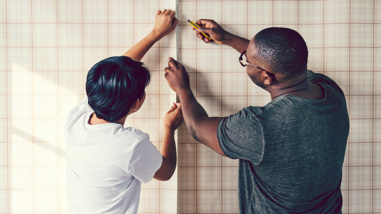
A unique way to add in some vibrancy and variety while adhering to your main flow-through color is to pick out some wallpaper. Wallpaper in a print or pattern that features your flow-through color is a great idea for an accent wall in one or more rooms in your home. Options for wallpaper range from artistic and geometrical to pastoral and pictorial. As home improvement retailer Lowe's advises, if you've chosen a wallpaper with a pattern you're particularly fond of, be sure to consider how its main color or colors pair with the main flow-through color of your home. The general guidance is to aim to match the pattern.
If you're creating a tropical look in your home, for example, you might be drawn to the iconic Martinique wallpaper and its famous banana leaf print that adorns many of the interiors of the Beverly Hills Hotel in Southern California. The dominant colors of this wallpaper are the rich greens of the banana leaves and would pair well with other green shades. Another option would be light pink, which is the background color behind the leaves on the wallpaper. Pink as the flow-through color would really make the banana leaves of the Martinique print pop on an accent wall.
Sticking to warm or cool colors will keep your home visually pulled together
When you're trying to craft a cohesive color palette in your home, the color wheel will become a good friend. And yes, color theory is a thing. As described by MasterClass, the color wheel is "a circle diagram that illustrates the relationships between different colors." Colors that are complementary to each other are found on opposite sides of the wheel, whereas analogous colors are situated beside one another.
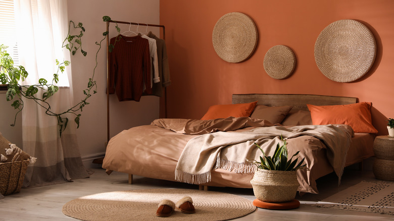
One way to create visual cohesion in your living space is to stick to using either "warm" or "cool" colors. Examples of colors that are perceived to be "warm" are yellows, oranges, and reds. Colors considered "cool" are blues, purples, and greens. Say, for instance, that your pull-through, or main, color in your home is blue. Using pink or yellow for a room in your house would break the cohesion visually, as it would be a mix of a warm color with your predominantly cool tone.
Weave a cohesive color palette throughout your home
While a flow-through color will provide a main base of sorts for your home's color palette, you might be interested in having a few more colors appear in your space. In this case, choosing colors that you then essentially play with from room to room is a great option. One of the fun benefits of weaving a color palette through different rooms is that you can mix up how much of each color you use depending on the space or your preferences.
Perhaps you're drawn to colors like green and blue but also want to include some white as well. Changing up how much of each you use in a particular room will provide interesting variation while still keeping your home's interior cohesive overall. One room, for instance, could be 80% green and 20% white, while another room could be 60% blue, 30% green, and 10% white. Adding even more colors to your palette is a possibility too, especially if you'd like a maximalist feel throughout your home.
If choosing color percentages seems a bit daunting, interior design experts like Sara Lynn Brennan Interiors in North Carolina often recommend the "60-30-10 Rule," which means that "60% of the room should be a dominant color, 30% should be the secondary color or texture, and the last 10% should be an accent." The accent color is your opportunity to go big and playful or keep things leaning more toward understated or neutral.
Match the undertones in your colors
Odds are, you'll probably not opt for a house full of bright reds, oranges, or hot pink colors. So you're going to want to incorporate some neutrals like white, black, or gray. Neutrals are oftentimes not so neutral, though. Because these colors can have either warm or cool undertones, some shades of them will not pair well with other colors.
If you're employing a neutral paint color, ECOS Paints recommends determining whether it leans warm or cool based on its undertones, like a gray that can be perceived as cool because of its blue undertones. In this example, if it's a cool gray, the other colors you include in your palette should also be cool colors. If your flow-through color is a shade of brown, traditionally a warm color, your other colors should be warm as well.
Paint manufacturer Sherwin-Williams advises that one of the best ways to determine what kinds of undertones are in your paint colors is being sure to not view a color by itself. A shade of green on its own will appear to be just green, but next to a sample of pure green, you'll be able to tell which undertone is in the shade you've chosen.
Keep passageways in neutral shades
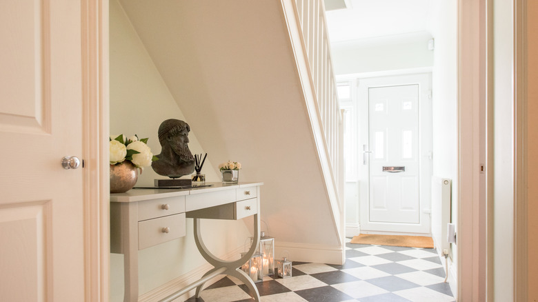
No matter which colors you're thinking about adding to your home's interiors, neutral shades that go with anything can be relied upon to act as connectors. It might seem counterintuitive, but one way to increase the visual cohesion of your home is to unite your various rooms by keeping passageways like hallways and stairwells in neutral colors. With the neutrals matched to the undertones of your other colors, they will provide a grounding sensation as you move into spaces with stronger or more varied colors.
Whichever neutral color or colors you ultimately pick for a passageway, Acadia Stairs, a New York-based firm, points out that natural light is an important factor to consider. A hallway that gets a lot of sunlight, for instance, could be painted in any neutral shade. But one that doesn't get much light or is smaller in size could benefit from being painted in a lighter neutral, which will serve to visually open up the area and make it seem bigger than it actually is.
Wood staining can be added for increased cohesion
Despite your best color intentions, sometimes the interiors of your home may still feel unbalanced or lacking in cohesion. In such a case, it's time to think outside the paint can. Wood staining is a relatively easy way to tie in multiple elements in your home for a more pulled-together look. You'll want to stick with one major wood stain tone to keep the look consistent, as interior design brand Ballard Designs notes, rather than using different shades.
When you're thinking about staining wooden elements in your home, be sure to think beyond just wood flooring. You can also stain trim, doors, and baseboards the same stain shade as your floors to bring all of these elements together into unison with each other, increasing the cohesive appearance of your interiors. If you don't have wood floors or other wood elements to stain, you can still take advantage of this design trick. Furniture pieces stained in the same shade can provide that extra touch of continuity in your home.
Area rugs can connect different spaces
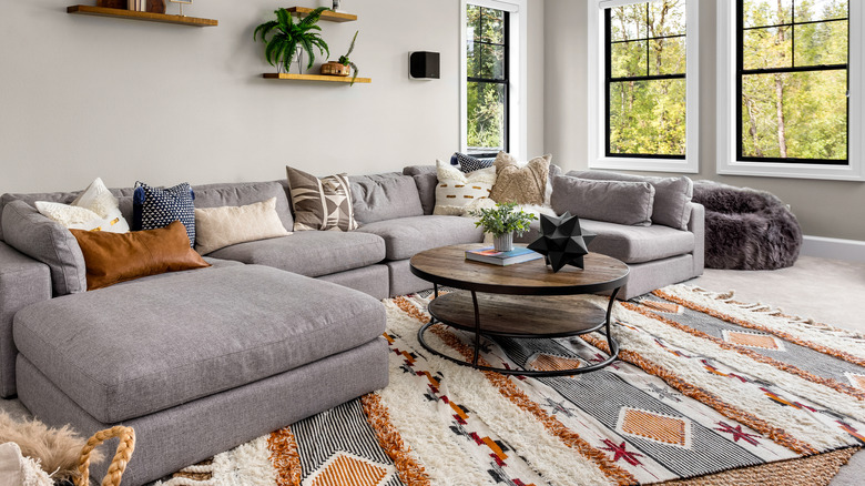
Whether you're opting for strong consistency in your home's color palette or mixing things up a bit, area rugs can be a fun and easy way to add some unity to your interior spaces. Incorporating rugs in similar shades in different rooms will help to keep the overall color palette consistent while still imparting a bit of visual variation. Perhaps you've got an area rug in a blue shade in your dining room. Adding another rug to your nearby living room in a slightly different shade of blue will tie the two spaces together.
According to Jane Lockhart, an interior designer in Canada, there are a few key points to remember when it comes to choosing an area rug. Size, style, and quality should all be taken into consideration before you make a purchase. If a room is full of patterns and color, an area rug in a neutral shade can add a calming element. And similarly, in a room with fewer colors, a vibrant and striking area rug in a mix of colors or patterns can really make a space seem vibrant and add visual interest.