These Are The Best Colors To Pair With Very Peri
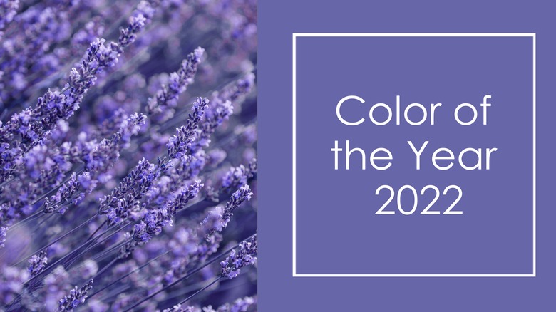
It's electrifying. It's history-making. It's creative and calm at the same time, and we can't wait to put a touch of it somewhere inside our home, like right now. It's Very Peri, an irresistible new shade of periwinkle, a sort of medium lavender with blue-gray overtones and red undertones.
For the first time in their history of naming a Color of the Year, Pantone invented a color for 2022 –- Very Peri -– to reflect the stunning transformation the entire world is experiencing and the growing innovation of online artistry. The company also wanted to offer something with a "joyous attitude and dynamic presence" to offer hope, and communicate positive emotions through color.
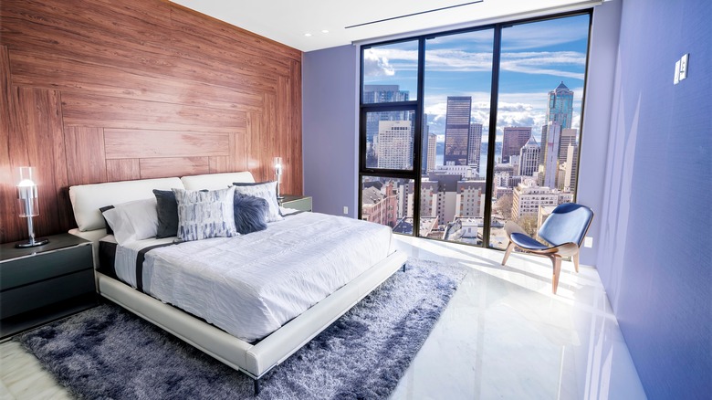
Neither masculine nor feminine, Very Peri is a little bit of both, and more, a way to add a shot of color that cools down a bright room featuring yellow, red, and/or orange. However, it also warms up an interior that to our eyes today may have an overload of tone-on-tone gray. In general, we recommend pairing Very Peri with neutrals such as cream and taupe or deeper shades like navy or brown. So let's take a look at ways to bring this glorious shade into your space.
Creams and warm whites
This may be the most no-brainer combination to consider, especially if your walls suffer from too much white. A quick way to warm up a room is to ditch stark, chalky white and instead use off-white with warm, yellow undertones. When pairing Very Peri with cream, if ruffles and bows start coming to mind, the tone is probably too yellow, so back off with a lighter color or an undertone that's grayer.
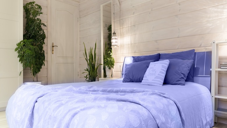
Adding touches of Very Peri to a room with white walls or cabinets can take various forms. A way to ease into the color is to incorporate it into accessory pieces, like a vase or a lamp, or use in soft furnishings such as throw pillows or area rugs. Architectural Digest lists other ways to work with the color -– in bedding or curtains in a bedroom, or in one or two central pieces, such as a chair or cabinet in a living or dining room. Another recommendation is to pick one wall as an accent wall and let Very Peri reflect the other surfaces in the room in cream or ecru for a dynamic interior that welcomes more color such as mauve, light olive green, and medium gray.
Taupe colors

Taupe is a versatile neutral that's part brown, part gray, according to Color Psychology. More complex than either shade alone, taupe is a mix that can range from a yellowish-clay to a nearly black shade. It can be cool with green undertones or warm with red undertones, and as a true neutral, it takes a backseat to the other colors around it.
Using Very Peri with taupe is ideal. The innovative red/blue combination of Pantone's Color of the Year will give spaces filled with taupe, brown, and gray a welcome shot of color that acts as a neutral itself. Often, large investment pieces like sofas, carpeting, and built-in shelves are taupe since the color works so well with so many palettes.
It's easy to bring Pantone's newest color into a taupe-filled room, per SFGate. Use an area rug on top of carpeting, especially to define a sitting area or office space. Artwork is a great idea and so convenient to add to surfaces. Online, search Wayfair, Etsy, and Overstock, or look for wall art large or small at a local boutique or antique store to bring Very Peri or related shades of periwinkle into the room.
Navy hues

Navy blue, like most darker shades, is usually applied sparingly in a room in order to avoid making the space look like a midshipman's bunk. But navy is an elegant color, akin to black but actually warmer, and used judiciously it pairs beautifully with green, pink, mauve, beige, and metallic finishes from copper to brass, plus silver and gold.
With Very Peri, note how on a color wheel graduated hues of periwinkle eventually deepen into a navy shade, an effect artists and designers use called saturation (via Visual Art Academy). Employing the light, medium, and dark of a particular color, using similar colors together can make for a pleasing interior, as well as an outstanding palette for special events, even for wardrobe. A hot color is hot everywhere -– in the living room, on the table, and on the runway.
In this case, take inspiration from navy and Very Peri combinations seen online in wedding photos, Pinterest, clothing collections, and more, as noted by Koyal Homesale. Note how once navy and Very Peri are combined, colors mentioned previously such as brown, gray, taupe, and off-white start appearing and repeating in these color schemes.
Brown shades
Not too long ago there was a booming trend that paired a deep chocolate brown with a delicate powder blue. The trend was everywhere and lasted about 10 seconds, mostly because it was everywhere. It burned out. But pairing Very Peri and brown will work better than a 10-second trend if it's thought through and the colors are the right colors, per The Spruce. Here's what we mean.
Be sure to start with a rich cocoa brown –- something without yellow or green undertones in it. Once this color is in your room -– in the carpet or flooring, or the furniture (think walnut or dark pecan) — it will bring out the warmth of the wood tones with the cooler shade of Very Peri as an accent.
In a paneled room, even flowers or candles Very Peri-colored will lighten the mood. If you're bold enough, consider painting an entire wall Very Peri to offset dark, rich wood tones. If it all feels too much, add a touch of off-white or taupe to balance the visual appeal of the room.
Greens
As much as we love Pantone's 2022 Color of the Year, we have to mention one more thought regarding upcoming color trends, and that's gray leaning towards green. Sherwin Williams has Evergreen Fog, Benjamin Moore has October Mist (per the Nordroom), and Valspar has Gilded Linen.
The key to these silvery-gray greens is their versatility. As a neutral that's more colorful than gray, they soften a dark palette of black, white, brown, and steel, and are right at home with softer shades like pink, pearl, taupe, and robin's egg blue. Most importantly, these sage-greens stand up to the stronger Very Peri, blend with it, complement it, and would be just beautiful in a room as a background color, allowing Peri to stand out.
Any good decorator will tell you to go with what feels best to you. Make the hues, textures, and highlights of paint colors your homework for you. But don't hesitate to experiment and add color however it suits you and your family — and your lifestyle.