Add Unique Charm To Any Room With Erin Napier's Bold Paint Trick
Bright and bold paint colors can be daunting to use; the fear of creating a flashy and overwhelming space often drives people to settle on safer neutrals. Erin Napier, designer, author, business owner, and co-host on HGTV's "Home Town," eases our minds and demonstrates how to infuse these popping hues into our homes while creating a serene and calming space. Napier showcased how she designed a room using a warm-orange and peachy neutral paint color to liven it up. "The warmth of brick and clay and wood, the modern sensibility of a 20-something artist like Harley. I love to take a basic ranch and make it something unforgettable," she wrote on Instagram. "Most of the houses where we live are this style, and this proves it doesn't have to be boring."
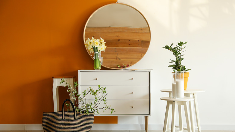
It's important to note that Napier didn't just paint the walls and call it a day. Instead, she created dimension with a two-toned look and a circular design that perfectly highlighted the wooden floating shelves and décor.
Using bright and bold paints
Creating a happy space for ourselves is often the focus, and there's no better way to add an airy and bubbly feel to a room than with vibrant colors that radiate joy. Balancing bold colors will be crucial to making the design feel comfortable rather than chaotic. A good method is choosing one primary color to utilize on 60% of the room, a secondary shade making up roughly 30%, and then using that last 10% or so to bring in accent tones. This can be divided in many ways, with neutral as the dominant tone and something bright and daring as the secondary or accent. Even if you choose that unconventional color to take up 60%, you'll find that it'll still balance out well with the 60-30-10 rule. Adding a significant amount of texture and mixed materials will also draw the eye away from a color that might seem overly intense.
"Choose whatever color you like that has a bit of yellow in it to make the color feel integrated and truly part of its environment instead of too-new, too bright, not quite right, and out of place," Napier advised on Laurel Mercantile. "It is so subtle, but an important delineation between a house that's comfortable in its color vs. a house that's squeaky." If you need help figuring out where to start, consider playing around with colors like Benjamin Moore's Jet Stream and Wildflower or Sherwin William's Butter Up and Nurture Green.