4 Brilliant Tips For Decorating With Complementary Colors
While mixing the perfect color combinations can sometimes feel like a formidable task, some rooms make the process look effortless. Every color and element fits seamlessly together, pleasing the eye and mind with their harmony. What is the secret? There's a method to the madness and science to the process of mixing colors in your interiors. It all begins with a simple tool called the color wheel, via Canva. Brandished by artists and hair colorists alike, designers often rely on this uncomplicated round tool to help choose perfectly paired colors in the spaces they decorate. According to Centsational Style, the color wheel is based on the principle that opposite shades attract and enrich each other, and these hues are considered complementary.
At its core, the phenomenon is scientific. Our eyes interpret light and color through tiny parts of the eye called photoreceptors. These photoreceptors read the color in front of us and interpret the shade. Stare for a few moments at an orange square; looking away, and you will see a ghostly image of a blue square. This is because the eyes, in responding to the orange, dampen those receptors for that color. When you look away, all you see are the blue ones left. Because the human eye works this way, it yearns for the colors that fall opposite and delights in seeing them placed in proximity to each other.
1. Intensity and shade
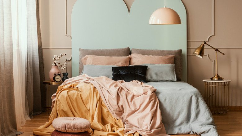
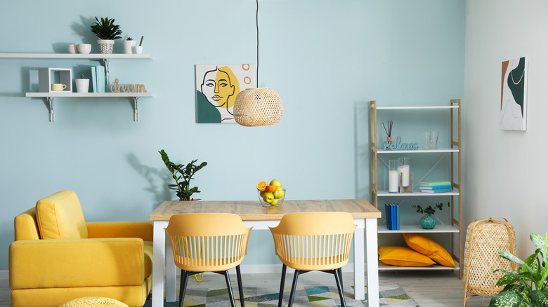
While the color wheel itself exhibits the boldest, brightest colors for emphasis, that doesn't necessarily mean you are only limited to those hues when considering complementary shades. Every color, whatever its base, has a variety of shades in terms of lightness and intensity. Each variation has a similar effect on the eyes when posed with its opposite on the wheel. While deep blue and bright orange sit opposite, a pale aqua and peach shade are just as beautiful in a room full of pastels. Mustard, which sits next to orange, is also a nice compliment to pale aqua.
Deeper, jewel-toned shades like midnight blue and amber pair well together, as do brighter hues like tangerine and cobalt blue. Keep in mind there are also variations in intensity, that is, the amount of grey or brown in a color. These dustier, more muted shades can also be paired along similar lines, according to House Painting Tutorials. A dusky blue grey is a perfect compliment for a rust-colored orange.
2. Light touches
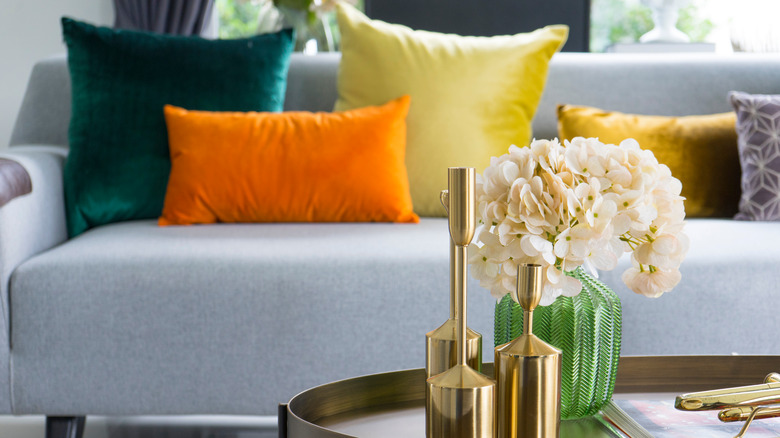
The use of complementary colors in your own space can be approached as boldly or restrained as you like. If your home tends toward neutrals, small touches of complementary colors work wonders, doing the same sort of work for the eye when it encounters them, even mixed among otherwise neutral spaces. The neutrals often provide ample rest for the eyes, which gives the smaller pops of color even more impact when paired together.
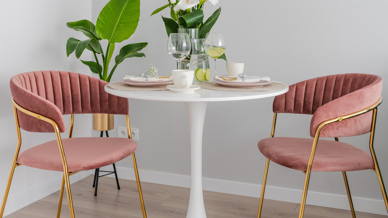
Try some throw pillows in complementary shades on a neutral sofa. Or a stylish set of pink velvet chairs balanced with natural greenery. The pink has magenta roots, which sit opposite green on the wheel. You can also choose one boldly colored accent piece like a chair or rug and add small touches like vases and lamps throughout the space in the opposite shade on the color wheel. According to Maria Killam, too many neutrals in one place can be less than exciting, so try adding a splash of bold orange or yellow. Certain colors pair exceptionally well with neutrals, including mustard and teal with gray shades and cranberry and pine green with browns. Bold, Swedish flag-style cobalt blue yellow and canary yellow look stunning in a sea of white.
3. Bold strokes
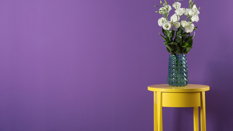
If the idea of bold and high-contrast color appeals to you, consider filling your space with the brightest, intense shades on the color wheel and use them liberally. Since they naturally complement each other, even the brightest and most shocking shades have a visual unity that pleases the eyes. A bold purple wall looks beautiful in a room filled with swathes of bright yellow. According to Custom Home Group, bold doesn't always imply intensity. If you favor pastels, choose a lavender wall color accented with a paler, buttercup shade. Or a rich deep royal purple mixed with gold or mustard for a room full of rich jewel tones.
While large amounts of color may be jarring in other circumstances, carefully considering complementary shades allows unity and harmony even in the most vibrantly-colored spaces. Our eyes naturally seek the corresponding color, so go all out and go big! Wall color can form a complementary balance with larger pieces in the room like sofas and rugs to create cozy, dramatic spaces.
4. Mixing in other shades
The great thing about the color wheel is that you are not limited only to opposing shades. Many hues in proximity to a chosen color also pair well with the opposite color on the wheel. This is why yellow pairs just as beautifully with blue as orange. Magenta and purple, adjacent on the color wheel, pair equally well with the opposite green, as does red. These variations make it easy to mix more than just two colors in a space, adding elements of all your favorite shades for a unique combination.
The colors adjacent on the wheel, like green and blue, usually look stunning together as is, but even more so when you incorporate a complementary shade like orange. According to Tracy Tesmer, another tip is choosing colors with the same vigor and tint. If you love earthy colors, choose sage green and mauve pink. If you love jewel tones, select dark teal and rich mustard. If you like pastels, pair baby blue with a buttery yellow.