House Digest Survey Reveals The Best Metallic Accent Color For Your Home
When you're trying to envision the ideal color palette for your home, there's one thing you shouldn't overlook — the power of some great metallic accents throughout your space. While you can absolutely select a regular colorful accent shade or two that you love, metallic colors add a little something extra. As Mansion Global says, they can bring in some serious glamour, and since they reflect light, it adds some depth and complexity to your space.
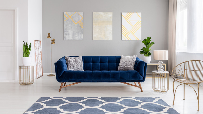
Metallics do make quite a strong statement, so in most cases, you won't want them to pop up everywhere in the room — they are definitely best used as an accent. Laura U Design Collective recommends incorporating metallic hues in elements like light fixtures or in statement pieces — for example, in a bedroom, metallic elements on a bed frame can make a big visual impact.
While you can certainly mix metallic colors, you don't want to go crazy — too many metallic accents and your space may end up looking like a furniture store or light warehouse, depending on where you incorporate the metallic shades. Instead, select one or, at the maximum, two, as Invaluable recommends, to work with.
House Digest surveyed 627 individuals to figure out what their favorite metallic accent hue for interiors was, and the results just might inspire you to incorporate one of the gleaming shades into your own space. Read on to learn which metallic the majority are loving — and which most are avoiding.
The metallic of choice for the majority of respondents
Those who prefer cool tones, such as many grays and blues, will be delighted to know that the most popular accent hue is silver, with 31.74% of the survey respondents selecting it as their favorite. Silver pairs very well with cool tones and can help you achieve a clean, modern look in your space.
Those who love warm tones in their home, don't worry — coming in second with 20.89% of the vote was bronze, a metallic hue that pairs well with warm tones and helps achieve a cozy feel, with a bit of an antique vibe in some cases. Or for those who prefer a little more luxury, gold received 15.63% of the votes in the survey, suggesting that there are still many people who are drawn to the classic hue.
Copper and rose gold, two shades that have a lot of similarity in terms of their overall hue, received 12.28% and 12.44% of the vote, respectively. However, these shades make a bit of a stronger statement and can skew slightly feminine in some cases, as Eye For Design reports.
Finally, coming in last with a mere 7.02% of the survey votes, selected by 44 respondents, was brass. In many interiors, brass can look a little bit dated. However, it shouldn't be overlooked by those who prefer a mid-century modern aesthetic — as Essential Home states, brass is a natural complement for interiors in this style, making it a great accent shade.