The Most Controversial Design Choices We've Seen On HGTV's Fixer Upper
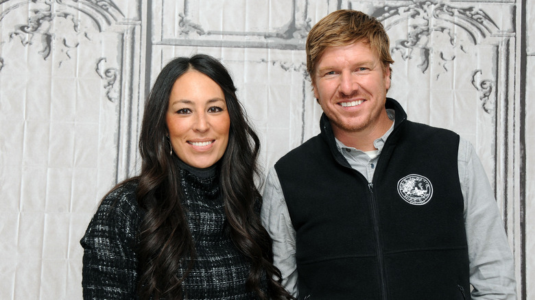
"Fixer Upper" has been a source of inspiration for millions of fans. Joanna Gaines' sharp eye for modern farmhouse elements and her neutral approach to home decor have influenced countless viewers to mimic her style. While you can't go wrong with airy white living rooms and soft, white oak furniture, that doesn't mean the Gaineses have nothing but hits under their belts. While they have tackled some truly amazing renovations (remember the $1 million shotgun house?), they have also had their fair share of controversial design choices.
These choices run the gamut and vary in their level of controversy. For example, when the renovating couple put a kitchen on the second floor of a family home, fans got up in arms over the bizarre move. They lamented that the house was unlivable with such an unusual floor plan. Fans also had choice words to say about Joanna's earlier experiments with modern farmhouse, like when she installed an artificial fireplace in a living room and filled the inside with wire baskets and bird nests. However, we can chalk that up to her still perfecting her farmhouse aesthetic, since her designs have evolved by leaps and bounds since then. Here are the Gaineses' most head-scratching design moves and how to avoid them.
Putting the kitchen on the second floor in the barndominium
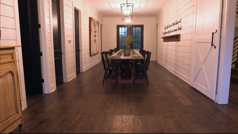
The barndominium in Season 3, Episode 7 of "Fixer Upper" is arguably one of the Gaineses' most famous flips. The 2,653-square-foot barn originally housed horses on the first floor and had a small, one-bedroom apartment on the second floor. But to make it work as a family home for their friends, the Meeks, the couple had to do some rearranging. They created a dining room on the first floor (complete with a 17-foot table), but put the kitchen on the second floor. "With the original design of this home offering the apartment on the top floor rather than the bottom, we decided to save on budget and keep the kitchen upstairs," Joanna explained on Magnolia. But fans didn't like that budget-conscious move. "I couldn't believe it when I watched the show," a viewer commented on Country Living's Instagram post about the flip. "Who's going to carry food and dishes up and down the stairs. Didn't make sense."
To remedy this situation, you can create a dining space upstairs where the kitchen is. Rather than having the living room upstairs (which, in the barndominium's case, was adjacent to the kitchen), you can instead move that downstairs and dedicate the vacant space for a large dining room. This solves the issue of having to run meals and dirty dishes up and down the stairs. Plus, by moving the living room downstairs, the layout feels less like a separate apartment and more like a traditional home.
Installing artificial fireplaces to add character
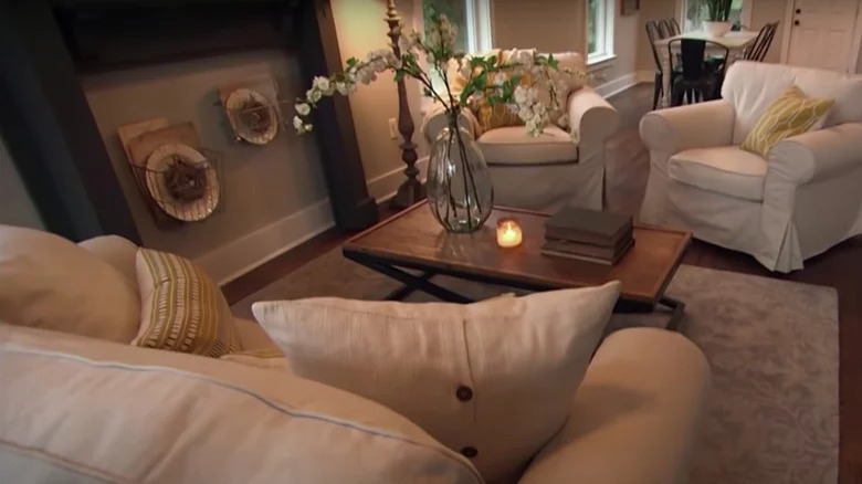
Fireplaces don't just create a cozy atmosphere — they also act as a focal point. A marble one can give Parisian apartment vibes, whereas a carved wooden one can add a touch of Frank Lloyd Wright to a living room. Because of this, sometimes people install artificial fireplaces to create the same wow-factor. While there is nothing wrong with that, there is an art to making it look authentic. You want to make sure you either have a fireplace box or a cast iron cover to create the illusion that the feature leads to a real chimney. However, in Season 1, Episode 6, when they renovated their furniture designer Clint Harp's home, Joanna added a mock fireplace right against the painted wall, trim and all. She also added wire baskets with dinner plates and bird nests, calling even more attention to the fact that it's not real.
To avoid making the same design error with your own artificial fireplace, make sure to create a surround to make it appear more authentic. Find a mantel that fits your aesthetic, and then create a stone surround that has a mock-brick interior, making it look like the fireplace box was permanently sealed with brick. To create the stone surround, cut out three vertical pieces from MDF that will fit the inside cavity of your particular mantel. To create the texture of stone, consider using Roman clay. Then add brick peel and stick wallpaper in the middle to create the brick interior.
Floating nightstands suspended by ropes
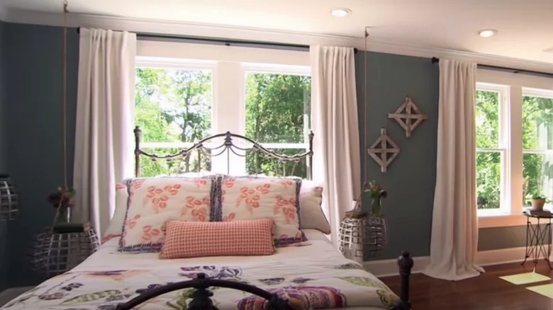
In Season 3, Episode 1, Joanna and Chip remodel an early 20th century home. While they keep some historic elements in it, like the original shiplap walls, they add some modern touches, like floating bedside tables. This was some of the worst home advice that was dished on "Fixer Upper," because it seemed impractical. The tables themselves look like upturned wastepaper baskets, and they're suspended in the air with metal ropes. These ropes can get in the way of easily accessing your cup of tea, phone, or reading book. And since they're suspended, they're also not as stable as a traditional tabletop.
There are plenty of reasons why someone would like a floating nightstand. Perhaps your bedroom is small, or you have a lot of bulky furniture, and having a table without any legs makes it feel airier due to less visual clutter. Or, maybe you just want furniture that's super easy to vacuum under. Whatever the reason, there is a better way to incorporate floating nightstands. For example, you can get ones that attach directly to the wall, such as the Article version that retails for $199.
Old windows that doubled as nursery art
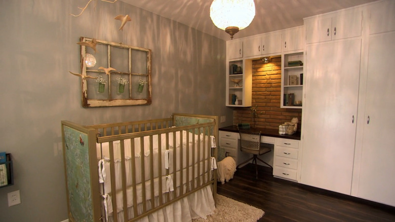
Artwork doesn't have to be paint on a canvas, but in Season 2, episode 9, Joanna might have pushed the envelope a tad too far. While renovating a house for a young couple with their first baby on the way, Joanna bonded with the owners over their love for flea markets. Inspired by their fondness for shabby chic items, she chose questionable wall art in the form of salvaged antique windows. The designer hung up one paint-chipped window over the crib in the couple's nursery, seemingly as a focal point. To take it a step further, she also hung mason jars with baby's breath in the panes, giving it a 3D element. While it might be a fun DIY, the end result feels random and like a filler — you don't usually find a broken window over a crib.
If you're a fan of "Fixer Upper," you know that this is a trend Joanna has since left behind. Nowadays, if she has an empty wall she needs to fill and framed art won't fit the bill, she will use a mirror instead. A big mirror not only covers a lot of wall, but it also has similar reflective properties as a window, giving the illusion of more space. You can see this design move in action all over her Instagram. For example, Joanna added a large vintage mirror to the dining room she flipped in Episode 2 of "Mini Reni", as well as over a fireplace in the same house.
Generic word art
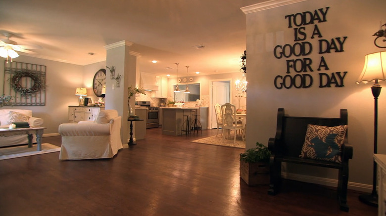
Word art in itself is controversial. Bobby Berk avoids it all costs, and Pinterest warns to keep this popular decor trend far away from your home. But whether you love it or hate it, we can all agree that there is a good way and a wrong way to do it. Typography can be a fun addition to your wall if it relays a message you really resonate with. However, if it's nothing more than word salad, it's best to skip it. The latter is exactly what Joanna added to her remodeled home in Season 1, Episode 8, making it one of her most controversial design moves. The sign in question read, "Today is a good day for a good day," which feels more generic than inspiring.
So, what should you do instead? If you have a penchant for word art, then you probably like it because you prefer to have more variety on your walls. A painted canvas feels too typical. In that case, try to decorate with a mix of mediums to make your space more interesting. Berk, for example, recommends, "Instead, I would use a collection of different types of art. Some like painted art, some photography ... wood pieces on the wall ... but just not words," he shared on TikTok.
This decked out reclaimed wood kitchen
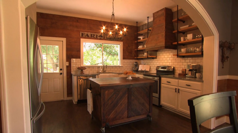
Reclaimed wood is beautiful when done in small doses. It adds a rustic Americana touch to a space, and often has an interesting backstory or history attached to it. Whatever the story, it adds a special element to the room. However, it goes from interesting to overwhelming if the whole room is covered with it. That's what happened in Season 2, Episode 1, when Chip and Joanna designed an entire kitchen out of reclaimed wood. The island, statement wall, and even the vent hood was fashioned out of rugged wooden pieces. The end result felt too visually heavy and repetitive. They proved that there is such a thing as too much reclaimed wood.
The trick is to only use wood in one or two places in the room. If you create an accent wall, refrain from adding reclaimed wood furniture. You can also focus it on a focal point in the room, such as commissioning a reclaimed wood mantel or wooden beams. Or, perhaps you can showcase it in open shelving. "With more time in the kitchen and a newfound love of display-worthy handmade items, we are finding that clients still really love open shelving," designer Christi Barbour told Architectural Digest. "The use of reclaimed wood is the perfect way to incorporate some natural texture and warmth."
Covering a tray ceiling with reclaimed wood
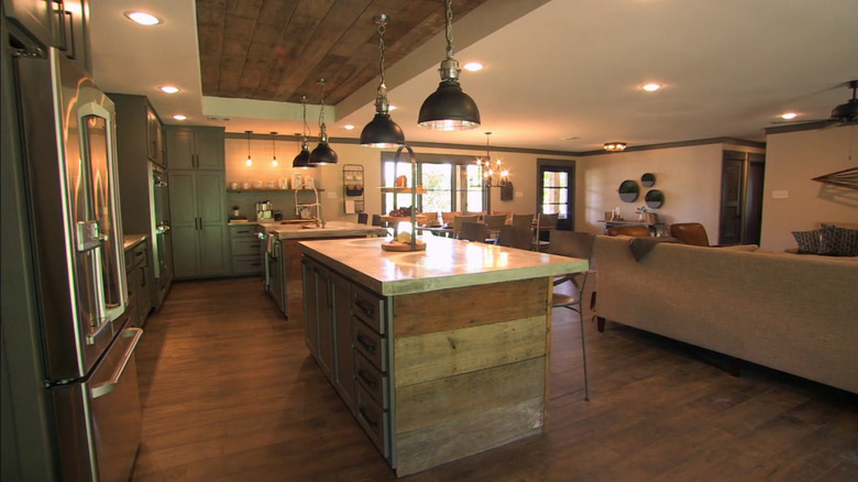
Joanna clearly had an affinity for reclaimed wood, because it made many more appearances in the early years of "Fixer Upper." For example, it had a starring role in the kitchen of Season 3, Episode 11. While renovating a ranch house for a young bachelor, Joanna decided to add a masculine edge to the kitchen by inlaying the tray ceiling with reclaimed wood. This was a controversial design move for two reasons. First, it once again created an overabundance of rustic wood accents, since the two islands in the kitchen were also covered in the same rustic material. But, second, it highlighted the tray ceiling in the kitchen, which is a notoriously outdated design from the late '90s and early 2000s. It's such an outdated ceiling feature that another HGTV couple, Dave and Jenny Marrs, avoid it at all costs.
If you have a tray ceiling and feel like it dates your house, the best thing to do is not highlight it with texture. Instead, you want to cover it up with drywall to create a flat ceiling. That's exactly what the Marrses do every time they encounter the feature in a client's home. For example, they closed a tray in a ranch house in Season 4 of "Fixer to Fabulous." "The living room was large to begin with, but it felt so dark and outdated. We chose to close up the tray ceiling and add recessed lighting to modernize it," Jenny wrote on their blog.
The graphic grid wallpaper in 'Mini Reni'

Joanna experimented with bolder looks in the series "Mini Reni," embracing things like patterned accent walls, floral wallpaper living rooms, and dens painted rich, mossy greens. While fans have been loving her bolder design choices, there was one renovation that flopped. In one episode, the famous designer transformed an empty white room into a modern bedroom for a young boy. To make it feel more masculine, without relying on traditionally childish designs, she wrapped half the room in a blue and white grid wallpaper. However, viewers had some pretty strong opinions about the look. Joanna took it in stride, jokingly sharing some of the most tongue-in-cheek comments on her Instagram Stories, such as the grids reminding them of "an '80s airport bathroom."
Joanna chose that particular wallpaper because it added a wow-factor without overwhelming the space. "Wallpaper can bring a lot of character into an otherwise basic room, and because this grid pattern is subtle, it makes for a good foundation to layer in colors and additional patterns," she wrote on Magnolia. However, the blue and white grid was a little too dated for fans, so to avoid this, choose a print that isn't as nostalgic. The thin white lines reminded people of grout, making it look like old tiles, so choosing something with a chunkier grid — or perhaps a different pattern altogether, like stripes — to avoid this issue.
Sliding barn doors
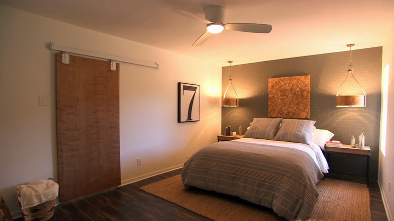
Thanks to her love for all things farmhouse, Joanna had an integral role in putting sliding barn doors on the map. They became a unique focal point in places like living rooms and bedrooms, and often added some texture to the space when they were built out of reclaimed wood. However, the design world has been arguing that barn doors are out of style for years now. They have oversaturated everything from HGTV shows to home design blogs, making them feel tired. Plus, they're also impractical in places, like bathrooms, as they don't keep sound or warm air in very well.
The consensus is that these doors are on their way out, but if you like them due to their space-saving capabilities, you can use folding doors or pocket doors instead. "You can also do double doors that fold all the way back and do not take up too much room," interior designer Margaret Handley told The Seattle Times. Since these are more classic designs, they won't feel dated after a couple of years. But, they will still save space and add an interesting design element, making them a win-win.