3 Things To Consider When Painting With Bold Colors
For years, brighter colors were put on the back burner in favor of all-white interiors. White walls, white furniture, and white decor all reigned supreme. While white can make a space look clean and modern, an overwhelming amount of white can make a space look cold and impersonal, says 21 Oak. But recent years have seen a rise in color throughout homes, with many more homeowners and renters using brighter and bolder colors throughout their spaces.
Choosing a color can feel incredibly overwhelming, which can often stop people from painting their homes with bold colors. But there are a few tricks to making bright colors look incredible in your home. Whether you're looking to add a pop of color or all-over hues, anyone can learn how to masterfully handle color. When adding bold colors to your space, here are three things you have to consider when going to paint your space.
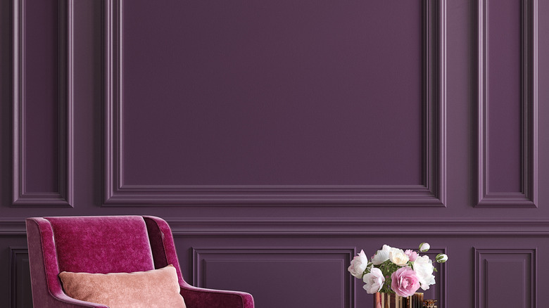
1. The right hue, tint, and shade make a difference
Bright colors can be intimidating and tricky, but they're not impossible to use in your home design. If you're new to adding color, experts recommend not jumping in too fast and going slow with adding it to your space. Start by painting one wall or one room rather than the whole house to get a feel for how to design a space with a more colorful base.
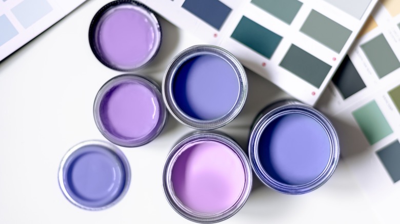
One area where many get color wrong is the hue, and that can make all the difference. According to Beach Painting Contractors, hue refers to the origin of a color. Or, in other words, the base of a color. Add white, and that refers to the tint of the color while adding black to the base refers to the shade.
A basic understanding of color theory can make you more confident in choosing your colors. You can still make bold color choices with deeper, muted, or lighter colors. But understanding the base of the color and what the hues, tints, and shades are can help you choose other elements to match.
2. Factor in the finish
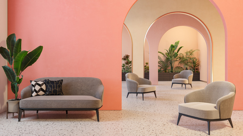
The finish of the paint can make just as big of an impact as the color itself. They can also help communicate the style of the home. Paint sheens range from flat to high gloss, and the location of where you put these matters. Benjamin Moore suggests using flat sheens on ceilings and in low-traffic rooms, while gloss makes sense for door trims, doors, cabinets, and other architectural details. Eggshell, a popular choice that falls around the middle of the spectrum, is great for walls in living rooms, dining rooms, and bedrooms.
Traditional homes might want to highlight the unique architecture and details with a bold paint in a glossy finish. Glossy paints reflect light, so choose it for an area you want to grab attention. Meanwhile, sleek and modern homes might prefer a matte finish for a more contemporary look. The lack of reflection often allows you to see the depth in the color.
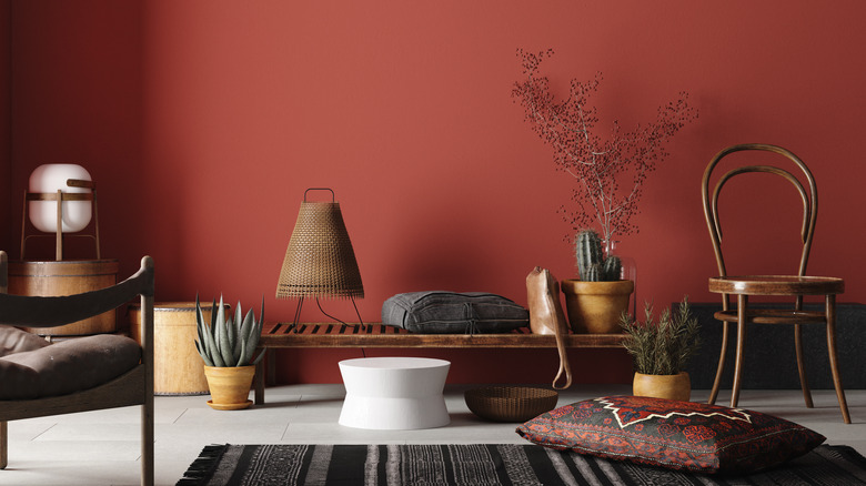
3. House as a whole
Using a lot of color in your home can quickly make a space feel overwhelming. Tying multiple rooms that use different colors together often makes people choose a simpler, more neutral color palette. But that doesn't have to be the case. The trick to creating a colorful home is to think of the home as a whole rather than as individual rooms. That doesn't mean that all the rooms have to look exactly the same or have the same shade of paint on every wall.
The first thing you can do is create a whole-house color scheme. The Turquoise Home suggests starting with a shade of white and another neutral, like gray, beige, or black. Then choose two or three main colors. With this color palette in mind, you can design every room in the house. You can take this collection of colors and use them in different ways in each room. So your living room might have blue walls with green and pink accents. But a bathroom can change these colors around, making green the wall color and using pops of blue and pink. Using the same colors helps your home flow but keeps every room from looking like a variation of each other.