The Best Color Palette For A Southwestern Home Decor Style
The isolation and otherworldy views of the American southwest evoke feelings of passion, a yearning for simplicity, and a desire to reconnect with the natural world at its quietest. As a result, the Southwest is famous for a number of types of homes, including the Pueblo Revival, also known as the Southwestern home décor style. This was a popular décor fashion in the early half of the 20th century that thrived off the utilization of earthy materials like stucco, flat rooflines, and smooth forms existing alongside its Martian surroundings (as noted by the Department of Archaeology and Historic Preservation).
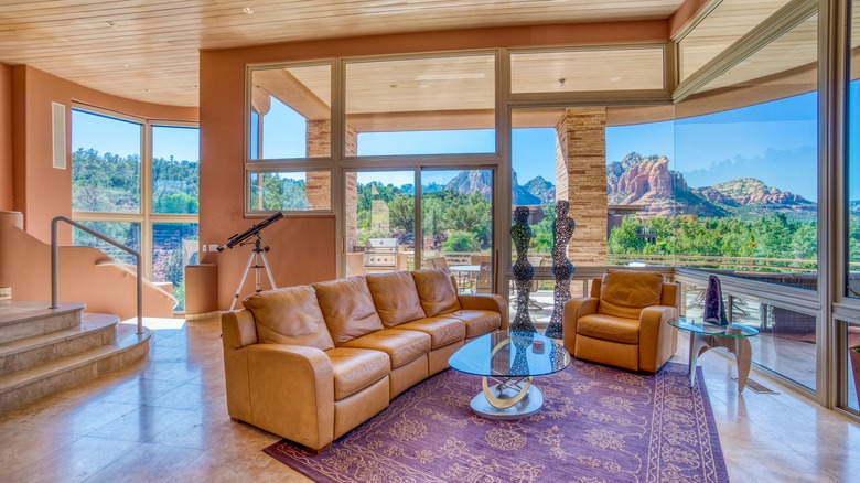
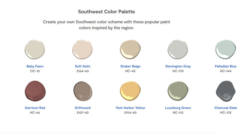
The Southwestern style, among other similar builds, thrives off of colors born from the natural world, with a particular emphasis on the red rock tones that consume the region. These tones include hues such as rust, ginger, copper, dark amber, and sherbet. Such variations work magnificently as the baseline for interior walls throughout main living areas and entertaining spaces. While many of these colors might look a bit out of place in other settings, this blending of the natural world with the interior will create a striking and serenading effect.
Warm whites for the win
This blend of warm tones with the desert landscape will work in many parts of the Southwestern home. However, these tones can sometimes be a bit overstimulating, and it is important to balance these choices with lighter and brighter touches to soften the space. In fact, clinical studies have actually proven that an excess of reds in any room can increase one's heart rate and induce anxiety, per Lycoming College.
Rooms such as the kitchen, bathroom, and bedroom can benefit from warm white paint tones. Off-white shades will provide additional opportunities for optimal natural light to be absorbed through the space and offer some variety to the orange and red tones that will dominate many other parts of the house. These color options are also great for resale value, giving a home a more updated feel and making your space feel clean. But it is important that whatever white you go with isn't too glossy, cool, or sterile looking, as it can throw the whole room out of balance. Additionally, this pigment will also pair well with a lot of the existing flooring in Pueblo Revival and Adobe styles, such as terracotta tiling and oakwood hardwoods.
Pops of blue
Nature has a funny way of reminding us of the things that we already know. Yes, you will also probably notice in the Southwest how beautifully the red rock formations pair with the blue sky overhead. There is a scientific explanation for this, as these hues are perfect when mixed: The color wheel shows what two colors are opposite one another and, therefore, pair the best (via Canva).
For many of these red tones that dominate the exterior and interior palettes of the Southwest home, pops of blue will pair spectacularly. They will bring in the sky, calmness, and serenity and offer a dynamic contrast to the warm hues. Dark blues work well with lighter orange tones, while lighter, softer blues will look beautiful alongside the earthier, calmer amber and red. Enjoy these tones when designing your essential Southwestern home; your space will feel calming, naturalistic, and an extension of the beautiful surroundings with these hues.