The Tip That'll Make Balancing Warm And Cool Toned Paint A Breeze
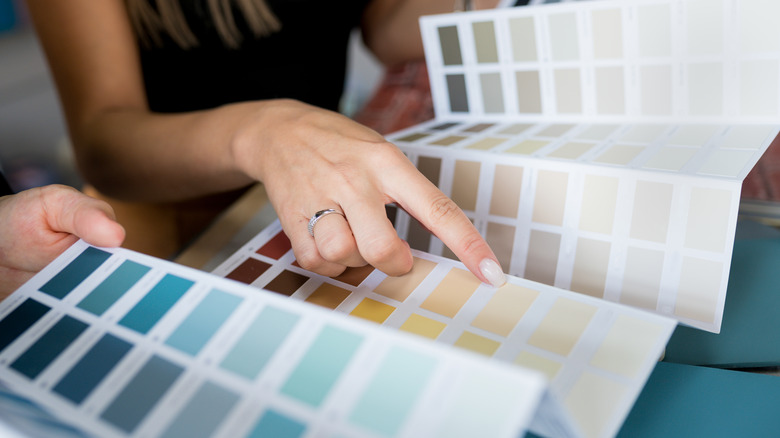
When it comes to choosing paint colors, experts will always emphasize the importance of taking note of the undertones. The color you see immediately when looking at a specific shade is the mass tone, while the undertone is the secondary shade that acts as a tint. Undertones can either be warm or cool, with warm tones generally being red, orange, and yellow and cool tones being blue, green, and purple. The undertone color itself, as well as the amount of it, will affect the shade you see.
Experts often match the undertones of all the design elements in a room to create a cohesive look. While that's a great place to start to ensure a room's parts work together, it can also be limiting, look monotonous, and be somewhat boring to design. Luckily, you can pair warm and cool-toned shades together by following a specific trick. Choosing a warm color that's lighter than the cool one is the key to getting these two opposite tones to work. You want the cool color to be the darker and stronger shade in the pairing. For example, a dark gray-blue paired with a light creamy beige would work well together.
Think of the undertone, not just the color
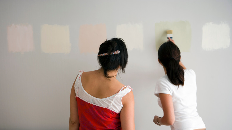
Neutrals are often put into either warm or cool boxes. In general, taupe, beige, and tan are considered warm colors, while grey and white tend to be considered cool. However, this isn't always the case, thanks to the undertones in the paint. White and gray, for example, can be either cool or warm depending on the undertone. Think of a creamy white with yellow undertones versus a crisp white with blue undertones. Further, though true black is neither warm nor cold, there can be near-black shades with undertones that appear either warmer or colder. That's why it's important to look at the tones of the paint and put colors in the right categories.
Comparing undertones is also crucial when it comes to trying to pair two colors within the same category. Even when two colors are warm, because of the tones, one might be cooler than the other. For example, taupe is cooler than beige, which means the taupe shade should typically be darker than the beige one when used together in a room. With colors other than neutrals, there is a little more flexibility, but the same principles of evaluating the undertones and choosing the cooler shade as the darker one still generally apply.
How to mix cool and warm tones in a room
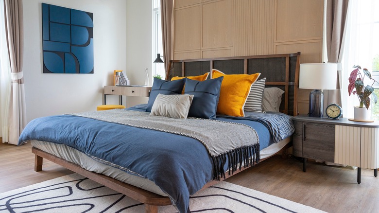
Using both cool and warm tones in a room leads to a more balanced design, but exactly how much of each undertone should be used? Balancing colors doesn't mean that they have to have an equal presence. In fact, using one as an accent is what will make a room feel well-thought-out and consciously designed. Designers often suggest using the 80/20 rule, where 80% of the colors in the room are either warm or cool and the remaining 20% are composed of the opposite undertones. That means that if you're more drawn to warm tones, maximize the use of warm colors in the room by making them the majority. Smaller, complementing accents can be cool-toned in this scenario.
Choosing whether warm or cool tones should be the main shades or the accents doesn't have to be difficult. Start by assessing the pieces you already own or the finishes you have already selected. This can tell you what colors you're drawn to naturally, but it can also clue you in on what you need more of. You may realize you tend to pick out blues and greens and may require a hint of yellow to balance it all out.