The Moody Color Palette Joanna Gaines Recommends For Older Homes
Move over, beige, gray, taupe, and cream. Hello, burgundy, charcoal, teal, plum, navy, and cocoa. Fixer upper maven Joanna Gaines recommends leaning into darker colors that impart moods. When it comes to a moodier palette, Gaines recommends choosing colors for each room's unique look and feel, letting each room "tell its own unique story" as she explained to Better Homes & Gardens.
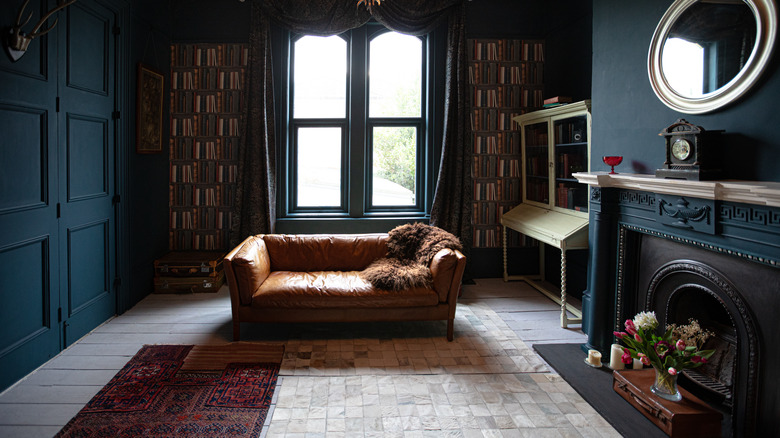
Like many other home improvement spokespeople, Gaines is a fan of pale, neutral colors, but when it comes to older homes, she recommends considering the unique quality of older architecture when choosing colors. Working on an iconic property in Texas called "The Castle," Gaines pivoted from her love of paler tones to darker, richer colors to embrace the building's potential for dramatic flair: "In some rooms where I really wanted to play up that story and that history and that richness and that intention, I went darker, and I didn't look back."
This approach to color can enhance the character of older homes. Houses built during the Victorian era, the Gilded Age, the early 1920s bungalow and Craftsman era, or even midcentury, often have unique features, such as crown molding, arched doorways, built-in shelves, pocket doors, unusually shaped windows, and other features that can be showcased by choosing darker, richer color palettes. Darker colors often feel neutral, though they also come in more vibrant shades that feel warm or cool. Spend time looking at swatches and photos to help you choose what works best in your space .
How to work with dark paint colors
Simple tips when working with dark colors can help you avoid aesthetic mistakes. While dark colors on walls can make rooms look smaller, there are ways to balance this effect. For example, experimenting with different paint finishes, from matte to glossy, can affect how paint colors look. The most common approach is to use a matte or eggshell finish paint on the walls and a semi-gloss or high-gloss finish for trim and doors. But you can paint walls with a semi-gloss paint if you wish; this works especially wells in bathrooms and kitchens.
A lighter color on the ceiling can also create the image of a larger space. Imagine a green living room with deep forest green on the walls, a semi-gloss version of the same color on the wood molding, and a slightly lighter shade of green in the same color family for the ceiling. This offers a rich combination of color within the same palette, which can be reflected in furnishings as well.
Contrasting or complementary dark colors can also work well to enhance rooms in older homes. Jewel tones often work very well together: like pale sapphire blue with a deep ruby red, or emerald green alongside a deep orange cinnabar hue. Saturated jewel tones can have a big impact even if only used in a small area, such as an entry way or small bathroom. If using two contrasting dark colors in a room, consider choosing a lighter color for trim or doors.
Choosing furnishings that work with dark color palettes
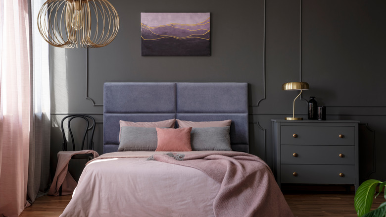
One challenge to working with dark color palettes is avoiding an overall feeling of drabness or darkness in a room. There are a number of ways to avoid this. One way is to paint two of four or three of four walls one dark color, and the remaining wall or walls a lighter color. Keeping the paint choices in the same color family adds an interesting visual effect and enhances the overall palette.
Complementary or contrasting colors in bright or muted shades also creates an eye-catching visual impact. The possibilities are endless. Deep orange drapes in a room painted navy blue will help play up the brightness of the blue tones. Cocoa brown walls with a dusty rose velvet couch and floral cushions with similar color accents embodies a warm, romantic look. Burgundy walls with taupe or olive trim works well with brown leather club chairs, Persian rugs, or other vintage furnishings.
Another way to avoid a dark or drab feeling is to choose furnishings that reflect light, such as drapes or cushions in fabrics with a natural sheen such as woven silk or velvet. Knowing how to decorate with metallics is helpful, since they reflect light beautifully: You can choose metallic décor (such as chrome-finish picture frames), metallic furniture, or furnishings with gold leaf for a warmer look. Cushions or drapes in fabrics with metallic thread also reflect light and lend some shimmer. In addition to overhead lighting, using lamps at different heights creates more opportunities for reflected light.