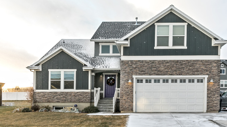
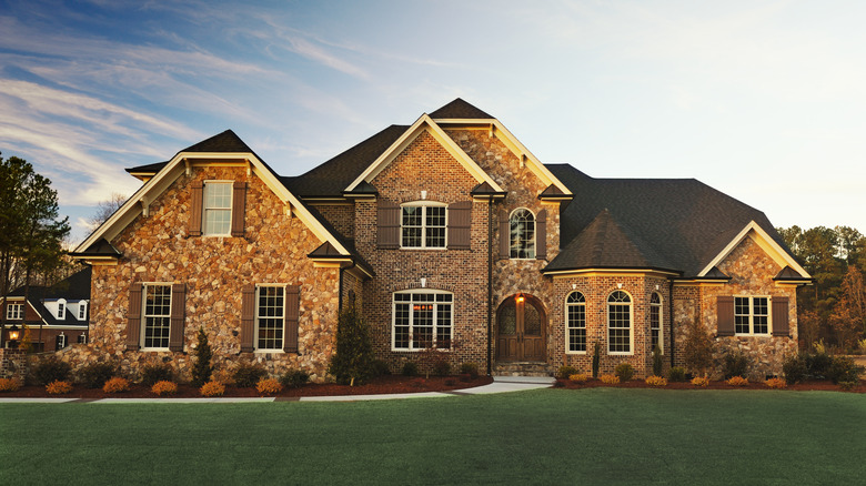
The Best Front Door Colors That Complement A Brick Home's Exterior, According To Our Expert

Your front door sets the tone for your home. It is the first thing people see when they arrive and it literally welcomes you into the house, so making the right choice is critical. The perfect front door will match your home's style. When you have a home with a lovely brick exterior, it can be hard to pick a color that won't detract from the brick while also making a statement of its own. There is no one-size-fits-all solution to which color you should paint your front door. It depends on the color of the brick surrounding the door, as well as how much personality you want to introduce.
To help guide us through the seemingly endless options of paint colors, Sue Wadden, the Director of Color Marketing at Sherwin-Williams, has clued us in to the best front door colors for every type of brick home. In an exclusive interview with House Digest, Wadden dishes out her best advice, helping you avoid common mistakes people make when choosing a paint color for their front door and instead picking the right shade that will truly make your house stand out from the rest.
Deep blues and charcoals look great on dark red brick
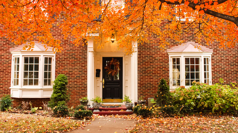
A dark red brick home evokes a sense of classic elegance, so you should choose a paint color that reflects these themes. Wadden suggests a deep navy blue such as Naval SW 6244 or Charcoal Blue SW 2739 that will match the deepness of the red tones. If you want something more neutral to allow the red of the brick to be the focal point of color, you will want to stick with a darker neutral. "Deep charcoals such as Iron Ore SW 7069 or Sealskin SW 7675 are also timeless front door colors ... bringing out the richness of the dark red, not competing with it," says Wadden.
The versatility of blue is what makes it classic. If the red-and-blue look is too Americana for your personal taste, the cool-toned charcoals will bring a balanced contrast to your home's façade. The dark red brings warmth, energy, and depth to the color scheme, while the charcoal adds that cool, calming, and sophisticated touch. This balance of warm and cool tones creates visual interest and complexity.
A versatile gray will complement bright red brick
If you have a bright red brick exterior, Wadden suggests painting the front door Urbane Bronze SW 7048, Peppercorn SW 7674, or Cyberspace SW 7076, depending on which undertone you prefer. "Urbane Bronze SW 7048 has that hint of warmth, making it a nice companion to bright red," she says. "While Peppercorn SW 7674 and Cyberspace SW 7076 have a cooler undertone and can balance out the bright red in the brick."
The key word here is balance. A bright red brick will certainly catch the eye of any passersby, so you don't want to paint the front door a bold color that will compete for attention. Using these colors will allow your brick to pop while still creating a cohesive look. However, your home is uniquely yours and if you prefer to establish a warm-toned color scheme from the start, Urbane Bronze is a down-to-earth brownish gray that still has all the complementary aspects of a gray while providing a natural warmth.
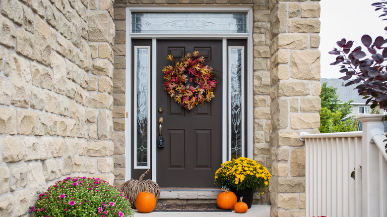
Keep it neutral or go playful for white brick
A white brick provides your house's exterior with texture while remaining a blank canvas to create your dream home. There are two different routes you can go. If you are a minimalist designer who prefers a modern look, using a true black like Tricorn Black SW 6258 will create a classic black-and-white combo. Since your home is majority white, you can use this black accent without worrying that it will darken the overall space. However, just because your home is white doesn't mean you're doomed to live in a neutral world if that's not your style. "You can have some fun by selecting a bold pop of color from our Colormix® Forecast 2024 such as Aquastone SW 9043 or Ravishing Coral SW 6612 to add a dose of personality to a white brick exterior," Wadden says.
The black-and-white combination is timeless and can work in any neighborhood. It creates a versatile façade that will allow any decorations or landscaping to be the focal point of the front of your home. But because white can pair with almost anything, if you have white brick, it is the perfect opportunity to share your favorite color with the world (although you probably don't want to paint the door white)! Don't shy away from using a color like Aquastone if you have other aqua touches throughout your house or Ravishing Coral if you want to set a vibrant, feminine tone in your home.
Natural browns and olives work for black brick
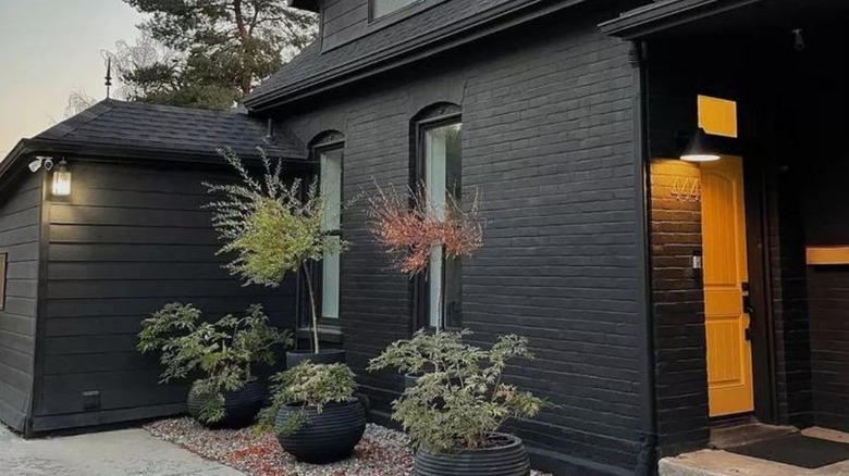
With black brick already making a bold statement, it's important to choose a color that complements the stark contrast it creates while also maintaining cohesion within the overall color scheme. Wood pairs well with black, so if you want to give the look and feel of a wood door, try a robust caramel like Antiquarian Brown SW 0045 to bring a dose of warmth. If you want to embrace a bit of color without going too bold, Wadden suggests green. "Try a deep mossy green such as Relentless Olive SW 6425 or Saguaro SW 6419," she says. "These olive tones have been labeled as trendy camo greens going into 2024 and beyond, and they can add that tropical pop to a black brick exterior."
Deep greens dominated the spring 2024 runways and will continue to be a trending color. Using these mossy green shades will keep you on trend while still being subtle enough to stay classic for years. Utilizing these suggested colors that are analogous to black means they share similar undertones that will enhance the visual appeal and create a unified look.
Undertones in a front door color are key to complement gray brick
Gray brick is commonly associated with industrial or commercial buildings, and some people might fear it will make their house look institutional or factory-like. But if you introduce a pop of color with the right undertone to the door, a gray brick house can look homey and welcoming. The deep violet Carnelian SW 7580 has warm undertones and has been rising in popularity over the past few years. "This deep berry shade would add a rich dose of elegance to a gray brick exterior," Wadden says. She went on to explain that using a golden shade is another popular option, but you have to carefully choose the right undertone. "Escapade Gold SW 6403 and Brassy SW 6410 both have more of a green undertone to them, making them an eye-catching front door feature for a gray exterior."
Because gray is a neutral that pairs well with a wide range of other colors, its versatile nature means that it can blend with other shades to create a harmonious contrast. But, since it can sometimes appear cold or flat when used on its own, introducing colors with brighter undertones like purple or green is critical to bring warmth, vibrancy, and dimension to the overall look.
Monochrome browns or deep blues work well with dark brown brick
Dark brown brick has a historical, fairytale-like feeling. To embrace the unique feature, try painting your door brown. This might sound like a fashion faux-pas, but Madden explains that it can create an elevated look that homeowners crave. "Dark rich browns such as Rockweed SW 2735 and Turkish Coffee SW 6076 can create a sophisticated monochromatic look to a dark brown brick exterior and coordinate with some of the deeper tones within the brick variation," she says. If monochrome isn't your style, using a dark blue such as Sea Serpent SW 7615 and Dark Night SW 6237 is another good option. Adding a cool tone to your front door can balance out the warmth of the brown in the brick, making the home feel more modern.
Monochrome homes are often referred to as a trend, but with its enduring popularity and evolving variations, it seems like it's sticking around. This design choice isn't even a trend; it's a new classic that won't be going out of style anytime soon. Just don't forget about the importance of undertones and texture when crafting a monochrome look, echoing Madden's thoughts on using the dark, rich paints to balance the rough brick.
Use history to inspire what complements tan brick
Tan brick houses have a timeless appeal and rich architectural heritage. We want to pay homage to this tradition by integrating colors from Sherwin-Williams' historic palette. "Colors such as Aurora Brown SW 2837 and rich Polished Mahogany SW 2838 have warm red-purple undertones to them," Wadden says, explaining that these undertones can balance out the yellow undertone that might be found within tan brick styles. If you want a historical color while still playing with undertones, you can use colors with a green undertone in Roycroft Bronze Green SW 2846 and a subtle blue undertone in Roycroft Pewter SW 2848.
"Either color would pair nicely with a tan brick exterior and can create a rich earthy vibe for the exterior of the home," Wadden adds. While tan is technically considered a neutral and its paleness can be paired as a complement to almost any other shade on the color wheel, each brick is different. It's important to consider the unique color of yours, and choose a front door paint with an undertone that will suit it well.
Gray tones look good with pink brick
If you're lucky enough to have a pink brick home, it's important to choose a front door color that lets the pink brick shine while also creating a cohesive vision. Using a gray color is the best option according to Wadden, but within the gray category, you still have many choices depending on your personal preference and what you want your front door color to mean. Cityscape SW 7067 and Classic French Gray SW 0077 are neutral, mid-tone grays that she says will "coordinate and balance out the warm tones of a pink brick exterior." A true mid-tone is great if you want a clean look, but if you want something softer, you can explore shades of blue gray. According to Wadden, colors such as Serious Gray SW 6256 or Grays Harbor SW 6236 will work nicely with the pink brick.
Choosing a gray with hints of blue will provide a contrast, since blues and pinks are on opposite sides of the color wheel. The combination of warm and cool tones will create a balanced look that has a seamless transition to whatever décor you have inside your home.