The Design Rule Nate Berkus Wants You To Break When Decorating With Wood Tones

Design rules are there to help us, so our space is as gorgeous as can be. Otherwise, we might have homes that are a collage of clashing prints and bright colors, or worse — boring. One common design rule many live by is that a room should only be decorated in one wood tone. That means the wooden picture frames should be the same shade as the trim and tables. However, interior design expert Nate Berkus, is calling foul on that style rule. "You do not have to use one wood tone in a room," Berkus shared on Instagram. "In fact, it's so much more interesting to use several."
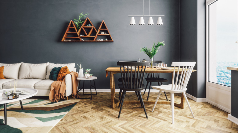
Berkus is right. Only decorating with one wood tone is like only using one shade of paint or one style of pattern. Imagine not having stripped pillows because your one-pattern card was used up on floral wallpaper. The rule is super limiting, and sticking to only one wood tone is a design mistake Berkus wants you to avoid. In fact, styling your room with two or three colors of wood can amplify your space, and incorporating the different shades is easier than you think.
Mixing wood tones adds character
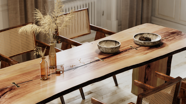
Nate Berkus' design style is all about building a space you'll love that is timeless and has depth. Wood is the perfect medium to accomplish just that. The classic material is never going out of style and is so versatile. "The character of different colored wood and different species of wood, and different finishes — even if it's oak, you can have cerused oak or bleached oak or dark oak or blackened oak. And I think that that's what brings a lot of life and energy to a space," Berkus further explained in his Instagram post.
The uniqueness of each piece is why you should decorate with various wood tones. It's a great way to break away from confiding rules and decorate your home like a professional. Light colored wood can make a room feel more open and brighten up your space, while dark woods stand out and have an elegant aesthetic to them. Decorating with different tones creates a dynamic contrast that adds dimensions and beauty to each room. Plus, there are easy design tips to help you nail the mix-and-match style just right.
How to decorate with multiple wood tones
Mixing various wood tones can be intimidating, but there is a way to decorate with these different browns so you don't end up with a space that's clashing or with pieces that are competing with each other. To perfectly mix wood tones, start with a dominant shade. This would be the most prevalent stain in the room, whether it be on the hardwood floors, kitchen cabinets, tables, or wall panels.
You can then pick secondary and tertiary wood stains in your design that are lighter or darker than the dominant color, but they should all have the same undertone. Warm-toned woods have a red or yellow tinge, like oak and mahogany. Cool-tone woods have a blue or gray tinge, like ash or birch. Then there's neutral wood, like walnut, that has a balance of both. Despite being a different hue, the colors will complement each other because they have similar color temperatures.
Finally, when you are incorporating multiple wood tones, each color should pop up at least twice in the room. The repetition creates cohesion and ties together all the varying pieces. So in the kitchen, you might have cherry cabinets, pine décor, and light cherry stools and trim. Just like mixing and matching bold paint colors, you can do the same with wood, just ask Nate Berkus.