The Two Paint Colors HGTV's Joanna Gaines Doesn't Love Using In Homes

Joanna Gaines is no stranger to a well-thought-out color palette — it's one of the reasons why so many homeowners are inspired by her designs. Although many people consider her color stories to be fully neutral, she's not afraid of adding bold pops of color into her homes. In fact, she encourages bringing vibrant shades into neutral-based color palettes to add balance and character. Choosing the right colors is a huge aspect of interior design, and after years of honing her craft, it's safe to say that she often knows what hues to either highlight or leave behind. That's why it is no surprise that Joanna Gaines' paint collection is on par with one of today's biggest trends – biophilic design. She simply has a knack for knowing what a stylish color palette consists of. However, there are two colors you shouldn't expect to see starring in her collection, or most of her designs for that matter — purple and orange.
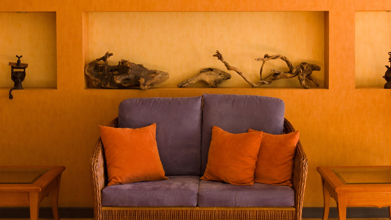
Gaines is admittedly not a fan of using these colors in her home designs, and while she may attribute it to personal preference, fans of her signature style might want to consider rethinking these shades in their own design. This doesn't mean that all colors with orange or purple undertones are off-limits. When you look at her designs, it's clear that she doesn't boycott these colors altogether. Instead, she opts for more earthy variations of the colors if needed or chooses to add vibrancy with some tried and true, naturally beautiful shades.
Why she avoids orange and purple
Gaines may love a neutral color palette, but she's not afraid to experiment with bolder colors — except maybe when it comes to orange and purple. She's discussed how she often finds it difficult to make these colors work without making the design look too themed. On a more personal note, she's also admitted that specific shades like purple and orange tend to activate her anxiety. However, this may not be as personal a response as she thinks, considering these are known as two of the paint colors that may overwhelm you in your own home. The study of color psychology sees orange as a mentally stimulating color, but this may also come off as too stimulating to some people, leading to feelings of restlessness or anxiety. Purple can also trigger excessive energy in a similar way, and many designers agree with Gaines' perspective that it's often too harsh and fussy to work with in homes.
Whether or not you can identify with Gaines' personal response to these colors, in her own designs, she places plenty of value on how a color affects her emotions. She has expressed that choosing her color scheme is typically the first decision she makes for her designs and picks her palette based on how colors make her feel. Knowing this, as well as her response to purple and orange, makes it clear why she avoids these colors when decorating, favoring those that will evoke warmth and serenity.
The colors she opts for instead
It's no secret that Gaines loves taking a neutral color palette and finding ways to make it visually compelling and beautiful. Despite her love of earthy, subtle neutrals, her designs are anything but the "sad-beige" styles that are going out of fashion. One way she accomplishes this without relying on vibrant shades of purple or orange is by focusing on striking hues found in nature, like green. She believes that green in any form is a timeless choice that draws a beautiful connection to nature in designs, as well as adding an emotional impact. Shades like sage green are known to create a relaxing environment, which aligns perfectly with Gaines' consistently comforting designs.
You can bring earthy tones to your home decor with a rich and gorgeous color combo of green and orange — surprisingly, you may see this pairing in Gaines' interiors, too. That said, she typically opts for more subtle, organic hues of orange rather than the typical vibrant shade. In "Fixer Upper: The Lakehouse," for example, there are many green elements paired with terracotta and warm woods, which can fall under the orange umbrella of colors while still feeling natural and welcoming. For purple, she often uses neutrals with understated purple tints, like dusty lilac, as an alternative choice. When going for a deep, rich design, she'll go for more organic interpretations of the shade, like the colors "Moody Fig" and "Plum Suede," which she included in her Magnolia Home paint collection.