The 7 Unexpected Colors Designers Are Pairing With Beige (& Why They Work)
Interior designers use a variety of decorative tools to delineate a theme, set the mood, and elevate the overall atmosphere of a home. Among these tools is the use of color. Neutral colors like beige are often used as a popular backdrop for many design styles — from sophisticated satin beiges that adorn contemporary interiors to calming sandy tones used liberally in modest styles like farmhouse or rustic decor. While it's a safe choice that can tastefully accompany many different shades, beige on its own tends to lack character and visual interest if it isn't used thoughtfully. That's why choosing the right color combinations that harmonize with this tone is important — and it can be the difference between a dull and an aesthetic space. To achieve this, it's not uncommon for experts to experiment with pairing beige hues with playful colors that seem unlikely but actually work together, such as blues, greens, pinks, and purples.
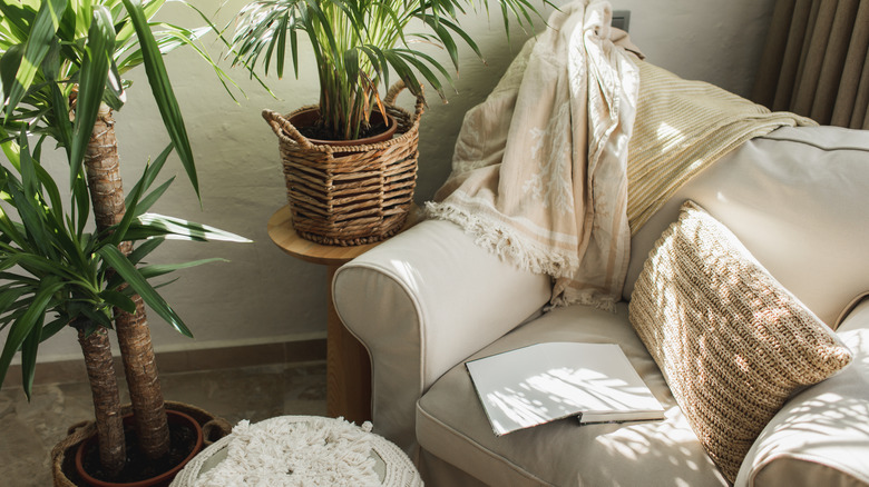
Beige isn't just a safe choice, though. It's a versatile color too, and when layered with other muted shades, it can create depth and add texture. Beige can obviously be paired with classic colors like black, white, and grey for a sleek, monochromatic vibe. But shades of blue, green, purple, and pink can brighten things up and contrast nicely, plus they're great for adding a pop of color to an otherwise neutral space.
Beige and blue
The cool tone of blue breaks up the monotony of warm beiges and livens up the neutral color scheme. Blue is a calming shade, and in color psychology, it's known for translating stability and reliability. In interior design, professionals use blue to evoke a sense of tranquility, peace, and stillness in a space. A blue-and-beige combo works well in areas where you want to translate these emotions. Try a rich, cobalt blue accent wall or couch to ground a dining or living room. In beige bathrooms, navy blue accents – like cabinets or a door — can echo feelings of serenity.
Beige and light purple
Muted purples, such as lilac, lavender, or wisteria, can add charm and subtle contrast against beige hues. According to color theory, purple is associated with creativity, mystery, and luxury. Whether you aim to make a room feel more elegant or interesting, using purple with beige creates visual intrigue and brings an element of sophistication and mystery. A vibrant lilac jewel-tone couch or pale purple drapes can instantly become a beautiful focal point in a beige interior. Not only does this combination provide depth and dimension, but the soft contrast can save a beige space from feeling flat or dull.
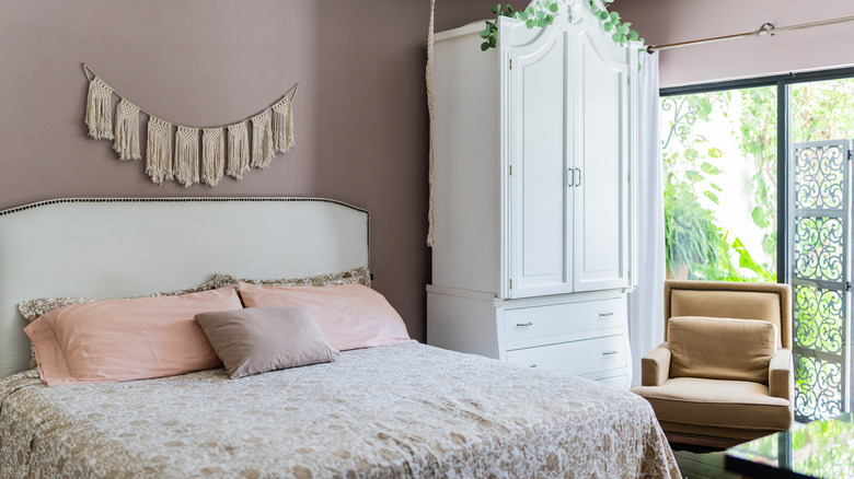
Beige and light pinks
Incorporating pink into your home decor lends a sense of sweetness and playfulness to a space when paired with neutral shades like beige. This color combination effortlessly softens a space, creating a cozy atmosphere. For example, pink curtains, bedding, and seating can layer beautifully against a neutral beige wall. With that in mind, it's important to consider the undertones of pink and beige. Warm, earthy pinks (like dusty rose or sand pink) can complement warm beiges for a romantic aesthetic. In your dining room, consider adding muted pink dining chairs or a blush-colored rug to complement beige walls or furnishings.
Beige and coral
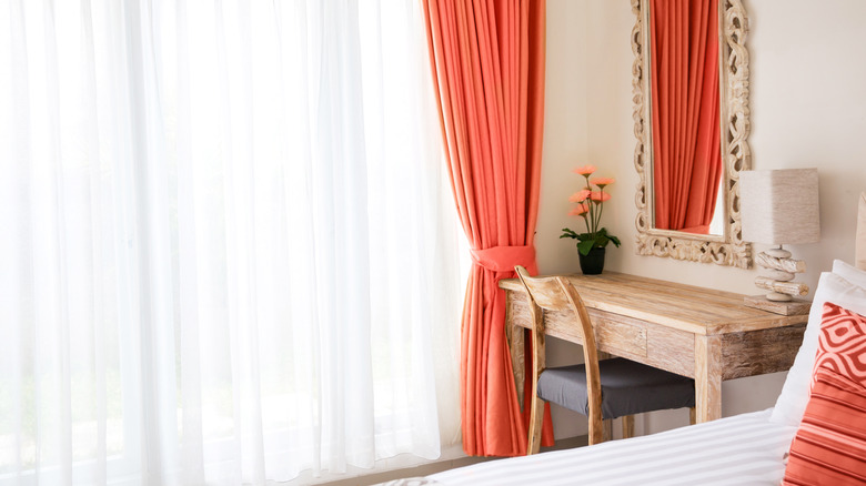
Beige pairs beautifully with vibrant colors too, such as the red and pink-orange tones found in coral. As the name suggests, coral is named after marine polyps that color our vast oceans. And like the ocean, coral is a soothing shade that can transform any beige room into an oasis. The color coral gives life to beige because of its lively hues and significance in nature, while beige's versatility helps tame the bold energy coral often brings. Beige with orange undertones works best in this case because of its shared hues. Try a coral-colored wall with beige finishes or coral accents layered against beige walls.
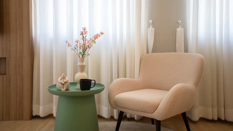
Beige and olive green
When beige is mixed with another muted earthy tone like olive green, it can set the scene for a calming and grounded atmosphere. Hence, this color combo is ideal for rooms where comfort and relaxation are a priority, such as living rooms or bedrooms. Aesthetically, cool beiges, like greige or taupe, can complement olive shades since they share a dusty, cool, and nature-focused undertone. You can pair your olive green finishes and furniture with a taupe beige wallpaper or textured wall to add character and elevate an elegant or minimalistic decor style.
Beige and terracotta
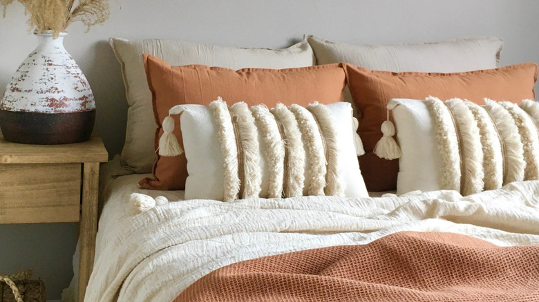
Terracotta is another earthy tone that complements the natural element of beige. Reminiscent of fire clay, terracotta is defined by its orange-brown mixture that comes alive in a beige space. Terracotta also creates an inviting atmosphere, working well in kitchens, dining rooms, and living rooms. For a cohesive look, pair the comforting shade with beiges that have warm undertones. Bisque or camel beige furnishings — like seating, consoles, or tables — can balance a room with rich, dark terracotta walls. Alternatively, you can match terracotta with cooler beige tones, like greige or latte, for a more complex and contrasting effect.
Beige and pistachio
The color pistachio was inspired by — you guessed it — the creamy, lush green shade of the beloved oval-shaped nut. Its beige outer shell explains why these two shades naturally go together. When paired with the sophisticated shades of beige, the soft, cheery pistachio can bring a youthful element to the muted space. It goes well with fellow warm-toned beiges like almond but also provides a punchy contrast to cooler beiges. Because of its food origin, pistachio green can be added to dining rooms or kitchens — such as seating, base counters, cabinets, or paint — for a calming, warm, and inviting ambiance.