David Bromstad's Paint Color Combo That's Giving Palm Beach

Color is often said to be the cornerstone of interior design. It affects the way we perceive a room and how we feel in a certain space. It's such an integral part of design, in fact, that certain color combinations can be the difference between a house that feels cold and sterile (enter: the ever-divisive Millennial gray) or bright and inviting. When you get the shade mixtures just right, you can also create dreamy, serene, and vacation-inspired spaces in your home. Beige, creams, and terracotta perform well in Southwestern decor, while dusty blues and subtle tans can transform your home into a coastal getaway. And if there's one designer who knows how to mix certain shades to curate a vacation vibe all year long, it's professional designer and HGTV star, David Bromstad. According to him, jewel-tone emerald and soft blush tones make the perfect combination to transport an ordinary home into the glamorous tropics of Palm Beach.
The "Color Splash" host is notorious for employing bold pops of color and vibrant shade combinations in his eclectic designs, which explains why people have sought his expert opinion on the design trends that are still in and which are out, including the vintage and effervescent vibe of Palm Beach (which, according to Bromstad, is a totally timeless vibe).
How to use emerald and blush tones for a Palm Beach-inspired getaway
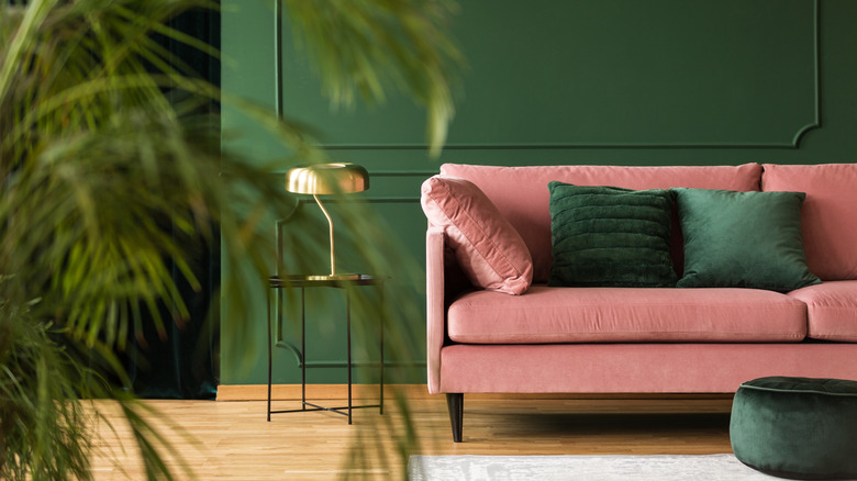
When mixing vibrant shades like emerald and blush pink feels almost forbidden, Bromstad's advice is to start small. In an interview with HGTV, he explains that big pieces should be neutral, then go in with colors for accents and furniture pieces. "The couches and chairs — anything that's expensive and an investment — should be neutral," says Bromstad. "Then you can pop in the trendy or current colors in with paint and accessories that you can change from season to season without breaking the bank." The same rule applies when decorating a Palm Beach-inspired home, and choosing the right pops of emerald and pinks is one way to liven up a neutral color scheme. For the living room, for example, you might consider a neutral base with a touch of pink, like Bashful from Benjamin Moore (1171) or Rosy Outlook by Sherwin-Williams (SW 6316), which are both soft and subtle backdrops that make emerald accents pop.
For a moodier vibe, consider a vibrant Emerald Isle by Benjamin Moore (2039-20), which can make living rooms feel elegant yet fun. Add blush accents, like a pink swivel chair, for a youthful twist. If you're into the moody green paint shades, a flamingo pink pendant light, like this Radiance Wide Pendant with a Ceramic Gloss from Justice Design Group ($380) and matching blush knobs and pulls, can blend together to create a gorgeous Palm Beach glam dining room.