The Joanna Gaines-Favored Paint Color That's Perfect For A Timeless Kitchen
The ultimate conundrum when decorating your kitchen isn't which fixtures and appliances to buy, or what countertop materials to use. In fact, the trickiest decision sounds like the simplest one, but can make a big difference on the overall finish and ambiance of your cooking space. You might be surprised to realize it's choosing the paint color. Of course all of the aforementioned elements matter, but without a solid base that creates both a cozy and welcoming yet stylish aesthetic, your whole room can feel cold and sterile. When it comes to choosing the paint color for your walls, the options might seem overwhelming: too white and you are creating a stark backdrop that might deter people from hanging out and socializing. Too heavy or dark, and the space might become overbearing. However, Joanna Gaines has the ideal shade to provide both an inviting aesthetic that still gives off clean and luxurious vibes. Appropriately titled "Gatherings," Gaines created this golden gray color to encourage the social engagement that brings family and friends together within a comfortable space.
Of the shade she said, "To me, this color captures the same feeling of family and friendship, and really makes you want to settle in and share good stories," per Magnolia. Considering the kitchen is such a hub and many people have even converted it into a place to gather and hang out, this color and the ideals behind it make it the perfect hue for a timeless kitchen. Joanna Gaines has many clever color tips to make a space seem more engaging, so when she suggests a hue to really enhance a room, it might be worth checking out.
Gatherings is full of warm undertones
Kitchens have come a long way from their humble beginnings. While they may have always served a functional purpose, throughout the centuries they have also acted as a place for families to work, eat, and talk together. However, recently it seems people are deferring back to these uses even more, forgoing traditional dining rooms and replacing them with kitchen islands or layouts where people can congregate in a more casual setting.
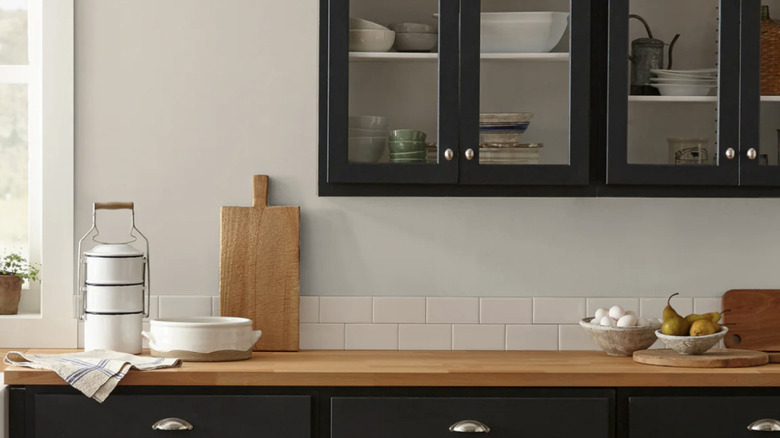
What really sets this shade apart from other off-white paints is the undertones, which the website describes as golden gray, but also featuring tan and amber hues. These warm elements bring that cozy and welcoming aesthetic that is so vital within a hub or social space. Natural light will pick up on these undertones and make the room seem more intimate rather than cold and stark as some more blue whites can do. Because of the varying warm hues within the paint, you can decorate with a variety of color combos that Joanna Gaines swears by in the kitchen, including neutrals and saturated earth tones to really bring them out. Using white trim will also give a clean finish and still give you that bright addition.
Use wood to complement the warm shade of the paint, incorporating natural materials through accents and even your countertops or cabinets. Copper or brass metals would also work nicely with this paint color as they are both warm metals. You can stick with earthy palettes, or get a little moody with dark green or black contrasts to create a bold finish that still comes across as inviting.
Layer your textures
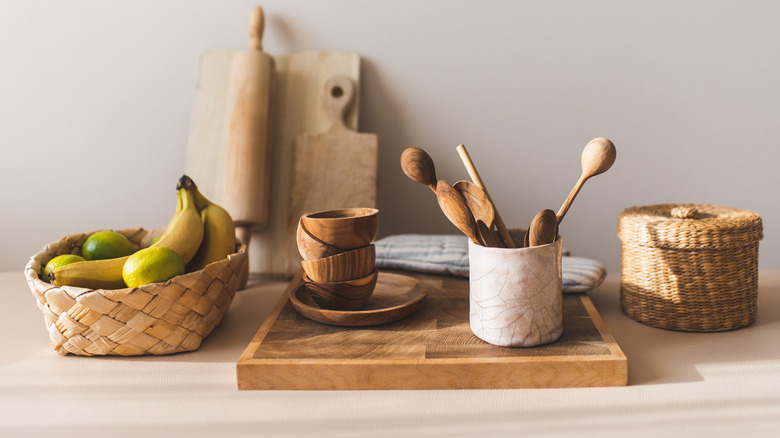
Joanna Gaines knows how to pack character into an all white kitchen, so it's no surprise she made a color that elevates traditional neutrals into something more dynamic. It's not just the colors that you combine with this paint shade that matter, but the textures as well. Obviously the natural grains in wood and stone will help to create layers that give your room more dimension, but you also want to introduce everything from fabric elements to woven accents to really make this color come alive. Consider using linen café curtains or other soft materials that will lend a hand to the calming atmosphere. Try adding pops of woven items like baskets on open shelving or your kitchen island, where they are away from cooking stations but still bring in a more textured element.
Greenery will elevate your space as well, and the natural backdrop of the plants will bring out the amber and tan undertones. If you can introduce upholstery on benches or seats to create comfortable areas for people, that will really pull through the thought process behind Gaines' paint color that's meant to bring people together in any room it's used in!


