The Soothing Sherwin-Williams Paint Shade That's Perfect For A Living Room Refresh
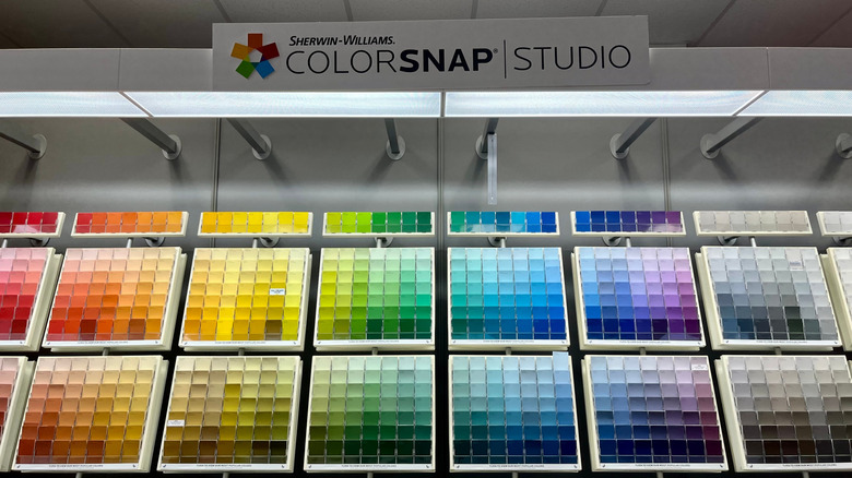
If your living room needs a refresh, a major renovation isn't your only option. In fact, one of the most affordable and effective ways to transform the look and feel of the space is with a fresh coat of paint. But due to a huge selection of options, picking the right color can be tricky. If you're not sure which to choose, consider adding Sherwin-Williams Shoji White to your list. This soothing shade is a versatile, neutral color — making it one of the best colors to incorporate into your living room.
According to Sherwin-Williams, Shoji White is a "warm, creamy white that borders on greige." It's a great choice if the effect you're going for is light and cozy. With a light reflectivity value (LRV) of 74 (on a scale from 0 to 100), this shade will lighten up a space without being overly bright. Andrea Seymour, co-founder of Springdale Custom Builders tells Southern Living she's a fan of the shade, particularly in living rooms. "It has the perfect amount of depth and saturation, and feels so soothing and calming," she says adding, "It is stunning with a neutral color palette where you don't want to use a stark white."
Use Sherwin-Williams Shoji White to brighten a space without making it feel stark
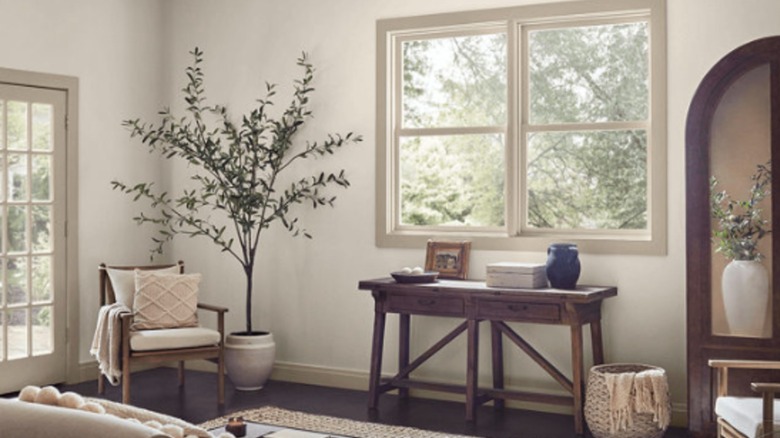
Shoji White has green undertones, which prevents the color from looking yellow — a drawback for many creamy whites. And because of its creamy quality, the shade also pairs well with both hardwood flooring as well as warm-toned tile, making it a great neutral alternative to white paint for a timeless living room. Even though it has "white" in its name, Shoji White is not a pure white. This means that while it looks beautiful on walls, it can feel too dark if you're using it as a trim color.
Shoji White looks great against true white shades, as it creates a beautiful, subtle contrast. But if you're looking for some stunning trim color ideas to use in your home that aren't a tired white, try a darker gray such as Sherwin-Williams Thunder Gray or an orange-toned brown like Quartersawn Oak (both are listed by the brand as coordinating colors with Shoji White). Like many paint colors, Shoji White will read differently depending on the amount of natural light in the room as well as the brightness of the light bulbs in the space. In brighter rooms the color will come across as a warm, soft white. In darker spaces, however, the greige undertones really come out. Though it's always best to test the color in your own space, Shoji White rarely disappoints — creating a timeless backdrop that's both soothing and welcoming.