10 Paint Colors That Actually Make Your Kitchen Space Look & Feel Smaller
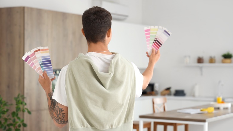
Remodeling or upgrading your kitchen often puts your focus on things like the appliances, cabinetry, and countertops when planning the overall design. However, the paint color or colors that you choose to include are also very important. The colors you use to paint the walls and molding in your kitchen can complement your cabinetry and appliances, and have an impact on the way you feel. Certain shades and colors can make your kitchen feel flat, making it seem more closed off rather than warm and inviting, cramping up the space. Choosing darker shades, such as dark grays, and vibrant colors like red and yellow can actually make your kitchen space look and feel smaller.
Choosing the ideal color for your kitchen is not an easy task. It can be helpful to do research before you settle on a color, so you don't choose the worst paint colors for your kitchen. You may believe that your favorite colors will help provide a warm and inviting feeling, but instead, they contribute to making your kitchen feel more cramped. To avoid making those paint color mistakes when upgrading your kitchen, here are 10 paint colors to avoid at all costs, ensuring your kitchen stays spacious, airy, and welcoming.
Dark grays and charcoals
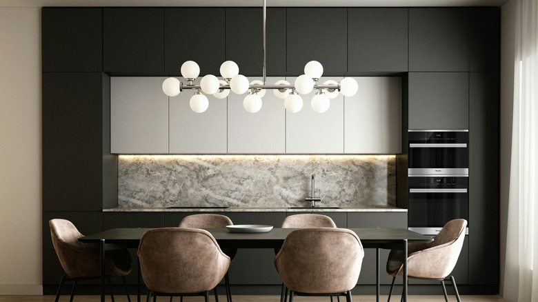
Dark gray or charcoal may be shades you gravitate towards having in the kitchen. These darker paint colors can make your kitchen look expensive without the cost, but this doesn't apply to smaller kitchens. The problem with these darker shades is that they absorb light, creating a closed-in effect and making the room feel more cramped. Consider a refreshing gray color instead to help make the kitchen feel more spacious, such as Valspar's Silver Leaf.
Bright oranges
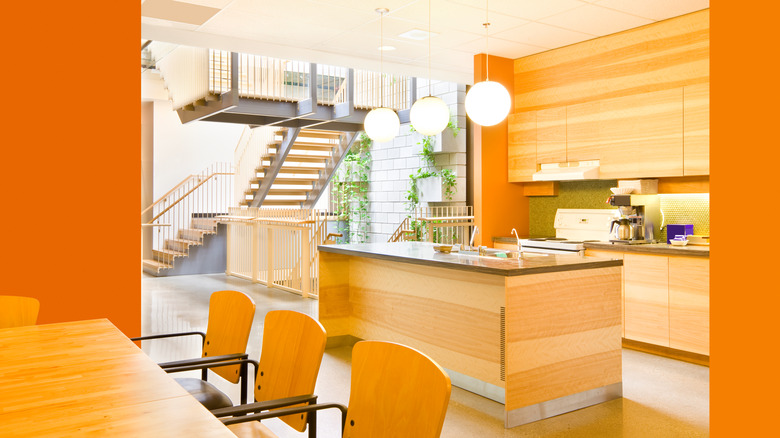
You might want to go for a more vibrant color to boost the energy and brightness in your kitchen, like orange. This is a bad idea, especially if you have a smaller kitchen. This bright color can actually make the space feel crowded rather than energetic. Go for a softer, more tasteful shade of orange with a cooler tone, such as peach or Rose Tan from Sherwin-Williams.
Dark or bright reds
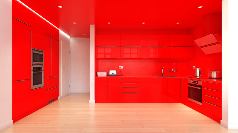
Intense colors can feel more innovative and provide an aura of fun in your kitchen. You might want to think twice, though, before painting it in a dark or deep red hue. The color red can actually evoke a feeling of hunger, which may not be what you really want in your kitchen, of all places. Instead of feeling warmth and comfort, it can feel like too much. Choose a more muted tone with subtle red shading, like Insightful Rose from Sherwin-Williams.
Forest or hunter greens
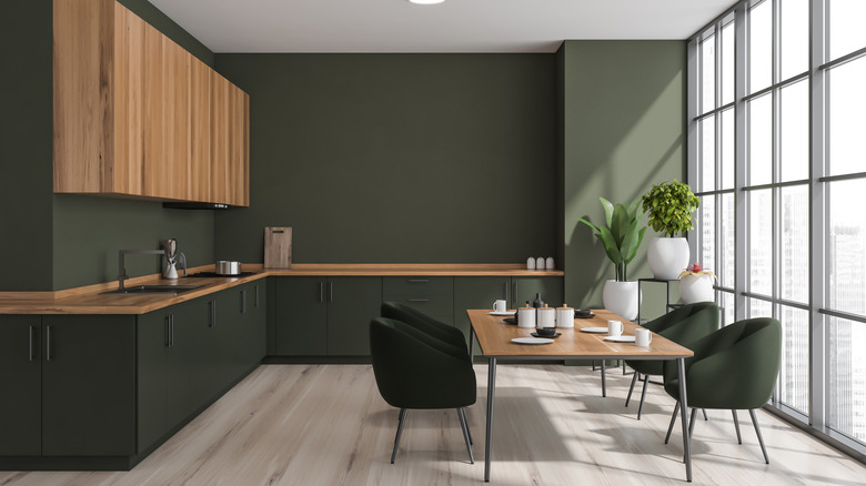
Darker greens may seem like a safe choice for your kitchen. However, a forest or hunter green tends to take in the light, which makes the space feel disjointed and heavy. It's better to utilize the darker greens that bring in a sense of nature to your kitchen space as an accent rather than a primary color. You might also want to consider swapping out the paint color for a shade that won't scream millennial cringe (since we've moved past the sage green trend now).
Bright yellows
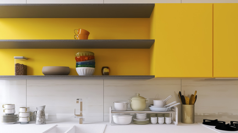
You may want your kitchen to be a cheerful and bright place, so yellow is a color you're going to try. Yellow, like red, can actually make you feel hungry. A bold yellow color in your kitchen will become dull-looking over time, too, and the intensity of the color can take away from your light, airy design. Instead, choose little pops of yellow color to incorporate. For your walls, you could use a muted yellow shade that feels more open, such as Yellow Bliss by Valspar.
Deep purples
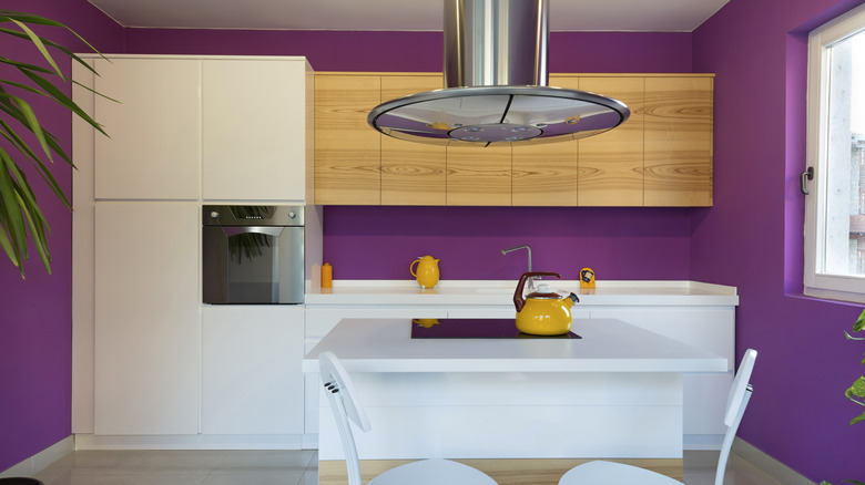
Purple is a challenging paint color to pull off in any room, not just the kitchen. Deeper plum colors and royal purples may be ideal when you're going for a sophisticated look, but in the kitchen, they can make the room feel smaller and more confined. It's not a color that will stick through the years, so you'll probably tire of it after a while. If you're looking for more versatility in the kitchen, stay away from those bolder hues. Go for more earthy and nature-based colors with a slightly purple undertone, like Quest Gray by Sherwin-Williams.
Bold teals
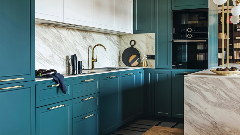
Bright teals are not ideal for the kitchen. The color often stimulates a boost of pep, but also has a colder feel to it, rather than the warmth you'd want in your kitchen. So, instead of being open and inviting on a cold winter day, your kitchen feels closed off and unwelcoming. That richness is better in a dining room that you don't utilize as much, serving as a pretty accent color. Look for something with more green for your kitchen's color, like this welcoming and airy Refreshing Teal by Juniper Paints.
Bright whites
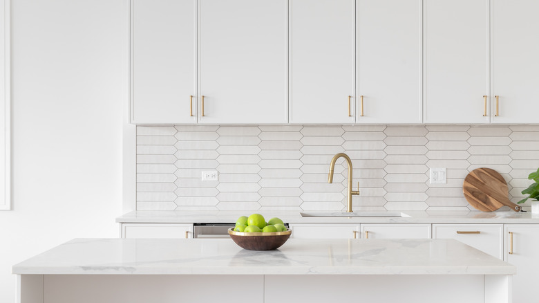
The classic white kitchen has been around for ages. It's visually appealing, with a sleek and clean look. However, too much of the bright white color makes your kitchen seem almost like a hospital — sterile and lacking any personality. You're better off incorporating those bright whites in layers, with other colors and shades to give your kitchen a unique and inviting aesthetic. Include tans and creams, like Colonial Cream by Juniper Paints.
Darker brown shades
Brown is another nature-centric color that can provide a sense of peace and elevation. However, darker shades, such as chocolate and deep brown, can make your kitchen space feel as if there's no light, and come across as lacking and even drab. Incorporate a brighter, lighter brown shade for your kitchen to make it feel more open and warm, like Farrow & Ball's London Stone.
Neon colors
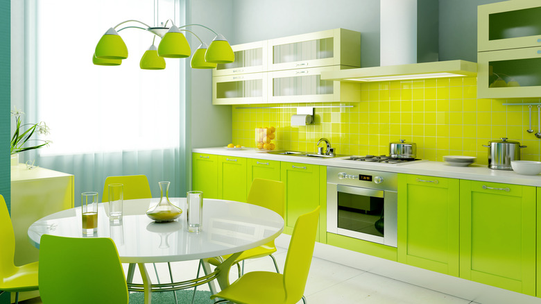
Finally, your kitchen is a place for gathering, cooking, cleaning, and enjoying meals. You're already going to be stimulated by everything that goes on in that room, so any neon colors are only going to add to the stimulation and make your space feel overwhelming. Neons are also not known for being on trend often, so they can quickly make your kitchen look outdated. So, skip that neon pink and go for a lovely pale coral color, like Benjamin Moore's Coral Buff.