The Once Timeless Color Palette That Can Make Your Home Feel Dated
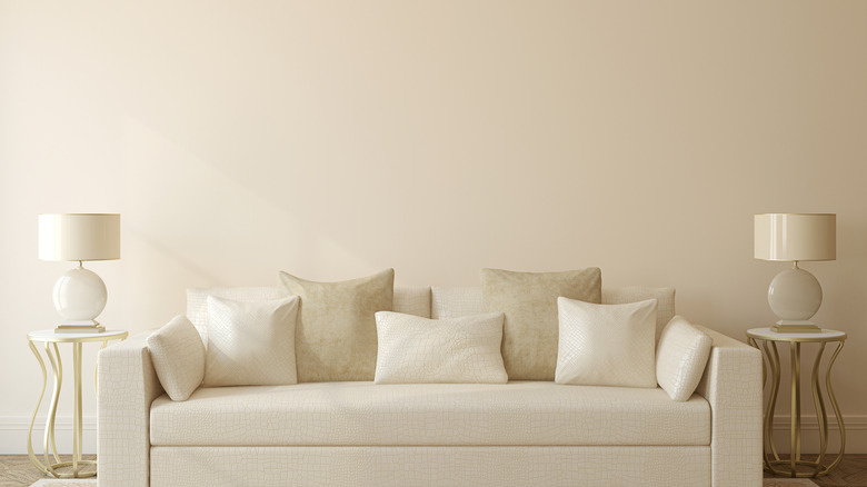
When determining an interior design aesthetic, color is often a big part of the conversation. Choosing the right tones to incorporate into a space can make the room feel welcoming and visually appealing. A neutral color palette is usually a safe choice when decorating. But an entire room covered in a single hue or style runs the risk of looking dull. Neutrals don't demand attention like bolder colors can, so it wouldn't be too surprising if a neutral-colored space doesn't make a lasting impression.
While neutrals are still considered a go-to for many, covering your entire space with a neutral color palette can come off as old and kind of boring. The overuse of a single neutral could drain the room of personality. In past years, it was considered classic to cover a whole space in greige or all-white. But now it seems predictable and lacking in individuality.
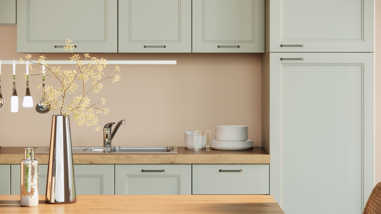
Homeowners are currently gravitating toward natural earth tones that make the space feel warm and comfortable. Here are some of the best ways to use neutrals in home décor by utilizing natural materials and textures, rather than colors that are only seen in nature. Some have taken saturated hues and utilized them in a pale shade to establish a vibrant, yet modest color scheme. For example, homeowners are using light blues and soft greens on kitchen cabinets to liven up the space without creating a look that is too dramatic.
How to use neutrals in a way that feels modern
Neutrals don't need to be replaced, but they could be updated in a way that feels dynamic. And this does not have to be accomplished by paint color alone. The use of décor and fixtures can liven up a neutral color scheme by subtly adding texture to the room. Embrace accessories and accent pieces that add a pop of color like wall art, pillows, or throw blankets. Area rugs with eclectic patterns and borders can give off soft and cozy vibes, complete with an artistic visual. If you have drawer pulls or knobs in the kitchen that are made of brass or gold, expand your use of the metals throughout the home in the form of contemporary ornamentation.
If you prefer those neutral tones, don't fret. They can still be utilized in the home, just make sure to do it wisely. An ideal way to create a neutral color palette is by picking two shades and balancing them at a ratio of roughly 70 to 30. This will look curated, and it adds a bit of contrast for some drama. HGTV star Joanna Gaines shared her favorite colors for a classic bathroom that won't age, which include two neutral colors and navy blue as an accent. Her combination of white and grey soothes the senses with just a splash of dark blue to catch the eye.