The Vintage Paint Color That Will Never Go Out Of Style
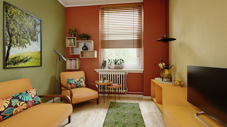
Trends come and go, and that's certainly true when it comes to paint colors. Certain shades, though, have a way of withstanding the test of time, especially those that evoke a sense of nostalgia. One paint color that seems to never go out of style — and has been increasingly popular lately — is sandy and gold ochre. Once a staple of mid-century modern palettes and retro 70s interiors, designers are embracing this warm, cheerful hue, using it to add playful pops of color and cozy character. Is this the vintage color everyone will be painting their living room walls?
Painting a room in a sandy or golden ochre shade can instantly transform the space. The earthy undertones make a space feel cozy, welcoming, and reminiscent of another era. The color is also highly versatile across a range of design styles, which is largely behind the recent revival of this vintage color. Gold ochre shades can work well in a wide variety of spaces, from living rooms or dining rooms, where they create an intimate atmosphere, to bedrooms, where they add a dose of serenity to the space. If you're not looking to paint an entire room, you can still inject some vintage character by using the hue to highlight a specific feature, such as a bookshelf wall — a living room design trend that has been replacing accent walls.
Pair golden ochre walls with natural materials and finishes to create a cohesive look
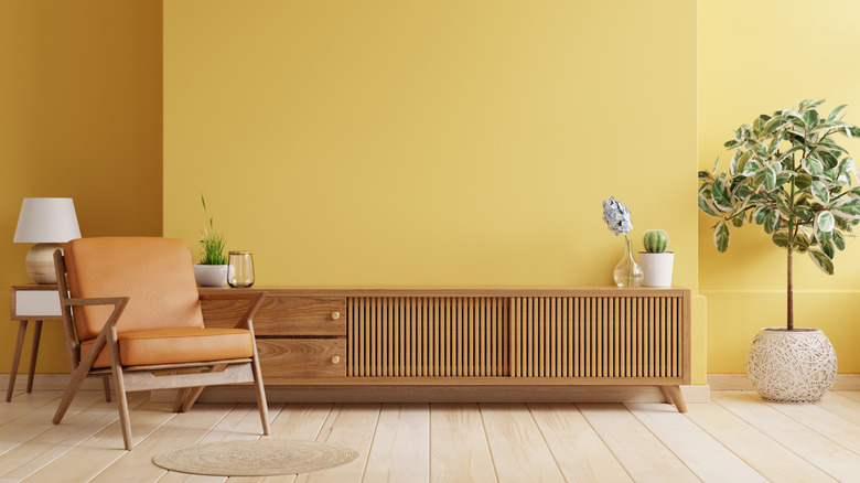
One shade in particular that designers are lauding this yearis Benjamin Moore's Summerdale Gold. This shade, which is part of the brand's Historical Colors collection, is described as a honey gold with soft green undertones. The earthiness of the color makes it a perfect tone for fall, while the calming, neutral feeling it evokes makes it a beautiful choice year-round. Sherwin Williams' Earthy Ochre is another option for adding warmth and nostalgia to a space. The muted yellow and brown tones create a natural feel that complements rustic, boho, or mid-century modern spaces — all of which focus on bringing natural elements into a space.
Because of the organic feel golden ochre hues offer, these colors pair nicely with natural materials and finishes. Textured materials such as wicker, rattan, burlap, or linen play particularly well with the shade. You can also complement a golden-ochre painted room by bringing in pops of the color through fabrics for cushions, curtains, or upholstered furniture. For hard surfaces, natural stones, such as travertine or marble, highlight golden ochre's earthiness while its warm undertones make it a great complement to rich wood tones such as dark wood floors and furniture pieces. If you have a room painted this shade, it's also a good idea to add in some warm-tone metals, such as copper or brass, through lighting fixtures or other accents. To enhance the vintage look and feel of your space, consider mixing metals in your home decor.