9 Color Trends Benjamin Moore Is Predicting To Be Huge In 2026
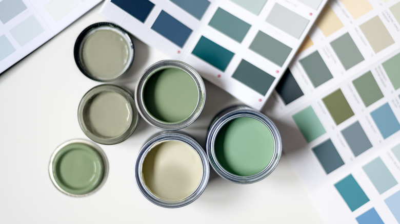
2026 is poised to be the year of the sophisticated but visually interesting neutral, and Benjamin Moore's color trends palette for the upcoming year delivers everyone's favorite earthy tones, but with a fresh perspective. Beyond basic beige, this paint capsule from the famous paint crafters features a versatile roster of tranquil sagey blues, rich creams, and deeply saturated grays, all which craft a refined color story. Benjamin Moore predicts that these colors will be at the center of the design world, reimagining classics.
Take the color Raindance, for example, steely-bluish green with soft, gray undertones that's the perfect pop that brightens and excites a space without ever feeling garish or overwhelming. Then there's Southwest Pottery, an elegant permutation of terracotta, re-interpreted as a neutral clayish hue with a little kick of violet. And of course, there's Benjamin Moore's Color of the Year in 2026, Silhouette, the perfect blend between charcoal and a browner espresso that'll instantly mood-ify a space in all the best ways. Taking their 2025 color of the year a step further into a luxe darkness, Silhouette feels sumptuous and elevated. These 2026 colors truly are a winning selection of versatile paints, guaranteed to give your rooms visual interest and a modern boost, but without dating your space.
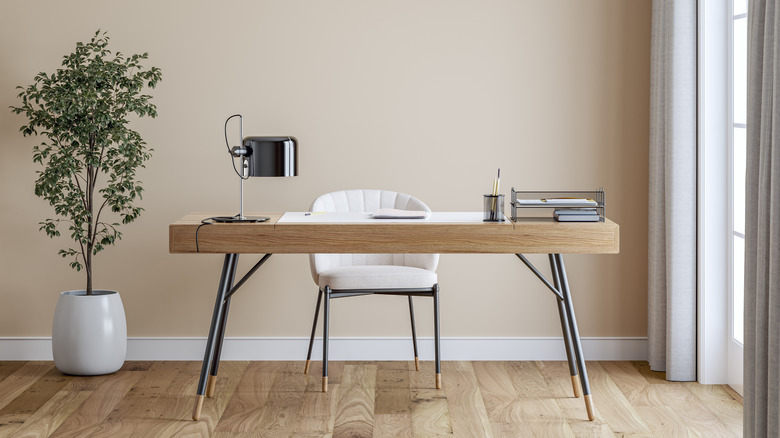
Sherwood Tan
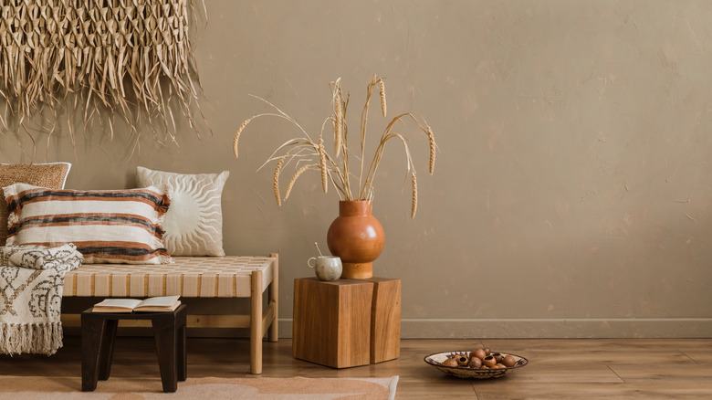
This soft and classic, yet slightly reimagined, tan is infused with subtle earthy-brown undertones, giving it a warmth that stays light and welcoming and serves as a clean blank slate for your own personal decor design. For a traditional aesthetic, try pairing Sherwood Tan with a crisp white trim or ceiling for a clean contrast, or layer in natural woods and natural grasses to mimic monochrome, but with texture. And speaking of texture, this color pairs stunningly with woven materials like linen, rattan or jute to enhance its organic and natural feel.
Raindance
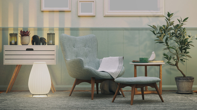
Raindance's lush bluish-green hue is softened with subtle gray undertones, making a uniquely interesting base that's still refined and classic. Something about this color evokes Regency decor of yore — perhaps its a resemblance to Bridgerton Blue — so consider styling the color with brushed brass or antique gold accents (the once dated metallic light that's having a comeback) to add some warmth while simultaneously elevating the space. To treat Raindance like a neutral, opt for a dramatic contrast for decor like deep charcoal or navy pillows and blankets, or pair with creams and beiges for a more classic palette.
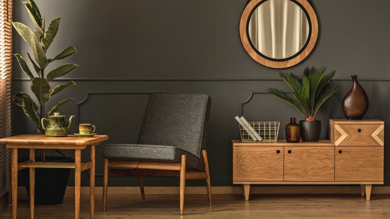
Narragansett Green
A deep, yet muted teal-green with blackened undertones, Narragansett Green evokes a sense of elegant sophistication that looks straight out of a moody, vintage billiards room — this color can ground a space without feeling too heavy. To style the hue, paint an accent wall in a living room or library, and pair with warmer brushed brass or gold fixtures, along with hardwood furniture for contrast. It also pairs nicely with soft neutrals like dove gray, beige, or taupe, or other pops of color like terracotta or mustard.
First Crush
With a name that's gives all the nostalgic warm and fuzzies, First Crush is a soft, warm neutral with a delicate blush undertone. It's bright and airy, and yet holds onto a cozy depth that looks like how putting on a fuzzy sweater feels. Given its neutrality, First Crush works great on all walls in a living room or bedroom to create a cocooning backdrop that isn't stark white but still feels crisp and clean. For decor, consider incorporating honey oak or walnut to echo the paints blushy warmth in ways you'd style dusty rose, a close color cousin.
Swiss Coffee
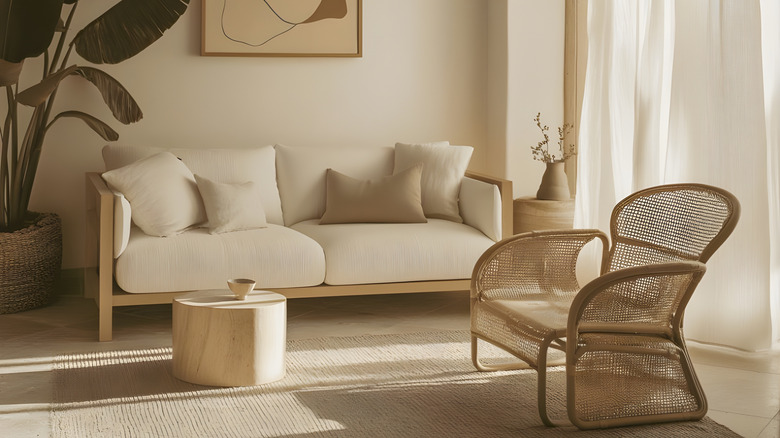
While the name suggests a mocha brown or a milky beige, Swiss Coffee in Benjamin Moore's line up is more like rich icing on Toaster Strudel than breakfast drink. Use Swiss Coffee on walls throughout a home to create a soft but warm base. Its underlying warmness makes it feel less clinical than other bright whites and less ordinary than regular beiges. Because it's a neutral that skews on the bronzer side, incorporate saturated accents like deep emeralds, terracotta or rust, darker but muted blues, or heavier charcoal grays. For a crisp palette, try taupes and rattan.
Batik
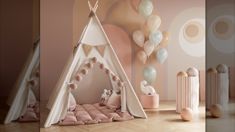
Step aside outdated Millennial Pink, Batik is in charge now! Another soft hue, Batik blends violet and baby pink into an updated interpretation of dusty rose. It has just enough color to feel neutral yet warm, rather than an overly pastel or overwhelmingly cheesy color. Use Batik on a feature wall or even an entire room (it would look fantastic in a nursery) to lend subtle warmth while still maintaining neutrality in design and without feeling overtly feminine or gaudy. Offset its milkiness with crisper, whiter trims to mute the hue just enough to perfectly blend into your design preference.
Southwest Pottery
Southwest Pottery is exactly as it sounds — a rich, earthy hue that blends clay-red, terracotta, brown, and orange to produce a kiln-fired pottery inspired palette. But this color also incorporates an unexpected purple-ish undertone that mutes the fieriness into a rich, but still interestingly neutral choice. Since Southwest Pottery is a deeper color, it works nicely as an accent wall — you can have fun with the color without overwhelming the space. In a smaller room or nook, you could even carry it on all walls and ceilings, if paired with good natural or warm lighting.
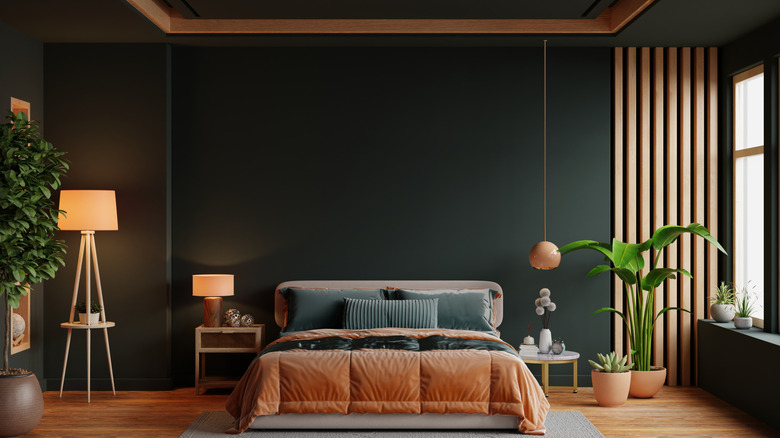
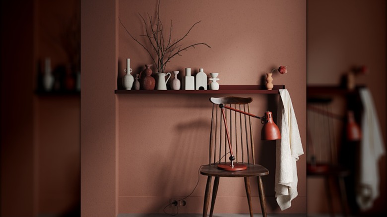
Silhouette
Named Benjamin Moore's official Color of the Year for 2026, Silhouette is a rich warm charcoal gray that'll give any interior a bold boost in design. Pairing well with lighter neutrals, warm metallics and natural textures like rattan, considering using the color of the year on a focal wall. Or, if you want to go all in with this saturated take on burnt gray, consider offsetting the space with accents in aged copper or brighter golds. Further lean into the luxurious palette with velvet pillows or go more natural with lighter woods and woven elements like baskets and rattan chairs.
Iron Mountain
If you're looking for a hue that skews a little cooler than Silhouette but want to stay within the same color trend, then try Iron Mountain, a sophisticated dark neutral that's perfect for drama without stepping fully into midnight-black territory. Though not officially a part of Benjamin Moore's 2026 design palette, this cooler-toned gray speaks the same design language as Silhouette. To style, use soft taupes or warmed up off-whites on adjacent walls so the dark doesn't feel too heavy. If using on an entire room, make sure ceilings and trims are noticeably lighter to avoid a cave-like feel.