10 Paint Color Choices That Instantly Cheapen Your Home - Even If You Buy Expensive Brands!
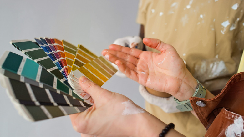
Paint colors are hard to nail. A lot of them look fantastic at the store or in small swatches, but they look terrible on the wall. Even if you love a color, it doesn't mean that it will look great in your house. Some paint colors can make your home look small and cheap because they're too saturated and vibrant, which makes your house look like it's straight out of the 1970s. Some other colors, however, will make your home look cheap because they're too basic and popular. Finding the appropriate shade that's neither too basic nor too eccentric can be hard, but there are at least 10 paint colors that you can safely steer clear of.
For example, millennial gray was a paint color that gained immense popularity and then went out of style. As a result, it can make your home look like an Airbnb or student rental. On the other hand, something like a bright red or magenta will take your home straight back a few decades, making your home look outdated and cheap.
In any case, the key is to consider a lot of paint shades and take the swatches home with you. Things like natural and artificial lighting, furniture, and floor colors can completely change the look of a paint color. Look at your swatches in the morning, afternoon, and at night to make sure you like how the colors look under different lighting. You should also take into account how you feel in different circumstances. For example, some light colors might feel too bright when you're watching TV on the couch at night, while some darker ones might feel a bit sleepy in the middle of the day.
White
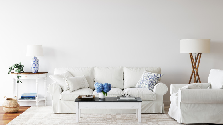
White is a basic paint color, and some might think that it's an easy and safe choice. However, white paint is unforgiving, and it can make your home look cheap and unfinished. Even in clean and tidy homes, white paint very quickly starts to show signs of grime buildup. We tend to associate white with bright spaces, but it can actually make a lack of sunlight more obvious. Instead, opt for a creamy white or light beige, something that still looks bright and light but that's more forgiving and can help make your home look expensive and elevated.
Millennial gray
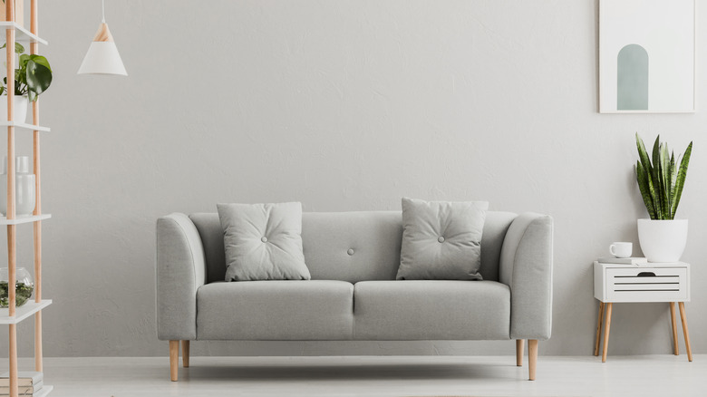
If there's one color that screams quick and dirty remodel, it's millennial gray. This paint color was everywhere a few years ago, so much so that it became synonymous with rental properties and Airbnbs. Whether it's on the walls or depressing gray vinyl flooring, it's a cheap-looking choice. It makes your home look like a quick house flip rather than a lived-in, expensive, and elegant home. Instead of millennial gray, opt for more inviting neutral tones, like a warm beige.
Eggshell and yellowy whites
Yellow eggshell is the 1990s equivalent of millennial gray. It's a basic neutral that's inoffensive to the eye, and was therefore used in a lot of quick home renovations and rentals. Despite being light and bright, this paint color tends to look outdated and cheap. By going just a few tones lighter to a less yellow, creamy off-white, you'll be able to breathe life into your home and make it look modern and elevated.
Green
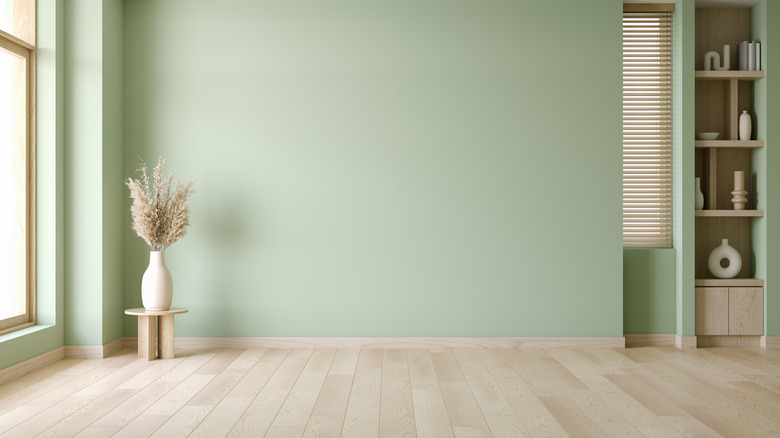
Green is a lovely color, but there's something about green paint that's reminiscent of a salad restaurant or community center. While it's lovely in communal spaces and outdoors, green doesn't translate well in homes, where it tends to look cold, cheap, and awkward. To incorporate a gorgeous green color into your space, consider deep and dark accents like trims, decorative pillows, and velvety couches, which look high-end.
Yellow
Yellow is a very tough color to style in your home. While these paints look bright and lovely in small quantities, they tend to feel overwhelming when used to cover entire walls. Any hues of yellow that are too saturated in pigment will make a room look awkward and cheap, even if it's a lovely pastel color. Instead, look for warm beiges and keep bright yellow for accent notes, like decor pieces and wall art.
Pink
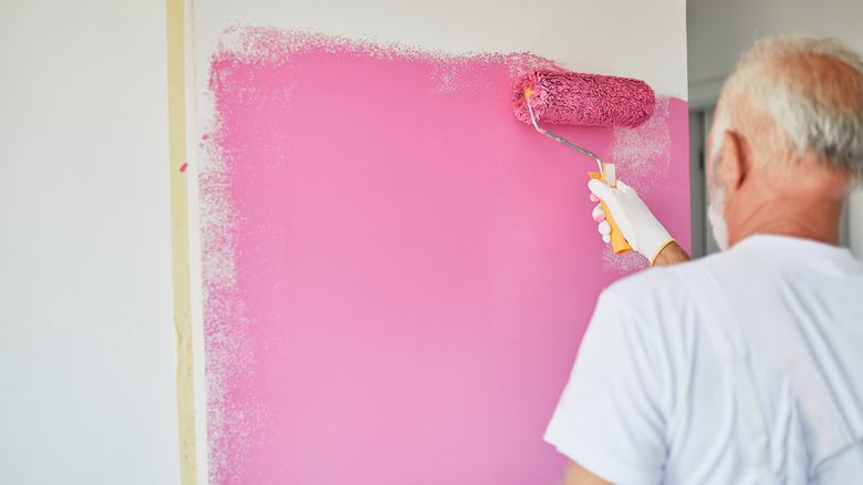
Unfortunately, the same is true with pink. In small quantities, pink is lovely and feminine, but when used to cover entire walls, it tends to make a room look outdated or childish. Some people choose to embrace that retro 1980s pink aesthetic by filling their homes with vintage pink furniture, fuzzy rugs, and heart-shaped decor, in which case a pink wall can fit the vibe. However, if you'd prefer to keep your home modern and current, it's best not to paint your walls pink and use it for small accents instead.
Magenta and purple
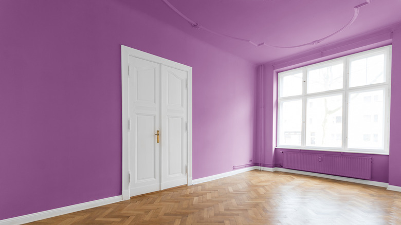
Shades of magenta and purple aren't often used in interior design. Part of the reason is that we left these shades in the 1970s, and part of it is that they're just too overwhelming. Opting for these types of colors, while a unique choice, will probably make your home look like an "Austin Powers" movie set. Instead, purple lovers can use eggplant tones, which are much darker and expensive-looking.
Black
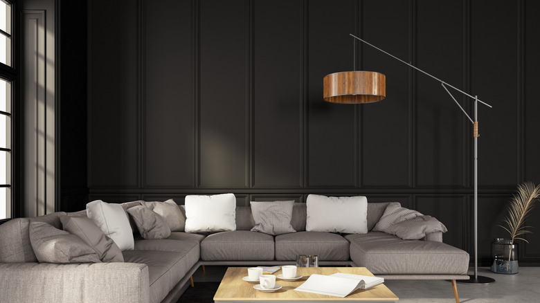
Black is a tough paint color to pull off. Many black paint shades, even from the best paint sellers, tend to be very difficult to work with and can leave awkward streaks behind. These types of basic black paint can make your house look like a moody bar or a room at an escape game, but they often miss the mark on the high-end vibe you were going for. Instead, consider deep and dark gray paints, or look for black paint colors that aren't one dimensional.
Red
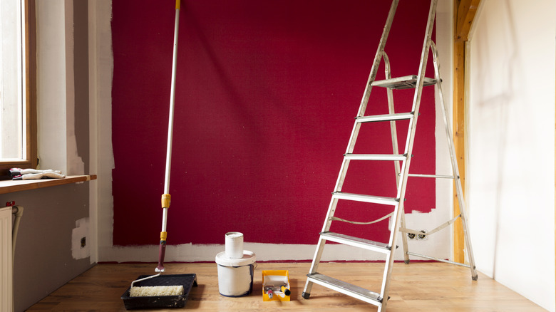
Red is a hard color to pull off, and it can easily make your home look like it belongs to an elderly couple. Nothing wrong with elderly couples, but if you're reading this, you probably want your home to look chic, modern, and expensive. If you're ever planning to sell your home, red walls should be off the table. Not only are they not popular, but they also tend to be hard to cover up, which will scare buyers away, quite literally making your home cheaper than it is.
Aqua blue and teal
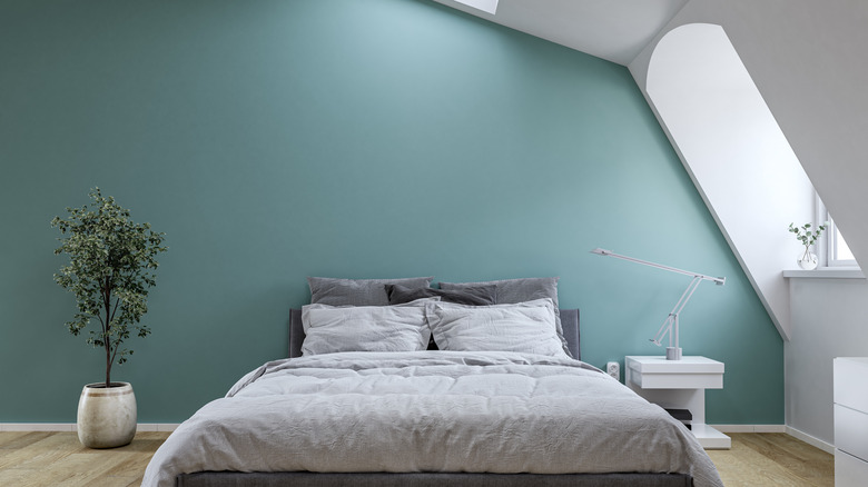
Once again, saturated paint colors like aqua blue and teal are fun in small splashes, but they can overwhelm a space and make it feel cheap. These colors are reminiscent of the early 2000s, or might be found in seaside Airbnbs. Either way, they're not the vibe you'd want in a high-end, elegant-looking home. To add blues to your home, opt for decor pieces instead. Deep teal works especially well in tiles, bedding, or furniture.