Summer 2025's Biggest Color Trend Is Already Looking Outdated In Your Home
Unique color trends can be fun to experiment with, but at the end of the day, you'll want to pick choices that will last long term. This is especially true when it comes to interior design, as the process of trying to keep up with the constant revolving door of trends can be tiresome and expensive. There's nothing more disappointing than realizing those telltale signs that a seemingly timeless trend won't last; even more so when the trend doesn't make it a full calendar year. Such is the case with one of this year's biggest "it" colors: Signs are pointing to the days of butter yellow's dominance coming to an end.
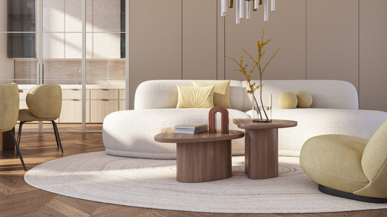
The bright butter yellow color seemed to pop up everywhere during the spring and summer of 2025. From fashion to furnishings, the soft shade was embraced for its energetic and warm nature that felt friendly and a tad outdoorsy. But now it's hard to ignore how butter yellow is not quite as versatile as once thought.
The tone is a better fit for fashion and accessories that can be easily switched out and updated — it does not have the staying power needed to live in a home. This yellow runs the risk of looking cartoony and with so much vibrancy will be too harsh on the eyes. Its vintage vibes prove how quickly hues can go in and out of popularity as this one is reminiscent of coastal grandma origins with a hint of '70s and '90s – just not the nostalgic parts that are still in favor.
Butter yellow is becoming stale and old fashioned
Butter yellow has fallen subject to the problems that occur when overusing the hue in interior design — namely, it does not mask signs of fading, and can be altered based on how the light hits it. This is especially true when it comes to the softness of butter yellow, which could look cold in some settings based on the color saturation.
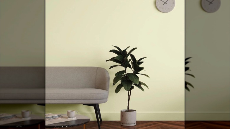
Don't panic if you went full force with the butter yellow trend. The hue can still be included in the home as long as it is styled smartly. When used sparingly such as for decor or subtle touches, butter yellow will be less likely to overwhelm. Make sure to pair it with balanced tones by using the timeless 60-30-10 color rule. Or use butter yellow as an accent rather than a featured color. It may even be the perfect color for the exterior to give the outside of your home a warm and inviting upgrade. When in doubt, select a more classic shade of yellow or gold in rooms where function needs to be prioritized, like the kitchen. Neutrals with yellow undertones or even a chic limewash are much more likely to stand the test of time.