12 Interior Design Choices That Make A Modern Home Look Outdated
Modern homes are meant to feel fresh and current, yet many furnishings fall into style traps that age faster than expected. What feels sophisticated one year can quickly turn into the next design cliché, especially when entire neighborhoods or social feeds latch onto the same ideas at once. Trends — which are deeply influenced by cultural moments like economic shifts, popular TV shows, or even a viral hack on social media — move quickly in design, and even elements marketed as timeless often reveal their era through certain finishes or overused Pinterest moments. The goal of a truly modern interior is not to chase every trend, but to create spaces that evolve gracefully over time.
Today's homeowners are becoming more discerning, recognizing that design choices come with a shelf life. The materials, colors, and details that once defined luxury — from particle-scattered granite counters to matte black fixtures — can now instantly timestamp an interior. As design becomes more accessible and visually shared online, the difference between trendy and timeless has never mattered more. A modern home should reflect comfort and individuality, rather than adherence to a passing trend. In this feature, we highlight design choices that once promised a cutting-edge, contemporary edge but now risk making your home look dated. From color schemes to cabinet styles, these are the décor decisions that can make your home look more like a design time capsule than a reflection of current taste.
Busy granite countertops come across as built in the early 2000s
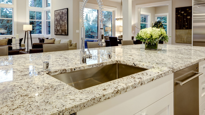
Granite was once the hallmark of a high-end kitchen. In the early 2000s, they became synonymous with status, appearing in nearly every upscale kitchen and bathroom renovation. Dramatic veining, expressive patterns, and high-gloss finish were celebrated as a mark of sophistication, serving as the go-to upgrade for homeowners chasing a more "designer" look. Builders showcased entire model homes featuring the material, and real estate listings proudly highlighted all-granite kitchens as a major selling point. Every slab contained a unique and slightly different pattern, giving homeowners a sense of customization and craftsmanship that other materials couldn't match.
However, design preferences have shifted toward lighter, softer materials (and less busy, more minimalist granite slabs) that evoke a calmer, more organic aesthetic. Growing in popularity for luxury kitchens are marble, quartz, and soapstone, as mentioned in Southern Living. So, simpler slabs with minimal veining or honed (non-polished) surfaces can still look refined and fresh. Granite's busy patterns can overwhelm today's streamlined interiors, while its reflective sheen feels less in tune with the matte finishes currently in vogue. Homeowners drawn to granite for its heat and scratch resistance might opt for neutral tones and understated patterns that blend, rather than dominate, their surroundings. In moderation, granite can remain a smart, durable choice, but gone are the days when bold, speckled stone was the pinnacle of "modern" design.
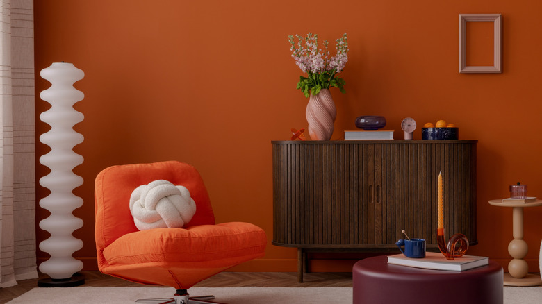
Defaulting to black-and-white or beige-on-beige
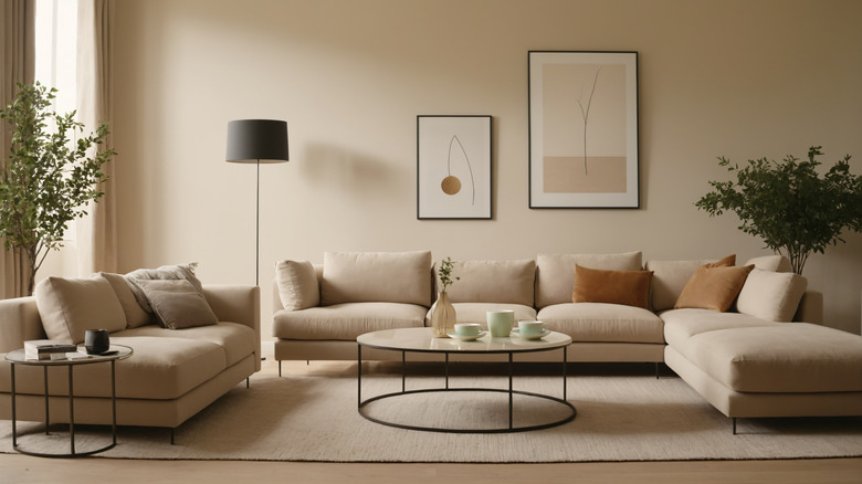
For years, neutral palettes ruled the modern design world. Black-and-white schemes and layers of beige became hallmarks of minimalist and farmhouse styles alike, offering a crisp, minimalist foundation that was easy to replicate. They also acted as a blank canvas on which any décor could shine. Many homeowners leaned into these looks to achieve a sense of cohesion, especially in open-concept spaces. Monochrome interiors felt safe and modern — at least for a while. As social media and renovation shows popularized the "clean aesthetic," entire neighborhoods adopted the same color story. While these combinations photographed beautifully, they often lacked warmth or individuality in real life. What began as a design movement rooted in simplicity gradually evolved into uniformity, leaving many homes feeling overly staged rather than truly lived-in.
Now, however, color is making a decisive comeback. Designers and homeowners alike are rediscovering color and are moving away from sterile palettes in favor of more expressive, personalized hues. An all-beige room can appear flat and dated, while strict black-and-white contrasts can feel harsh or overly thematic. Even in minimalist or wabi-sabi spaces, introducing subtle tones — think soft clay, sage, or muted blue-gray — adds warmth and depth without disrupting the tranquility. These nuanced shades modernize a neutral room, helping it feel curated rather than cookie-cutter. The key is balance: a splash of color through artwork, textiles, or even a painted door can breathe new life into a neutral scheme, signaling intentional design rather than outdated restraint.
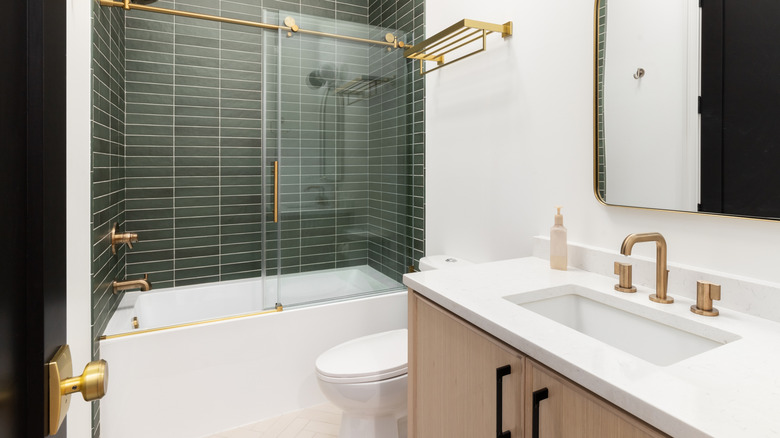
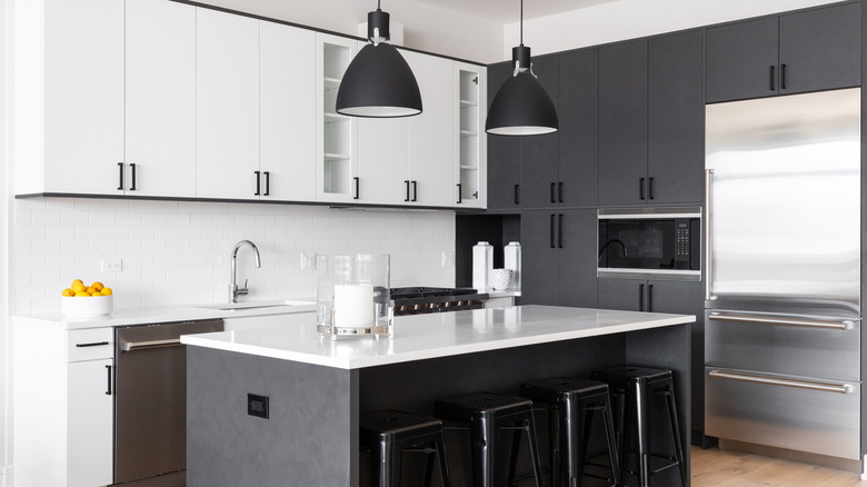
Black faucets and fixtures
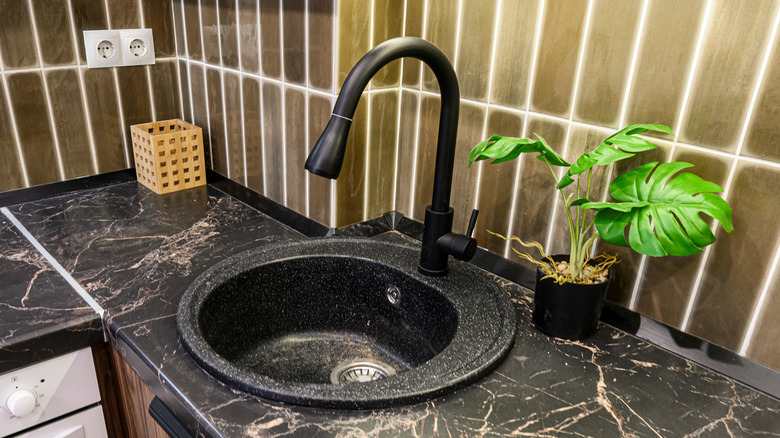
When black faucets first hit the design scene, they felt bold, graphic, and strikingly modern. A matte finish added an edgy counterpoint to white marble or concrete sinks, creating the kind of contrast that dominated social media feeds for much of the 2010s. The contrast of black against white marble or pale quartz also felt graphic and chic, lending bathrooms and kitchens a sleek, high-end look. They were instantly recognizable, and that was part of the appeal. Installing black fixtures made any bathroom or kitchen feel instantly updated and on-trend.
But as with many bold design moments, black hardware has reached its saturation point. "Flat black plumbing fixtures are officially out," says decorator Maria Killam on her YouTube channel. "It's just that heavy, 'look at me' black doesn't have the grace to sit back and play nice with other finishes and colors in the room." True to her words, their high contrast can also make them feel visually heavy, pulling the eye in ways that clash with today's preference for softer, layered finishes. If you still love the modern edge of black fixtures, consider mixing metals instead, pairing them with brushed nickel, antique brass, or muted bronze accents helps them blend more seamlessly. Alternatively, choose darker metals with more depth, like oil-rubbed bronze or gunmetal, which age gracefully and add subtle sophistication.
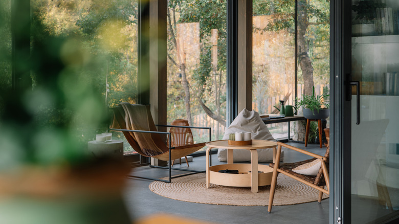
Poorly-placed accent walls
Accent walls once offered an affordable way to make a design statement and add personality into a space. A single bold color or wallpapered wall promised instant character without the commitment of transforming an entire room. For a while, the approach was a hallmark of accessible design, as anyone with a paintbrush could make a quick statement. However, the problem arose when the technique became formulaic. Many homeowners began adding an accent wall just for the sake of trend, without regard to proportion, purpose, or architectural logic.
Designers now view this approach as dated, especially when the wall serves no visual or structural significance. Today, they are far more intentional about when and how they use this trend. Instead of randomly painting one of four walls, they emphasize architectural logic — highlighting an architectural feature like a fireplace wall, a special room shape, or a transition space, as interior designer Emily Henderson writes on her blog, is key. When an accent wall serves a purpose, it can still look stylish and deliberate. If you're drawn to the concept, you can also wood paneling or softly patterned wallpaper instead of solid paint. "Accent walls don't just have to be paint, either," adds Henderson. These updates create depth without the dated "one wall only" effect that once dominated the DIY design landscape.
Standard-overlay cabinetry signals builder-grade and past design
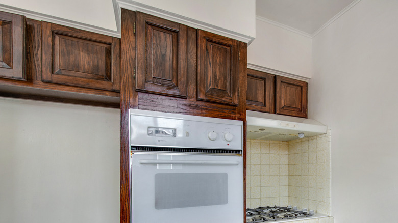
In the early 2000s, standard-overlay cabinetry hit its long-gone peak. It was practical, affordable, and readily available in most home builds. At the time, the visible framing and boxy profiles didn't feel out of place. But as the modern kitchen evolved into a design statement in its own right, homeowners began favoring seamless, furniture-like finishes. The visible frames and heavy lines of standard overlays now read as bulky and utilitarian.
Today's kitchens favor clean lines and seamless integration. Full-overlay or frameless cabinets conceal their structure, offering a smoother, more polished surface that aligns with current minimalist trends. These newer designs not only modernize a space but also make it feel larger and more refined. For homeowners unable to fully replace cabinetry, painting outdated frames in soft neutrals or replacing bulky hardware can make a significant difference. Even subtle updates, like adding hidden hinges or swapping standard knobs for slim pulls, can elevate standard-overlay cabinets from functional to contemporary, bridging the gap between old and new.
Pine furnishings tends to date quickly
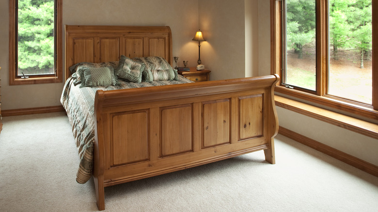
In past decades, honey-toned pine furniture epitomized casual comfort. Affordable and widely available, pine pieces dominated country cottages and homes in the 1980s and '90s. Their cheerful yellow cast and grain lent a homey vibe that many equated with warmth. Unfortunately, time has not been kind to this look. The natural yellowing of pine combined with its rustic finish, especially if it is repeated throughout your home, now reads as a nostalgic throwback rather than a classic choice. When paired with traditional fabrics or busy patterns, for example, pine-heavy interiors can end up feeling visually heavy.
Today's design trends favor lighter, airier finishes that allow spaces to feel open and refined. Unfortunately, pine tends to age poorly, and its uneven tone can make rooms appear tired, especially when paired with other dated elements like heavy hardware or ornate carvings. To modernize existing pine furniture, thinking of mixing it with contrasting materials like sleek metals, rattan, or stone, can also balance its warmth and create a more contemporary aesthetic. The key is contrast and restraint: use pine as an accent, not the dominant wood tone in your space. This helps your home maintain character without compromising modern appeal.
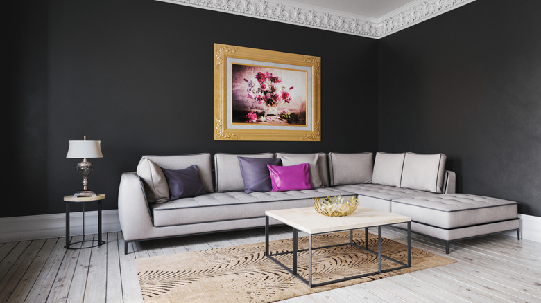
Matching furniture sets remove personality and age a space
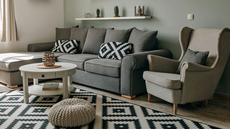
Buying a full matching set of furniture once represented a polished, magazine-ready approach to decorating. From perfectly coordinated bedroom suites to identical living room collections, these sets were once a mark of sophistication and promised instant cohesion. They made furnishing a space easy — one purchase and your home looked ready to be photographed. However, what once felt luxurious now reads as overly uniform and lacking in personality. A space filled with matching pieces can look more like a showroom than a lived-in home, missing the charm and evolution that come from mixing styles and eras. In today's interiors, contrast and texture tell a richer story — a marble-topped vintage side table next to a sleek modern sofa feels far more personal than a perfectly matched set. The trend now is toward individuality and collected character, not duplication.
Modern interiors celebrate individuality and layering. Mixing materials, finishes, and styles adds dimension and tells a story about the homeowner's taste. A sleek modern sofa paired with a vintage coffee table, or a painted nightstand beside a natural-wood bed frame, for example, creates contrast and interest. This kind of eclectic mix feels curated rather than chaotic when unified by color palette or texture. For those starting with a matching set, consider swapping out just one or two pieces or adding decor with different materials — a linen chair here, or a metal side table there. Breaking up uniformity brings visual richness and instantly updates even the most coordinated room. Layering textures, fabrics, and accessories tells a story of growth and change, which is the essence of modern design.
Gray-toned wood or LVP flooring
Gray floors — whether we're talking about gray-wash wood floors or gray LVP — surged in popularity around ten years ago, offering a cool, modern alternative to traditional brown woods. They complemented industrial interiors and paired effortlessly with white cabinets and stainless steel, making them a go-to for new builds. At first, the look felt edgy and contemporary, a fresh break from the orangey hardwoods that were once popular. Their neutral undertone worked with almost any palette, and for a while, gray was considered the ultimate "safe" modern choice.
But gray flooring now feels formulaic. The widespread use of gray-toned vinyl plank flooring made it the default choice for builders, stripping it of its once-unique appeal. Designers now favor warmer, more natural wood tones that add depth and comfort to interiors. If you're not able to change your gray floors, consider decorating with warm wood, whites, or layering with textured rugs or natural textures. These elements soften the overall palette and restore a sense of warmth and dimension. Ultimately, authenticity and comfort have replaced cold minimalism as the markers of modern design. Flooring is one of the easiest places to start.
Exposed polychrome or industrial lighting
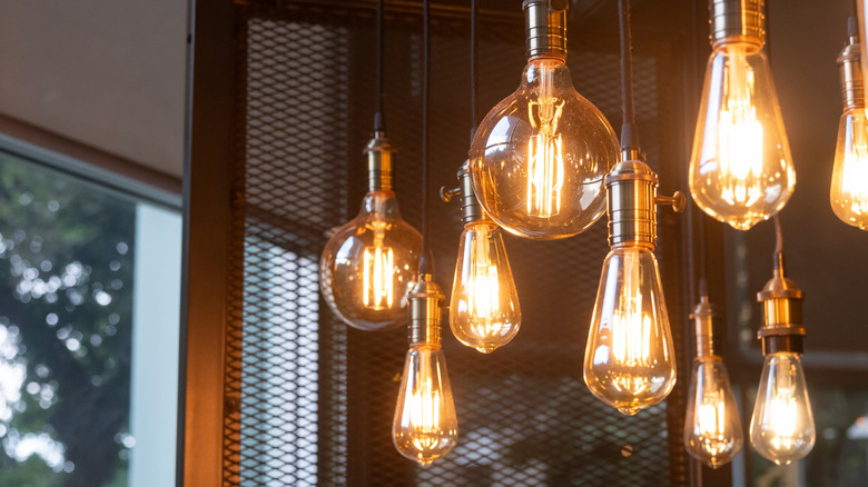
Industrial-style lighting, with its visible bulbs, metal cages, and factory-inspired shapes, once defined the loft aesthetic. It brought grit and edge to residential design, helping open-plan kitchens and dining areas feel urban and cool. For years, Edison bulbs and steel fixtures were the hallmark of modern interiors featured in magazines and in social media, reflecting a broader cultural fascination with repurposed industrial spaces.
Now, the look has become a bit of a cliché. The overuse of exposed bulbs and harsh metals can create a cold, unfinished feel that lacks comfort. In response to this, designers are gravitating toward softer, layered lighting in 2026, such as glass domes and fabric shades that diffuse light beautifully. The shift reflects a broader movement toward coziness and human connection in interiors. Lighting should enhance the mood and complement architecture, not dominate it. Swapping an industrial pendant for a sculptural fixture in plaster, linen, or smoked glass instantly updates a space, maintaining character while avoiding looking too trendy.
Going too hard on a single theme
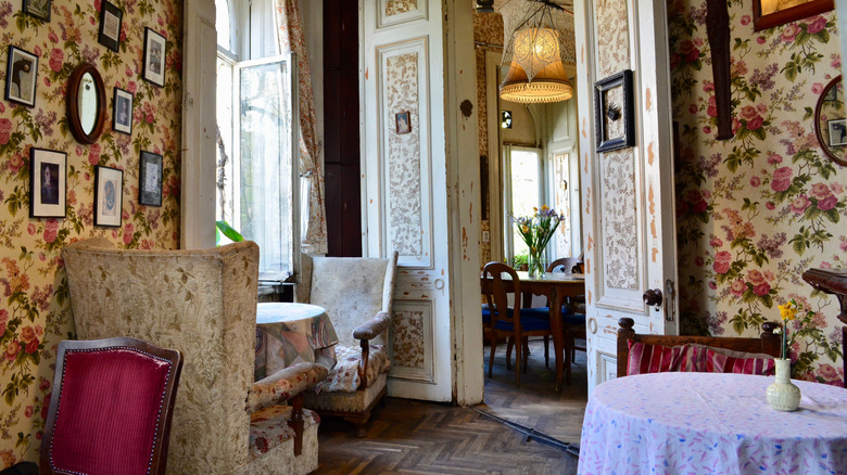
Theme-based interiors — from farmhouse to coastal to cottage-core — can feel charming at first but quickly verge on caricature. When every detail adheres to a specific aesthetic, a home loses its sense of evolution and personal style. The farmhouse trend, for example, once felt refreshing but soon became overexposed, with shiplap walls and sliding barn doors appearing in spaces far removed from rural living. The same risk applies to today's trending "-core" movements. Whether it's Regency-inspired opulence or the romantic nostalgia of cottage-core, these highly curated styles can quickly shift from whimsical to overwhelming when taken too literally. What starts as a few charming touches can easily turn into a themed set, making a home feel more like a movie backdrop than a reflection of everyday life.
Design experts suggest embracing trends as inspiration, not identity. Incorporating a few elements — say, a vintage-inspired wallpaper or soft pastel textiles — can capture a mood without locking a home into a specific era. Mixing in timeless pieces keeps the look adaptable as trends evolve. The goal is to nod to your favorite aesthetic rather than reenact it. Overcommitment leads to it looking dated, while moderation ensures your space feels authentic, layered, and enduring.
Heavy use of brass and gold hardware
Polished brass and gold finishes once brought warmth back to interiors after years of brushed nickel dominance. They reintroduced richness and contrast, especially against dark cabinetry and marble countertops. Initially, the look felt opulent and fresh, quickly becoming a favorite as it seemed to be a reaction to minimalism's starkness. For a while, every magazine kitchen gleamed with gold pulls and faucets, and homeowners embraced the return of metallic warmth.
However, excessive use of bright gold tones now feels a little stuck in the past. When every handle, faucet, and light fixture gleams in matching brass, it reads as overly coordinated and less sophisticated. Today's designers lean towards mixing metals — aged brass with matte black or brushed nickel, for example — to create a more organic, layered effect. Subtle variation keeps a home from feeling overwhelming. If you still love gold, you can opt for softer finishes, like antique brass or brushed gold, which work perfectly as accents with other materials such as marble and natural woods. The key is subtlety: a touch of gold adds warmth; a full suite of matching metallics can make your space feel frozen in time.
Mass-produced ultra-minimal pendants and ring lights
When sleek ring lights and geometric pendants first appeared, they epitomized modern minimalism. Clean-lined, simple, and futuristic, they suited the sharp geometry of contemporary architecture and offered an affordable way to achieve a designer look. Their sculptural symmetry and soft, even glow felt high-tech yet unobtrusive — the perfect fit for open-concept homes and sleek, gallery-like spaces. Their widespread availability and neutral design made them appealing to homeowners who wanted something effortlessly modern without committing to a bold statement piece. This mass appeal, however, eventually became their undoing.
However, what once felt fresh now reads as impersonal. While minimalism was popular in 2025, mass-produced fixtures lack character, blending into the background rather than enhancing a room's design. In 2026, the focus is said to be on sculptural pieces that are also functional, with an attraction towards natural textures such as plaster or rattan. Even subtle details, like layered lampshades or irregular silhouettes, introduce softness that minimalist rings cannot. In modern design, personality is key, and lighting is an interesting way to express it. Swapping an overused, ultra-minimal pendant for something with more depth instantly breathes life into a modern space.