13 Home Trends To Avoid Falling For In 2026
Interior design trends are moving faster than ever, often shaped by viral renovation videos and algorithm-friendly before-and-after reveals on social media. But what may look chic on Instagram or TikTok can lose its charm once translated into real life, and are trends you're better off avoiding. In 2026, designers warn against some of the trends that have taken off in the past few years, saying they're starting to feel overly staged or disconnected from how people actually live in their homes. As more and more homeowners value authenticity and emotional connection over perfection, a quiet design recalibration is underway.
Through exclusive interviews with designers and renovation experts, House Digest explores which home trends to think twice about before embracing in the new year. Each shares insights on how to design intentionally, making us realize that we should go inwards and prioritize things like longevity and character over hype. While these trends might photograph beautifully, they often fail the long-term test once the novelty fades. So, whether you're planning a remodel or simply refreshing a room, understanding which fads are on the decline can help you make smarter design decisions that feel timeless, rather than temporary. From overdone finishes to impractical layouts, these are the home trends experts say you should avoid falling for in the coming year.
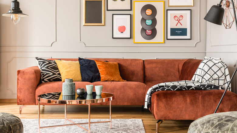
Falling for the fad that everything has to be brand new
For years, renovation culture and fast décor made the idea of "all new everything" the ultimate design goal. Social media fueled this mindset, showcasing immaculate interiors where every piece appeared freshly unboxed and perfectly coordinated. The rise of mass-market retailers and influencer-led home makeovers only reinforced the belief that a stylish home required constant renewal. Many homeowners began replacing, rather than restoring, chasing the next big look instead of investing in pieces that were built to last. This cycle created an approach that prioritizes instant gratification over longevity. This trend is losing its appeal as homeowners grow more conscious of waste and sustainability in design. More designers are urging a return to quality craftsmanship and timeless materials.
Terry Stewart, interior designer at Terry Stewart Interior Design Associates, tells House Digest that the mood is changing. "Fast décor and soulless minimalism are out. Homeowners today are leaning into materials with patina — brass, unlacquered finishes, natural stone — and seeking depth over perfection," he explains. Stewart adds that restoration now often takes precedence over renovation, especially in historic homes where craftsmanship tells a story. "It's about honoring a home's past, and that often means editing interiors with intention. Any mass-produced décor feels out of place in an historic home and dilutes the architecture's story," he explains. The result of doing this will always make a home feel more grounded, personal, and ultimately, more timeless.
Opting for overly bold, patterned tile if it doesn't fit your true vibe
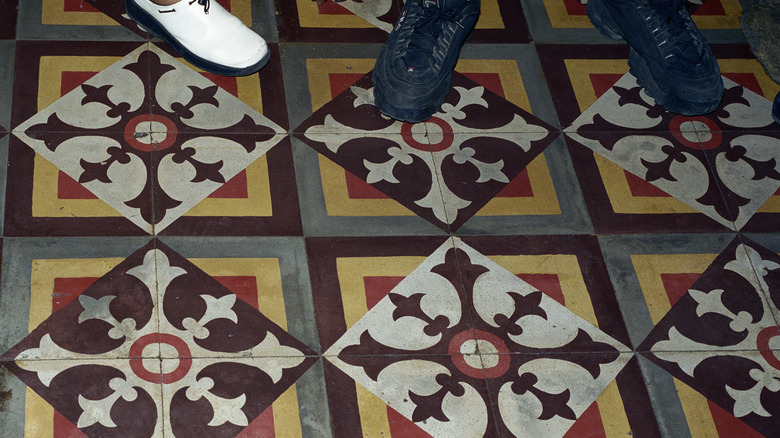
Patterned tile has exploded across design feeds in recent years. Moroccan-inspired motifs and vibrant, large-scale geometrics became the statement piece for kitchens and bathrooms alike. Homeowners loved how these tiles instantly injected color and personality into neutral spaces, transforming a room with a single surface. For those chasing that quick wow factor, bold tile offered a quick solution to express style, without changing layout or architecture.
But according to Design Contractor Eric Kotlyar of True Form Construction during an exclusive interview with House Digest, this effect can quickly wear thin. "There is much enthusiasm for statement tiles with extremely bold designs, like large-scale geometric or Moroccan-flavored prints. Be very cautious here because the boldness of these designs will soon become visually fatiguing and dated a few years from now," he says. If patterned tiles are your thing, there is no need to fret — simply look for a pattern that speaks to you and goes with the theme of your home, and not something that is just trendy at the moment. "A fantastic substitute to achieve an identical look of visual interest is to use textured, monochromatic tiles in an interesting configuration, like a zellige or a narrow, elongated subway tile. Play of light and shadow over the texture creates depth and character without the bull of a brassy design," adds Koltyar.
Defaulting to black fixtures and hardware
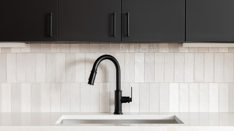
Matte black hardware once felt daring and sophisticated, offering a clean contrast to the white kitchens and minimalist bathrooms that were once so popular. It was an easy way to signal modernity without breaking the budget, and for a while, black fixtures were considered the ultimate design upgrade. In addition to this, homeowners embraced them for their graphic edge and compatibility with nearly any palette.
That once-fresh look is now beginning to feel heavy-handed. While it isn't disappearing altogether, designers suggest using matte black hardware with more restraint. What was once bold and modern, now risks looking predictable, especially when used throughout an entire home without variation. Lauren Lerner, founder and principal designer of Living with Lolo, tells House Digest, "Now it feels safe, and worse, it shows every fingerprint and water spot. It can also read harsh in spaces that need warmth. I'm reaching for aged brass, bronze, or brushed nickel instead. They bring depth, patina, and a sense of history." She notes that mixing metals adds dimension without feeling forced. After all, it is thoughtful contrast, not stark uniformity, that keeps a home's hardware feeling current.
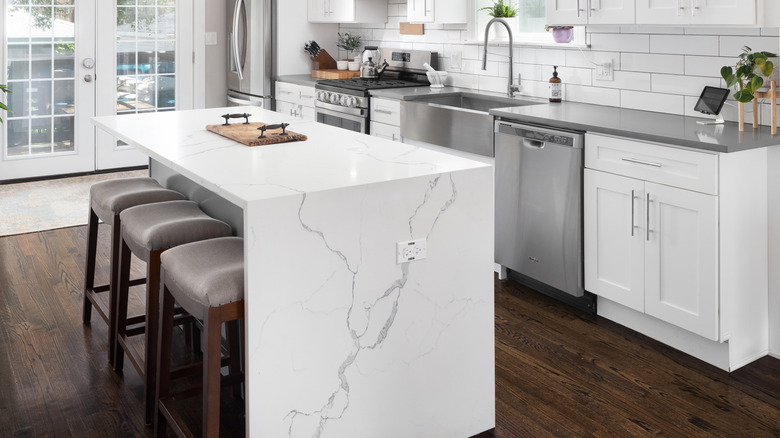
Statement marble overload (either real or imitation)
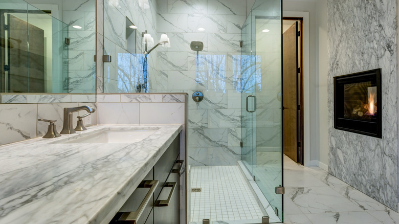
Marble has long been synonymous with luxury, and in recent years, its dramatic use has surged in popularity. Just take a look around and you'll see homeowners embracing full slabs and floor-to-ceiling coverage, thinking that this seemingly timeless upgrade of more stone automatically meant more value. It embodied the ideal of a dream kitchen and a sense of grandeur that instantly elevated even modest spaces. The material's natural variation and visual depth gave homes a feeling of custom luxury.
Lerner tells House Digest that, while she loves a bold stone moment, nothing lands when every surface is demanding for your attention. "Dramatic marble on the counters, backsplash, and floors doesn't read as luxurious. It reads as overwhelming. Use statement stone where it matters. A waterfall island, a fireplace surround, one intentional moment. Then step back everywhere else. The restraint is what makes it feel expensive," she shares. Because these stone installations are costly and permanent, overdoing marble means your remodel risks feeling dated or out of balance. So, as she advises, choose one intentional moment of stone and let the rest of the room breathe.
Imitation luxury finishes can feel both overdone and dated
In the race to achieve a luxury look at a lower cost, imitation finishes — think high-gloss veneers, faux marble, synthetic stone, and ultra-shiny hardware — became widespread. They offered the aesthetic of opulence without the price tag, which made them very appealing to homeowners on a budget. Retailers and builders leaned into these finishes because they photographed well and appealed to the people looking for a luxurious look for less. For a time, the shortcut felt clever and modern.
However, experts now caution that finishes designed to look expensive often reveal their true nature over time. Lerner says, "Anything trying too hard to look expensive usually does the opposite. High-gloss veneers, synthetic stone, overly polished finishes. They might seem like shortcuts, but they don't age well and they don't feel real." She shares a piece of advice, which is to go for authentic materials that age well over time. "Go authentic. Plaster walls, real wood, natural stone, unlacquered metals. These materials have depth and texture that only improve with time. That's the difference between looking luxurious and actually being luxurious," she adds.
All-open floor plans tend to lack definition
Open floor plans appeal to the desire for flow, natural light, and multipurpose living spaces. The kitchen, dining, and living areas merging stylishly into one large space became the default layout for many modern homes. It was ideal for entertaining and projecting a sense of spaciousness and ease.
However, total openness often works against privacy and utility, costing your comfort in the end. Designers are even talking about the return of the closed-concept home, as homeowners are starting to see the use of defined rooms. Lerner says that while an open concept can make sense, it doesn't always work automatically. "Total openness can leave a space feeling loud, exposed, and undefined. Every room needs some sense of boundary to feel like it has purpose," she says. Lerner suggests, instead, to create soft separation. "Use furniture groupings, built-ins, or architectural details like arches to define zones without closing things off. You keep the flow but gain intimacy and function," she advises.
Vessel sinks might look hotel-like, but they're impractical
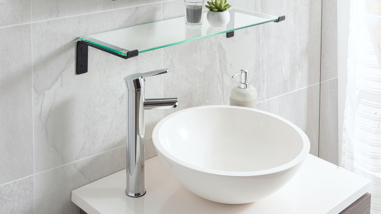
The vessel sink became a favorite in upscale and boutique-style bathrooms, because it added height and some design drama. Rising above the counter, it created visual impact and was widely used in bathrooms, both in residential homes and hotels, as a statement feature. It aligned with other spa-inspired trends and made a fairly simple swap feel elevated.
Upon closer examination, vessel sinks often fall short on practicality. They can lead to things like splashing, reduced counter space, awkward faucet positioning, and more frequent cleaning needs. Laura Lees Gilbert, owner and principal designer at L. Gilbert Design, says that while it's trendy and eye-catching, the trade-offs may not be worth it in the end. "A dry countertop goes out the window as soon as you turn the water on high or try to wash your face. It adds drama but is rather high-maintenance and not necessarily practical for everyday life. A more timeless and livable alternative is an apron-front sink, which is an option that's still functional, chic, and prevents ongoing counter damage," she shares. A sink that looks good in photos, but frustrates you daily, is never a worthwhile choice. Ultimately, choose one that balances beauty with practicality.
Waterfall countertops take a lot of extra material and lack function
Waterfall-edge countertops once became one of the most popular, recognizable features of modern kitchens. The design wraps countertop material down the sides of an island or cabinet, creating a continuous flow that feels sculptural and luxurious. The look appealed to homeowners for its sleek minimalism and its ability to showcase bold stone veining across multiple planes. Builders and real estate marketers often featured it as a hallmark of modern design.
However, designers are beginning to view the trend as more aesthetic than practical. Gilbert tells House Digest that the overuse of stone in waterfall applications, "feels extravagant without the matching sustainability or function." The effect can also limit cabinetry space and expose slab edges to chipping or staining. This look is now viewed as a bit clunky and overdone, suggesting more simple styles that can balance well with the rest of the kitchen is the new way to go. Gilbert shares similar thoughts. "In 2026, we will likely see homeowners moving toward countertops with only a slight overhang design, which is still modern but far more functional for everyday life," she shares.
Arches that don't tie in with your design style or home's architecture can feel out of place
Curved doorways, arched cabinetry, and rounded built-ins are appearing in homes everywhere. The look has grown alongside the broader revival of soft, organic design, which embraces gentle shapes to add warmth and contrast to sharp, modern architecture. Across social media, countless DIY transformations have showcased how a simple squared opening can become a sculptural feature. The style feels especially fitting in Mediterranean, Spanish, or older homes, where arches naturally complement the existing structure and lend a sense of continuity.
Melissa Roberts, founder and interior designer at Melissa Roberts Interiors, cautions that adding an arch purely for trend's sake can feel disjointed. "Arches are everywhere right now, from cabinetry to doorways, with homeowners adding them for the sake of the trend. Not every home or design aesthetic is a fit for arches, and they can easily look too out of place based on the overall design," she says. When curves don't align with a home's proportions, they risk looking forced. In those cases, she highlights echoing the shape through smaller details instead, suggesting, "opt for softer curves and rounder silhouettes when choosing furniture, mirrors, or lighting," that nod to the look without altering the structure. The takeaway: Use arches where they make architectural sense, not simply because they're trending.
Overloading your interior with rustic stone can create a heavy effect
Natural stone brings instant texture and authenticity indoors, and its popularity surged alongside the rise of modern rustic and organic-minimalist design. Stone fireplaces, feature walls, and thick stone cladding became shorthand for warmth, permanence, and craftsmanship. After years of glossy finishes and synthetic materials, homeowners began craving tactile, natural surfaces that age gracefully. The shift toward biophilic and sustainable design also fueled this return to stone, as people sought to blur the line between indoor and outdoor living. Just take a quick look online — many publications are saying that natural materials will dominate 2026 interiors.
But, as with any strong design element, balance matters. "The rustic look is definitely still sought after, but too much stone indoors can take a space from warm and inviting to heavy and cavernous. For balance, use stone sparingly as an accent," says Roberts. This can be done in many ways, such as a feature wall or a refined mantel, as she suggests, or as a sculpted fireplace surround or textural trim that adds texture without overwhelming the room. The key is restraint. Roberts points out that when layered with plaster finishes, natural wood, and soft textiles, the result feels inviting yet timeless. Ultimately, a home should be lived-in and layered.
Minimalist interior looks are starting to feel tired
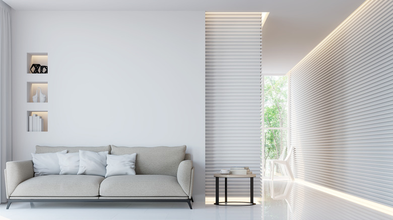
The minimalist decor trend promised calm and clarity, and for years its neutral palettes and empty surfaces defined what modernity looked like. Homeowners gravitated toward the aesthetic for its clean lines and open layouts; it was a soothing antidote to cluttered living. The style's restraint offered an appealing simplicity, one that felt refreshing. However, as people began spending more time at home, especially during the work-from-home era, minimalism's limitations became more apparent, with homeowners favoring more layers and nuance. What once felt peaceful often began to feel sterile. Rooms stripped of color and texture can also lack emotional warmth, making spaces appear more like showrooms than lived-in.
When this problem arises, think of reintroducing texture and tone variation. "Avoid very minimalist rooms in a uniform style, where everything is done in the same tone. They start to seem cold and uninviting — too perfect. Instead, it's better to mix materials of similar shades and furniture, so that the interior will be more comfortable and modern," says Principal Interior Designer at Planner 5D, Evelina Juzėnaitė. Designers are now embracing what's often called "soft minimalism," an evolution of the original style that keeps its sense of calm, but adds warmth and individuality. The approach focuses on using meaningful pieces within a pared-back framework.
Monochrome gray isn't chic any more
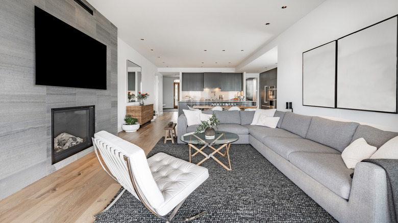
For nearly a decade during the 2000s, gray took center stage in interior design. Dubbed "millennial gray," the color became the default neutral for walls, flooring, and furniture. Its cool tone felt modern and safe, the perfect backdrop for white trim and black hardware. Many embraced it because it appealed to nearly everyone and made spaces look clean and cohesive. However, as tastes evolve, homeowners are realizing that gray can make it difficult to express individuality. No longer coming across fresh and balanced, all-gray risks creating a flat, predictable atmosphere, leaving little room for warmth or personality to shine through.
This sameness is precisely why the gray era is fading. "The so-called 'millennial gray' is becoming a thing of the past. Interiors like this look flat and boring. Instead, choose warmer or richer colors for depth and atmosphere," says Juzėnaitė. Even subtle updates, like layering taupe or sand tones, can transform a flat gray interior into something far more dimensional. Pairing these hues with textured fabrics or natural wood helps create the character that you might be looking for. This touch of warmth can instantly modernize a once-monochrome space.
Matching furniture is a blast of the past
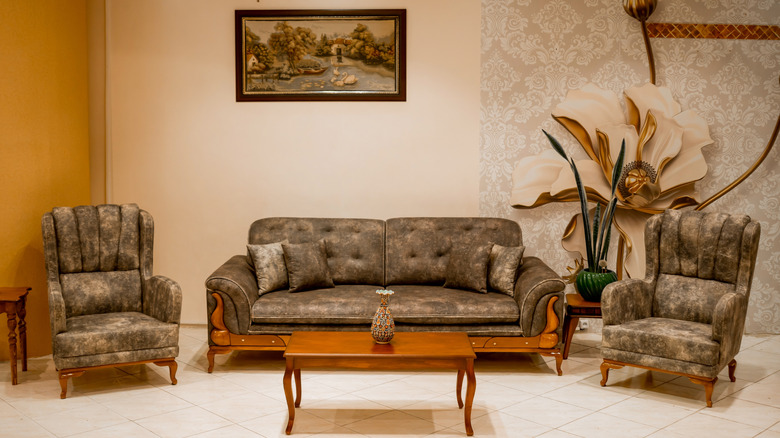
Matching furniture sets were once considered the hallmark of a put-together home. Up until the early 2000s, decorating an entire living-room or bedroom suite in a matching set was considered the easiest way to achieve a cohesive look. The approach appealed to busy homeowners who wanted instant harmony, and it quickly became popular. But as design became more about personality than perfection, this one-note style started to feel predictable. What once conveyed refinement now reads as overly coordinated.
That sense of uniform perfection no longer resonates with today's homeowners. "Don't have perfectly-matching furniture. This is no longer relevant when everything is from the same collection. For an individual and beautiful interior, it's better to combine different furniture from different collections," says Evelina Juzėnaitė. Mixing pieces from various styles and finishes makes a space feel personal, more like a collection that's evolved naturally than a showroom display. Designers are now favoring eclectic pairings such as pattern mixing, which is becoming popular for its cozy effect. A modern home should tell a story, and too much coordination leaves it without a voice.