IKEA's Color Of The Year Couldn't Be More Different From Pantone

Predicting the future isn't exactly easy, but with the annual tradition of picking out the upcoming paint color of the year, plenty of companies and organizations like to give it a whirl based on trends they have seen and ones they expect to pop up. Sometimes, the well-known interior design companies agree on what shades they think will be the next big thing — such as in 2023 when Pantone, Benjamin Moore, Dunn-Edwards, Sherwin-Williams, and Dutch Boy all picked their own version of a pinky-red hue. However, it seems that 2026 will not be following that tradition. IKEA and Pantone have both just dropped their chosen shades to usher in the year, and they really couldn't be any more different.
Pantone's shade — titled Cloud Dancer — is a crisp, white color meant to evoke feelings of lightness and calm. As executive director of the Pantone Color Institute, Leatrice Eiseman, told CNN, the hue is meant to reflect "our desire for a fresh start" and represent a "calming influence in a frenetic society, rediscovering the value of measured consideration and quiet reflection." In heavy contrast to Pantone's muted shade, IKEA has instead gone for the color Rebel Pink, a vibrant, playful hue that seems to carry on the "Barbie Pink" era, though with more of an emphasis on sophistication and versatility. IKEA's chosen shade bids you to say goodbye to boring neutrals and embrace a sense of fun, no matter your age. But, with plenty of discussion on how best to style calm colors like Pantone's Cloud Dancer, some people may find it a little more difficult to incorporate IKEA's Rebel Pink into their interior design.
How to style IKEA's Rebel Pink
According to color theory, pink has often been associated with feelings of playfulness, romance, and innocence. Rebel Pink can therefore be a great choice for areas that are suited to games and play-acting, such as a children's play room or bedroom. However, because of its vibrancy, it can also be used in darker areas such as bathrooms to bring a sensation of brightness to spaces which tend to lack natural light. If the shade feels a little too overwhelming for you, consider incorporating pink into your home decor by using it as an accent color in specific spots such as closets, doors, and decor pieces to infuse just a hint of whimsy into the overall palette.
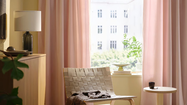
And, if you're not sure how well Rebel Pink will fit into your existing design scheme but you still want to try it, you can always opt to bring it in via soft furnishings that can be easily switched out. For example, the textured SVARTPOPPEL pink pillow covers or whimsical soft pink SANELA curtains from IKEA can be a great way to give this fun shade a test drive in your own space. Not sure what colors go with pink? Well, for a maximalist look, try pairing this rosy hue with other bright shades like orange and teal. Alternatively, if you prefer a more muted palette, try Rebel Pink out as an accent to neutrals like light gray and white for a delicate pop of color.