The Color Mistake That Is Making Your Home Feel Like Chaos

You've done everything right. All your items are organized in cute little bins, and you minimized as much as you could. You've set up your home in the most calming way possible and followed all the trends. Yet, despite all that, your space feels chaotic, and you can't figure out why. The answer may have to do with your color choices. Specifically, how much contrast there is between the hues in your rooms.
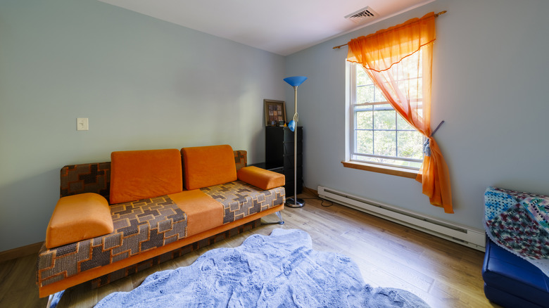
There are two common options: high and low contrast. High contrast is a bold difference, such as pairing black and white, which certainly draws the eye, but can also make a space feel chaotic. Low contrast, on the other hand, uses shades that are a little more similar, such as using a shade of gray with cream. It's still close to black and white, but not as harsh or bold. Moving toward a low-contrast option can make your space feel less dramatic and more comfortable and calm.
High contrast does have its place in a home, and can look really nice, but if you want a certain room to be calming, or if your house feels chaotic no matter how much organizing you do, then switching to a more low-contrast design may be the way to go. Finding fun and unique kitchen color combinations to try out that aren't high contrast isn't always easy, but with some patience, you can figure it out.
While having some contrast is nice, it can lead to a bit of chaos if it isn't done right
You can still get some of the color you want from a space, even going for low contrast. For example, you can fill a room with blue in different shades, then add some textured ceilings and a decorative element to achieve contrast without too much chaos. Your lighting fixtures, for example, are an easy way to bring contrast to your kitchen without it feeling overwhelming.
That's not to say you can't have some boldness in your home. For example, if you want bright and patterned wallpaper, put it on one wall. Then, tie in the colors of the wallpaper throughout the room. For example, if you have a jungle pattern with many different shades of green, add in a few other pieces that match, but in a solid color. Additionally, lean toward creams, beiges, and grays instead of black and white, so it doesn't feel so dramatic.
Or, you can go the route of color drenching, the once-controversial trend that increases your home's value and may remove some chaos from your life. Keep in mind that contrast comes from more than just your palette. While mixing light and dark shades can certainly create a high contrast, warm and cool tones, different textures, patterns, and materials pose their own type of boldness that may make it hard to achieve the sense of calm that you want.