How Interior Designers Pair Patterns So They Don't Clash
Mixing patterns is one of those decorating skills that can separate the amateur from the professional interior designer. When it's done well, it also distinguishes a harmonious space from a chaotic one. Expert designers mix stripes, florals, checks, and geometric patterns to make areas look like they were always meant to be. But behind every effortless layer is an intentional structure. Interior designers don't just throw random patterns together. Instead, they follow design principles that create balance. If you're anything like us, the thought of combining different patterns in the same room makes sweat form on your brow. A patterned pillow feels safe enough. A patterned rug? Sure. The moment you start to put them in the same space, it's easy to lose that quiet confidence. However, knowing how to do it so it doesn't look like a complete disaster isn't the hurdle you might think.
Most designers run headfirst into mixing patterns — without hesitation. They understand how to control the story that the space will tell. Whether your goal is to embrace a fabric trend that's a maximalist's dream or you prefer to keep a quiet luxury aesthetic, patterns should speak to each other without making it a competition. Patterns don't need to match, but they do need to relate in some way. It can be a color they share, a recurring shape, or an intensity level. The trick is to pick out those details and then catapult off of them.
Keep the scale of patterns in mind
When it comes to mixing patterns, designers focus on scale. A space feels more harmonious when prints come in different sizes. Say, you try a large floral pattern with a medium geometric design and a small stripe. The size difference makes each stand out rather than competing for attention. Even if you want to mix two floral patterns together, keep one larger than the other.
Pick a primary color
Designers often begin with three to five unifying colors, with one primary color to build the whole scene around. Think of it as a way to link all the different elements, like florals, stripes, and geometric shapes. When different patterns share the main color, or even variations, they automatically look like they belong together. This can also make picking out accent colors a whole lot easier.
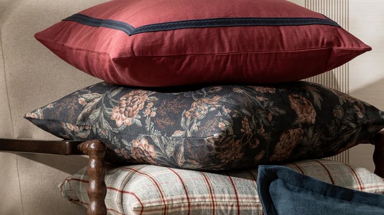
Don't be afraid to combine themes
Mixing pattern themes is a quick way to give your space a layered feel, instead of coming across as overly matchy-matchy. Decorators often pair florals and stripes, or pretty much any pattern, with geometric designs. The trick is to stick with a similar set of colors or even repeat a small shape so the room starts to take on a more unified look.
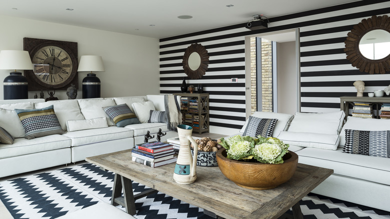
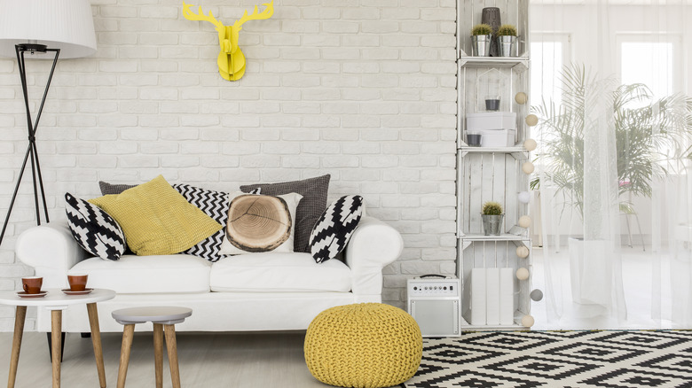
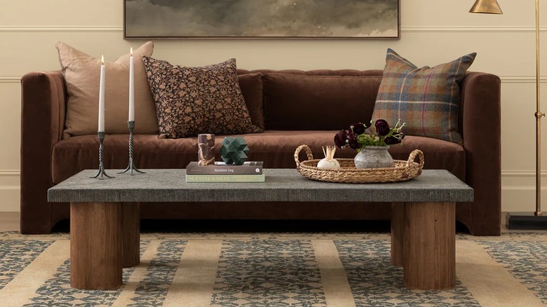
Stick to a max of three different patterns
Designers often stick to a simple rule: Use no more than three patterns in one area. This helps keep the look cohesive rather than chaotic. Think of a group of three, like one that stands out, one that's less intense, and one that's quiet. Of course, you can use more than three patterns, especially if you're into maximalism, but most rooms usually look better when you follow this rule.
Pick patterns that share a shape
To tie mixed patterns together, pick designs that share the same shape. If your rug has curvy shapes, try throw pillows with round flowers, or if your wallpaper has geometric angles, pair it with a checkered throw blanket. Repeating similar shapes helps link the patterns, even if the colors and themes are different. Just pick a shape you like and use it as a starting point.
Keep everything else simple
When your space has different patterns, the rest of the room should be simple. Designers will combine loud patterns with low-key fabrics, neutral walls, and simple decor so the patterns can show off. Simple furniture, fewer accessories, and clean finishes keep the space from getting too busy. This way, everything is noticeable in the room without looking overdone.
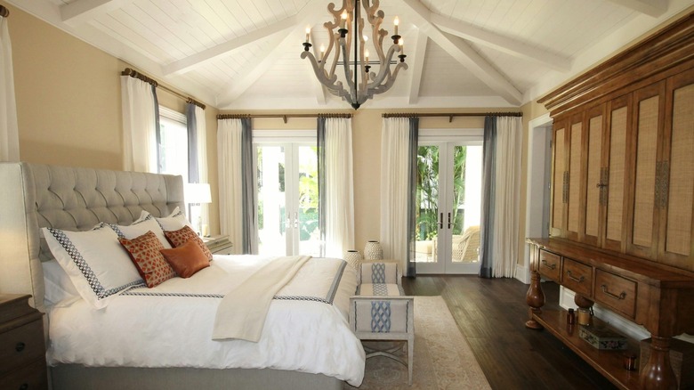
Incorporate wood accents amongst the patterns
Wood accents bring a warm, natural feel, especially when you have multiple patterns in a space. Think a simple oak coffee table, a walnut headboard, or even woven cane details. Its natural hue mellows out strong patterns and balances combos that might seem "too much" at first. Even small details like a wooden tray or picture frame can perfectly ground the room and layer it in style.
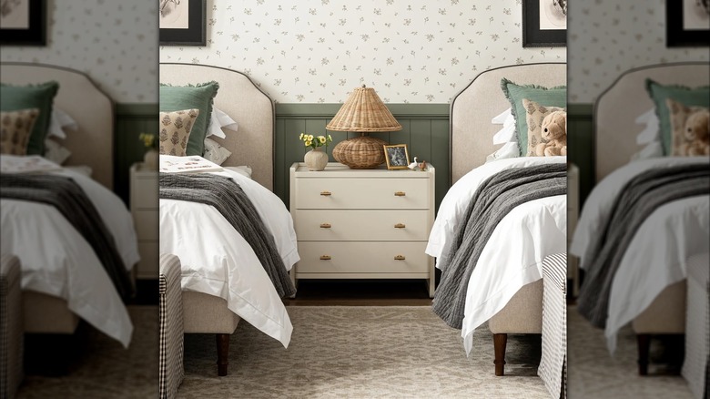
Stick to one color for all patterns
If you're not 100% comfortable with mixing patterns, a more subtle option is to stick with the same color group in your patterns, like all blues, greens, or warm neutral colors. By using the same color scheme, patterns can be different sizes and styles without the space looking messy. It's a baby step in mixing patterns that keeps everything looking calm and put-together.
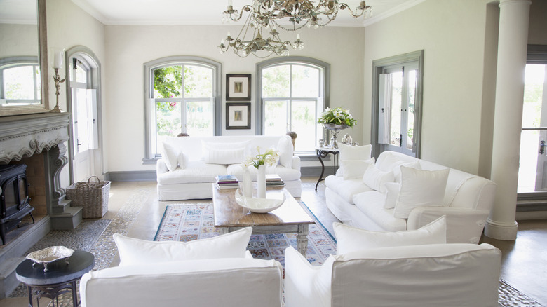
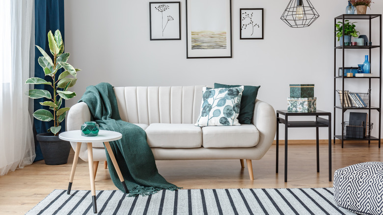
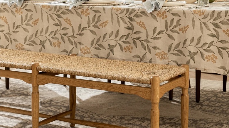
Let your rug dictate the look
An area rug usually has the largest pattern in the room, and finding the perfect rug isn't always as easy as you'd think. A rug ties the room together, and that's one reason designers like to start the planning process with a rug. Its colors, size, and design set the whole mood, which makes picking out fun patterns for pillows, curtains, or bedding a lot easier.
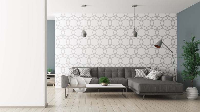
Keep colors simple and subtle
When you're mixing multiple patterns, it's best to keep the colors simple and subtle. Designers will pick a couple of primary colors and then repeat them in each pattern. This will quickly connect the patterns, keeping the space from feeling mismatched. Plus, fewer colors also make layering that much easier, letting you have fun with sizes, styles, and textures while maintaining consistency.
Put some space between patterns
One simple way to keep your space balanced is to give patterns a little breathing room. Designers often break up busy patterns with solid colors, plain walls, or just physical separation. For example, put patterned pillows on opposite sides of the couch or have a simple headboard when you add a duvet cover in a bold pattern. Spacing will help keep patterns from looking like a jumbled mess.
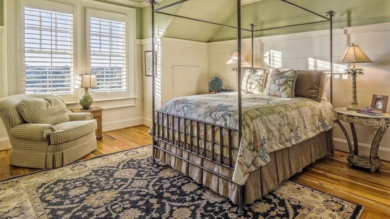
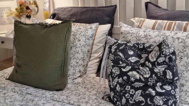
Mix vintage and modern prints
Mixing vintage with modern decor is a designer favorite because it gives a room character. Old florals and striped patterns bring a historical aesthetic, while more modern geometric and abstract patterns add an energetic feel. The key is to tie them together with complementary colors to create a layered and collected style that's both current and timeless.
Use plaid patterns sparingly
Plaid is a bold print that adds classic vibes to any area. If you want to make your space cozy, designers suggest using it sparingly. Just a plaid throw, pillow, or chair is enough to add warmth and a Ralph Lauren-y aesthetic without it being too much. Since plaid has striking lines, you can pair it with simpler patterns like ditsy florals for a classic look that just works.
Invert the pattern colors
A trick designers love to use is inverting the colors of the patterns to tie a pretty bow on the cohesiveness of the space. Rather than using matching patterns or solid shades, invert the colors, like a white design on a navy background next to one with a navy design on a white background. It's a great way to add contrast while maintaining a consistent color palette.
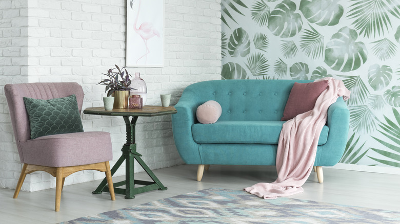
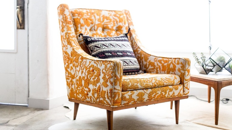
Mix opposite patterns together
Designers give two thumbs up for mixing opposite patterns together. Say, you have a floral, geometric rug, then try adding a smaller floral pattern on the walls. This way, you're balancing out the larger pattern with a softer print. The contrast keeps the space from feeling predictable and stale. Mixing patterns helps create a harmonious space that looks and feels intentional.
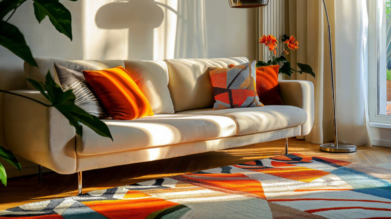
Sprinkle in contrast
To keep patterns from feeling flat, contrast is key because it keeps things interesting. Designers like to intentionally mix things up by bringing contrasting colors together, allowing each pattern to steal the show, yet still working in harmony. Without some contrast, everything pretty much blurs together. Say you want to hop on board the unique throw pillow trend that's currently making waves, mix it into your space with a pretty pattern that makes it pop.