The Clever Trick For A Color Palette You'll Actually Love — Tailored To Your Vibe
There's no denying that deciding on a color palette for your home is one of the trickiest parts of designing a house. While flipping through color swatches can be great fun in the early stages — what with so many options and variations to consider — the abundance of choice can get overwhelming when it comes time to narrow things down to a few coordinating shades. There's also added pressure because it's quite a commitment, as whatever palette you choose will influence much of the decor you buy for your home. For some, creating a color palette comes easily. For others, it can be difficult to know where to start or which color combos will transform your home's interior. Luckily, one clever TikTok creator has shared a simple trick for building a cohesive palette: using brands and packaging as a guide.
In a recent TikTok video, home and crafts creator @IveBrynnEverywhere admitted that while she loves interior design, she's not great with color palettes. Instead, she explained, "I go to my favorite brands' websites and look at the colors they use on their website and in their packaging, and I build the color palette from there." One example she shared was a trio of perfume bottles packaged in muted jewel tones, which inspired her bedroom palette. "Then what I'll do," she added, "is go around to different thrift stores or flea markets and I'll look for art, I'll look for trinkets, and try and stay within my color palette."
Using brands to build your color palette
Beauty and skincare brands can be a great place to look for color inspiration too, as they often lean toward lighter, muted, or more minimalistic palettes — like The Ordinary, for example, a skincare brand that uses shades of white, gray, and black for its color palette. Your favorite clothing brands are another smart source to pull ideas from, while interior design companies and home decor brands are an obvious place to look, too. Food and wine labels can also provide good ideas, the latter of which often has berry tones which deserve a permanent place in your color palette.
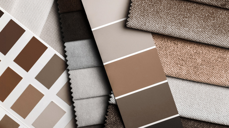
There are a few tips to keep in mind when deciding on a color palette. One of the most important is creating a palette for your entire home rather than approaching it room by room, as it helps the space feel more cohesive and connected. Another key factor to consider is how many colors you're using. An easy formula to follow is the timeless 60-30-10 rule, which is made up of a dominant color (60%), a secondary color (30%), and an accent color (10%). So if you're building off a brand with a larger palette, it may be best to narrow it down to three shades. For example, singer Selena Gomez's cosmetics brand Rare Beauty features six colors in its palette, including a port wine shade, a dusty rose, a slate blue, and a peach-toned pink, along with black and white. If you were using this brand as inspiration, you could focus on the three pink shades to guide your color palette.