9 Colors You'll Regret Painting Your Shutters, According To Professional Designers

Your home's exterior is a place where you can create a warm welcome and enhance aesthetics by carefully selecting the right exterior paint colors to showcase. Your window shutters can be one of those details that feel insignificant, but the right colors to complement your home can actually make your house sing. However, if you choose the wrong paint colors, it can end up undermining your home's curb appeal. You need your exterior paint choices to give your home a revival, providing a beautiful flow and contrast. We've researched the experts, and professional designers say that you'll have regrets painting your shutters with certain colors, so you're better off skipping them when you decide to upgrade or change your colors. These include high-gloss black, yellow neutrals, pastels, loud neons, and muddy browns.
The house shutters should be a complement the overall look and style you're going for and provide an accent to the primary color. So, why are some colors less likely to work well than others? There are many common mistakes that homeowners make when choosing exterior paint. Some colors can come off as harsh or be lost completely. Others may be trendy for a time, but end up losing their appeal within a short period. Here are all of the colors you'll want to avoid when giving your shutters an elevated upgrade and better options to choose instead.
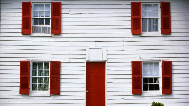
Glossy blacks are overdone
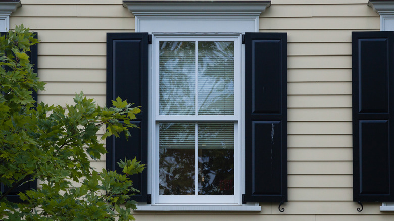
A go-to against a primarily white or light-colored home, high-gloss black is overdone on exterior shutters. Alykhan Velji, creative director of Alykhan Velji Designs, told Livingetc, "The classic ultra black door or high-contrast black-and-white exterior is starting to feel tired." It can take away from the uniqueness of your home when it starts to look like a trend that everyone is doing. The black can also showcase dust and dirt easily, which isn't ideal. Instead of black, opt for a deep charcoal to create a more elevated contrast.
Soft pastels are hard to achieve
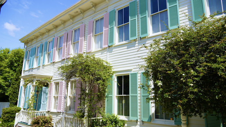
The idea of being unique and whimsical with your home's shutter choice may have you going for a pastel color like baby blue, mint, or lavender. However, this can be more challenging to achieve. Jessica Whitley, a creative designer who has worked across many areas of the U.S., told Southern Living, "Though they work in some beach towns, they can seem out of place in other areas." Rather than pastels, look for a bold blush or muted blue like Twilight Blush by Behr.
Yellow and beige neutrals are unremarkable
Yellow and beige neutrals are colors we're seeing everywhere. Dan Staube, owner of Compass Exteriors, told Livingetc the problem with beiges and creams is that they no longer make a statement. These hues are starting to fall flat and feel unremarkable on your home's shutters. They don't provide that bolder contrast on the exterior, so your home can end up looking washed out. Earth tones have beige-y and warmer hues that you can go for instead.
Muddy browns are dated
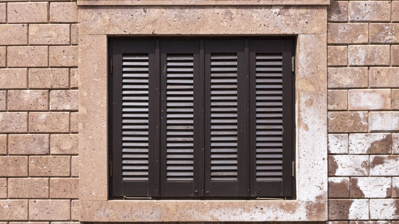
If you're in the mood for an earthier tone, you might think that brown is a good choice, but not every brown is fit for your house's exterior shutters. Melanie Bryant, founder of Melanie Bryant Interiors, told Southern Living, "Some mid-tone or muddy browns can look dated or get lost, especially if your siding or brick is a similar tone." Rather than lacking visual contrast, choose a brown with green undertones, such as Farrow & Ball's Mouse's Back, for a richer feel.
Bright and bold primary colors are unbalanced
Bright primary colors can create a cheerful outlook for your home's exterior when used on your shutters. However, these bold colors on your home's exterior start to feel overwhelming after a time, which ends up creating an unbalanced look to your home, according to designer Nicole Roe of R. Nickerson Interiors (per Southern Living). The colors can also sometimes feel a little childish in their execution. For a better and more blended look, try a primary color like red that has brown undertones for a subtle boldness.
Stark white can be too bright
Instead of looking at tons of colors, you may think to just go with a simple, classic, and timeless white. While this isn't necessarily a poor choice, it can be seen as too bright for an accent on your home's shutters. CWG Design's Cate Gutter told Veranda that bright white rarely works well on its own. The other downside is that dirt, debris, and cracking of the paint are easy to see when they occur. Instead of bright white, go for a slightly off-white or creamier light shade, such as Behr's Alpine Frost.
Loud neons scream showboat
The hot pink, neon green, and fluorescent yellow options are definitely a brave choice for making a statement on your home's exterior shutters. Even just as an accent, though, these colors are very loud and intense, which can make people think they are too showy. Designer Danielle Balanis specifically honed in on the hot pink, telling Southern Living, "Pinks for exterior should come off soft rather than brazen and overly bold." For a softer and still bright color, try an orange with pink hue like Antique Coral by Benjamin Moore.
Purples are too bold
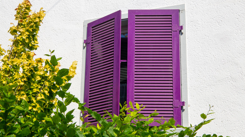
Purple shades on shutters are often too bold and don't work with most home styles. You want to create a nice, not too overpowered but noticeable, contrast between the colors of your house and shutters. Ashley Banbury, color marketing manager at Sherwin-Williams, told HGTV that the deeper purple tones are good for Victorian homes, but otherwise, they conflict with most architecture. If you want a bold color with a little personality, choose a deep navy or forest green.
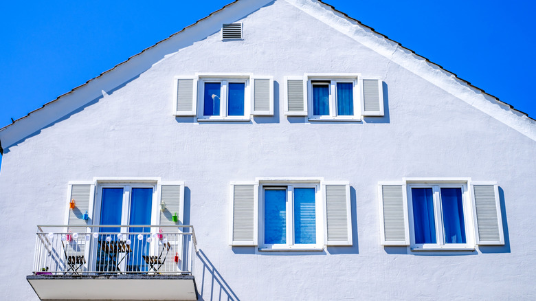
Sterile grays feel cold and lifeless
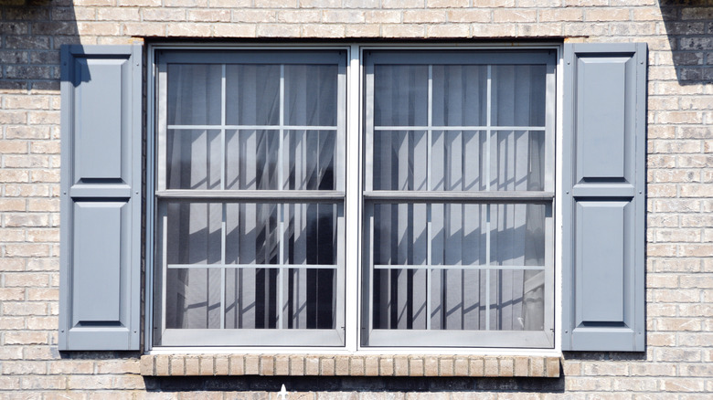
The blue-leaning gray colors for shutters seem classic and timeless, but they often read as lifeless and cold. These grays can look flat and dull in natural lighting, so they wouldn't be the best choice for your home's shutters. It's vital to complement your house's architectural elements when choosing exterior paint colors, and Christopher Boutlier, founder of Boutlier Designs, told Southern Living that steel blues and grays can result in the opposite effect, taking away from warm features. Instead, you should opt for a warmer shade like Perfect Greige by Sherwin-Williams.