10 Outdated Interior Colors No One Expected To Trend Again

For as long as we can remember, interior design trends have been pretty predictable. A color would suddenly become unpopular, getting slapped with an "outdated" label, and then quietly disappear. Shades like avocado green in kitchens, brown living rooms, or light blue bathrooms screamed "retro?". But those colors we happily left behind are now reemerging in modern homes — and they aren't being shy about it. Designers are using them boldly, homeowners are color-drenching walls with them, and suddenly, the shades we thought were gone forever feel fresh, cool, and even stylish.
Certain colors just create a feeling of nostalgia, no matter where they're used in home design. This comeback isn't about copying the past, but rather seeing these colors in a new light. The updated hues are richer, deeper, and have way more going for them than before. What used to be a heavy, dated brown now feels light and welcoming. That stuffy burgundy has become muted and relaxed. And after years of cool greys and stark whites, light and airy blues are elevating spaces with oodles of personality. Color can make a space intentional, tell a story, and set the vibe, whether it's through painted walls, textured furniture, tiled backsplashes, or opulent, rich accents. These old-school colors are returning to the forefront because of their flexibility, and designers aren't wasting any time incorporating them as backdrops that grab your attention. Trends don't ever really disappear, and these colors prove the best ones can return bigger and better than before.
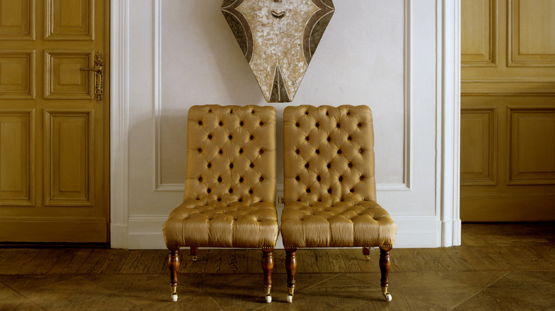
Rich brown
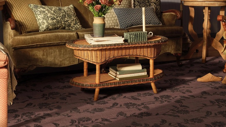
One of the most unexpected color returns is brown, which is even making a statement in bathrooms. Think rich chocolates, espressos, and soft taupes on walls, cabinets, rugs, or furniture that turn a regular room into one that's warm and inviting. Designers are mixing it alongside creamy whites, brass accents, and natural textures like wood and stone to keep the vibe from getting too heavy. The result is cozy, classic, and modern.
Hunter green
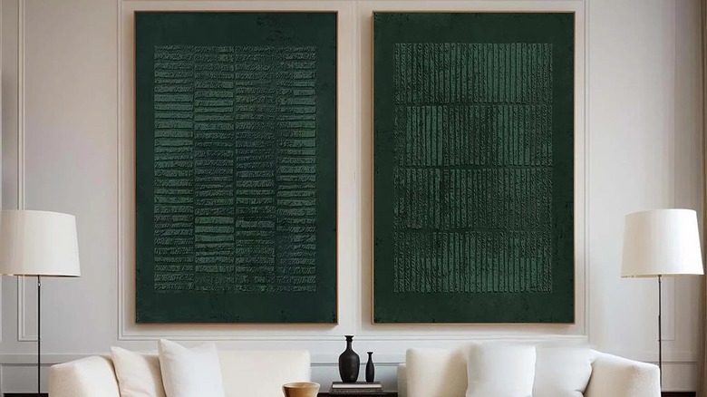
Remember the hunter green shade that seemed like it was everywhere in the '90s? Well, it's back as a top color for home interiors. Deep and saturating, it's giving off a serene vibe that lighter greens just can't touch. What used to be a library or dining room color now looks fresh when paired with finishes like matte-black hardware, warm brass, or light-wood tones. Hunter green is perfect for giving a space a little oomph without taking over.
Powder blue
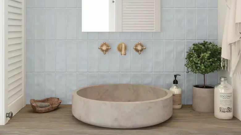
Powder blue is making a low-key comeback as a much-needed change from the typical whites and cool greys we've become accustomed to. Pale pastels like powder blue used to be a color you'd likely see in 1950s bathrooms, but today's candy-colored shades are way more grown-up and modern. Whether as a tiled backsplash or accent pieces, the hue brightens a room while still adding a smidge of color.
Muted burgundy
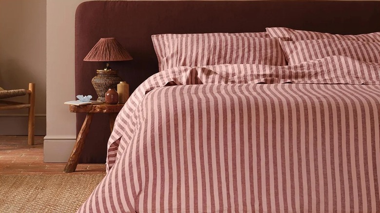
Muted burgundy hues are coming back into interior design as a super cool alternative to bright reds and purple tints. This toned-down version is softer, adding depth and a splash of color without dominating the room. Once considered a formal color, modern burgundy is showing up on bedding, walls, accents, and statement pieces, bringing a bit of drama along with it.
Opulent ochre
Bridging the gap between yellow and brown, ochre is a reemerging, earthy shade that once dominated '70s-style decor. Ochre used to be thought of as a rustic or boho shade, but today, it feels more sophisticated and down-to-earth. Its golden, clay-like tone adds warmth to a space without leaning too heavily into yellow. The moody shade adds an air of opulence to fabrics, walls, and furniture.
Sunbaked clay
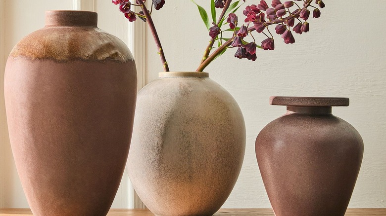
Sunbaked clay tones bring a warm, earthy vibe that feels both rustic and stylish. It's like baked terracotta and desert scenes that give off natural warmth, making any room look more inviting right away. Unlike bright oranges or reds of the '70s, it's muted and dusty, so it's easy to pair with almost any aesthetic. The final look feels timeless and natural without coming off as trying too hard.
Teal tones
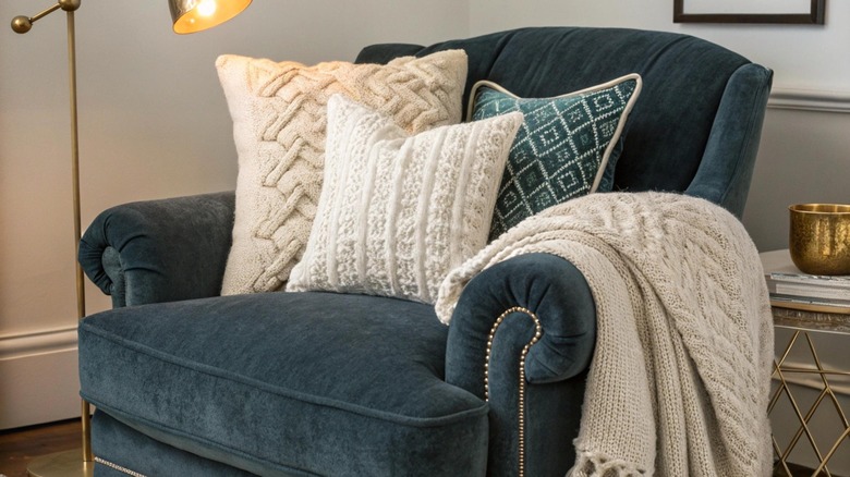
A lot of fun things came out of the '80s, but the vibrant color no one expected to make a comeback has returned in a totally modern way. Teal is making a big statement in home decor. Before teal was loud, but today, it's richer and more subtle, making an impressive mix of blue and green. It makes a room feel livelier and full of character, while remaining stylishly classic.
Warm caramel
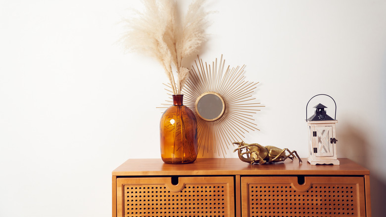
For a neutral color that doesn't miss a beat, warm caramel hues are coming back and ready to dazzle. With its golden brown tint, caramel can bring richness to your home better than beige or grey. While it used to be associated with old school decor, caramel is showing up on walls, furniture, and wood tones for a lived-in aesthetic. The flexible color is a classic shade that instantly elevates a room.
Creamy white
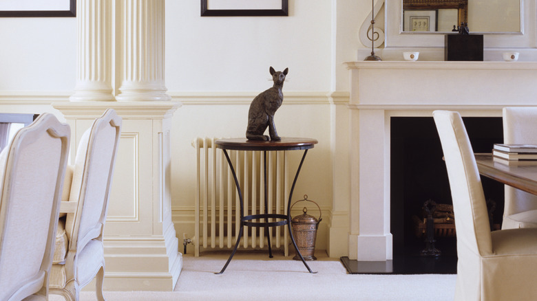
You might assume Pantone's color of the year is a foreshadowing of minimalism, but creamy white is also the perfect base for brightening up a room with earthy tones. At one time, it was less popular than cooler whites and grays, but now creamy white is making a comeback thanks to its warm, comfy undertones. Creamy white creates a perfect background for drawing attention to bolder colors, however you choose to use them in your space.
Greige
Greige is making a comeback as a solid, modern neutral. The balanced blend of beige and grey gives you a soft, warm feel with a fresh, updated look. Today's greige looks brighter and has more detail than when it was introduced in the early 2000s. Designers are using the color on walls, cabinets, and trim, mixing it with off-whites, natural wood tones, and warmer metals.