The Pink Color Combination That Unfortunately Screams 2010s
While it's true that interior design is cyclical, experts agree that some exhausted design trends and overplayed color schemes are better off left in decades past. From tacky shiplap walls to unflattering pastel interiors, there are many design elements that were all the rage in the 2010s but are now considered to be home design trends that date your home. One prime example of this is the pink and gray color scheme that was once considered to be very in vogue in the early 2000s but has since fallen out of favor with interior designers.
According to some experts, pastel pink and stark gray room themes are one of the design trends worth leaving behind, since they have a tendency to make rooms look childish and stuck in an era that has long passed. While this color combination was once considered to be playful and chic, carrying this trend over into the modern age of interior design can feel like you're holding onto an era that we've collectively outgrown. Here's why professionals are avoiding the notorious pink and gray color combo in modern designs, and ways you can still incorporate eye-catching pops of color in your rooms through more recent trends like color drenching.
How pink and gray color schemes can make your home look dated
Stepping into a pink and gray bedroom can feel reminiscent of stepping into a childhood bedroom, which is less than ideal for adults looking for a more refined, sophisticated home design theme. Not enough time has passed for the pink and gray color combo to be considered a timeless or classic style, yet the look has still been around for long enough to make your room feel like it hasn't been updated in more than a decade.
Another concern with this combo is that both pastel pink and cool gray paint colors are considered to be overplayed in their own ways now, so using them in tandem is less than desirable all around. Drab gray designs feel too monotonous for modern design trends, which favor homes with character and unique charm, and millennial pink can look too adolescent and unserious. The striking contrast between dull gray and intense pink color schemes can feel disjointed, contradictory, and unflattering. However, if you're set on incorporating pink into your interior design theme, there are still expert-approved ways you can incorporate the shade without coming across as tacky.
Expert approved alternatives that still add a pop of color
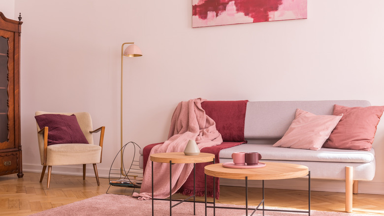
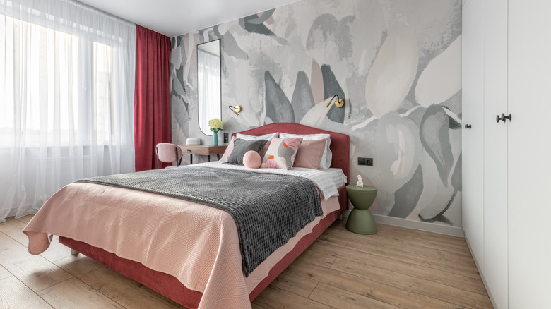
There are still ways to use both pink and gray colors throughout your home without creating an undesirable effect. More subtle and muted shades of pink, such as mauve or dusty rose, are still considered trendy, and can come across as a lot more refined than millennial or baby pink shades. When it comes to gray, warmer greige shades can be seen as welcome and inviting, instead of cool gray hues which can be unapproachable and cold.
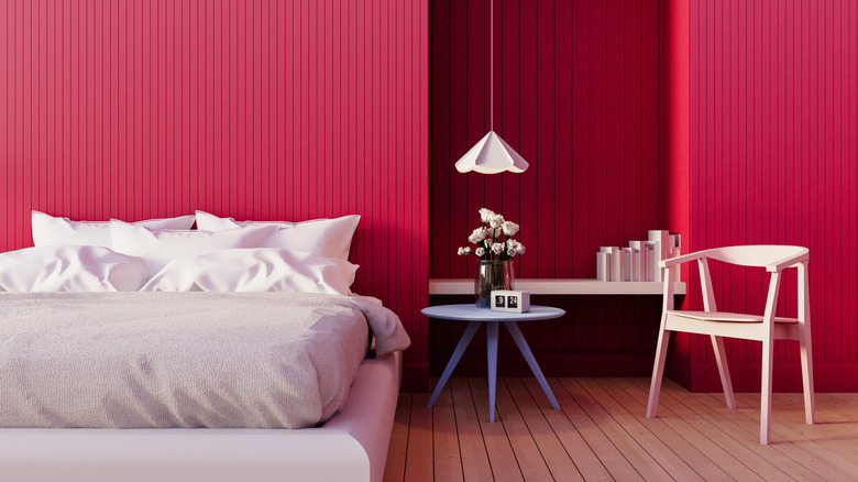
A clever alternative to the outdated pink and gray color scheme is to instead try the color drench paint trend, which is a lot more timeless. Instead of using the two colors together, choose trendier, more earthy hues of one specific color, and incorporate it into your room's design from top to bottom. You might find that more neutral shade of pinks complements a deeper, jewel-toned magenta harmoniously, and is less visually jarring than color combos from decades past. For a more tranquil aesthetic, a softer, warmer gray can make a space feel soothing and sophisticated. While both pink and gray color schemes can come off as tasteful individually, its best to just choose one color and stick to it to avoid the tacky, outdated aesthetic that's better left in 2010.