Jeremiah Brent's Controversial Take On Pantone's 2026 Color Of The Year

Every year since 1999, Pantone has chosen a Color of the Year, symbolizing the connection between color and culture. And this year's color has caused some controversy. The criticism surrounds the fact that for the first time in Pantone's history, it chose a shade of white, with the name "Cloud Dancer." Many have voiced their opinion that it is a "tone-deaf" choice (via Instagram), citing feelings surrounding the current cultural climate. But a voice of dissent is coming from what some might consider an unusual place — Jeremiah Brent, who spoke up in support of the choice on his personal TikTok in a post titled, "Okay, just hear me out!"
Since the inception of Pantone's Color of the Year, the selections have ranged from every part of the rainbow, with neutrals rarely chosen. Laurie Pressman, Vice President of the Pantone Color Institute, explained the motivation for this year's choice: "Similar to a blank canvas, Cloud Dancer signifies our desire for a fresh start. Peeling away layers of outmoded thinking, we open the door to new approaches." Pantone further explained that this color was chosen to reflect a need to strip away the noise from everyday life.
No matter what you feel about the color choice, many may agree with Brent when he said, "It's the perfect color to accentuate any design style." Some might even say Pantone's Color of the Year is a sign of minimalism fighting to continue being a part of home decor.
Cloud Dancer is a blank slate to express individuality
Brent stated in his TikTok post, "I've never felt more seen" when it came to the choice of Cloud Dancer, adding, "I love a neutral." With trends in home decor leaning toward "grandma chic" with a chorus of loud colors and textures, some may feel overwhelmed and overstimulated. It could be that Brent is a true Millennial and just can't escape his generation's innate need for minimalism. After all, there have been signs of decor trends shifting toward making minimalism feel warm again. But there can be room for both. As Pantone and Brent have pointed out, the beauty of Cloud Dancer is that it can be a fresh canvas to express your individuality.
The return of a white neutral to the design conversation doesn't mean there isn't room for color. It also doesn't mean anything other than what Pantone intended it to mean. Sometimes a color is just a color. Instead, we should take a page from Brent's book and see it as the perfect way to highlight our own personal design styles in the best possible way, with a fresh canvas showcasing our individuality.
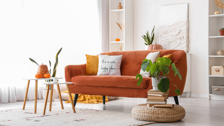
You can paint trim white to contrast colorful walls, add brightly colored curtains to a room painted white for a pop of color, or use bright metals against white furniture. Using white as a background to showcase your personal taste is one design choice that is sure to never go out of style.