The Perfect Color Palette To Use Around Your Home For A Retro Aesthetic
We may receive a commission on purchases made from links.
Have you ever entered a retro diner and felt instantly transported to the 1950s, almost like you've stepped straight onto the set of "Grease?" This effect may have come from the retro decor peppering the walls or the old-fashioned appliances lining the countertops. However, it is likely that at least some of that instant vintage feeling actually comes from the color palette. Cherry red and turquoise blue are often associated with the postwar period due to the use of these colors during that era for kitchen and bathroom designs. The pastel and candy-colored shades were already trending in the 1940s, but they became especially mainstream after the war, when people were filled with optimism for a brighter future ahead. Those bright colors fit their moods and captured the zeitgeist, filling homes with cheerful pops of color.
But are these striking shades best left in the past? Of course not! You can absolutely still make use of this charming color combination to give your home an unmistakably retro vibe. One of the most popular rooms in which to revive this color scheme is the kitchen, but don't feel like you have to be limited to this one space. These two eye-catching shades can be used together in living rooms, bedrooms, entrance halls, and even patios for an eclectic, vintage-inspired feel perfect for those who are fascinated by the fashions of the past. And, luckily, there are a variety of different ways to incorporate these bright colors into your home, from more permanent solutions like paint and tiling to more flexible options like furniture, decor pieces, and wall art. So, if you find yourself drawn in by this 1950s-inspired color pairing, why not look into how you can use this nostalgic home decor trend in your own home?
How to use red and turquoise in retro designs
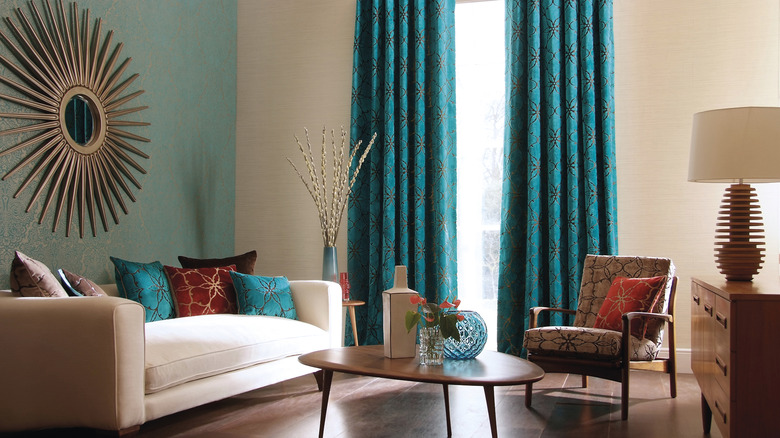
Red — particularly the bright red that is commonly associated with retro designs — is a strong, dominant color traditionally connected to feelings of passion, love, and power. As such, it was used in 1950s interior design to create calculated pops of color alongside the contrasting turquoise. You can use this kind of red to draw the eye to the parts of the room that you want to be the center of attention, such as a guest bed, a fun sofa, or curtains that frame tall feature windows. These are great elements to use into the retro shade because they can be easily changed out, making it a great way to try out this color scheme without committing fully.
However, if you are already completely sold on this quirky, '50s-inspired palette, there are some amazing ways to go all in with both bright red and turquoise blue around your home. For example, you could paint an entire room in a turquoise shade, using wall art and furniture pieces in cherry red to offset the blue and add visual interest. Remember that a lighter turquoise will really allow the red to stand out while a darker version of the blue could be a better fit when designing a moody room with a hint of vintage inspiration. If you'd like to fully commit to the retro vibe, you can also try underscoring these two shades with classic 1950s patterns such as checkerboard tiles, as seen in these ZRJT Store peel-and-stick floor tiles.