The Color Palettes That Jeremiah Brent Is Obsessed With In 2026

Jeremiah Brent is a celebrated interior designer and beloved host of television shows such as "Nate & Jeremiah by Design" and "Queer Eye." With multiple features on Architectural Digest's AD100 and Elle Decor's A-List, Brent certainly has his finger on the pulse when it comes to design. To kick off 2026, he shared three detailed color palettes to explore on his Instagram profile and Substack. Each color palette features textures and materials for both interior design and fashion inspiration — two industries in constant collaboration. There's a cherry red, black, ivory, and gray combo; a mix of radiantly warm browns and wood tones; and a palette with deep browns, gray, and natural materials.
Brent's social media platforms are brimming with great tips for both fashion and interior design. Aside from sharing clever tricks for color palettes you'll actually love, tailored to your vibe, he also shares his design process, unique décor finds, and excerpts from his book, "The Space That Keeps You." Each carefully curated post embodies Brent's philosophy that one's home should be a visual display of its inhabitants — past, present, and future. If you're looking to elevate your home design in 2026, it's absolutely worth looking over some of the free resources Jeremiah Brent shares online. To get you started, let's break down his latest color palettes and explore how to practically apply them in your home.
Exploring Jeremiah Brent's first color palette of 2026
The first palette designer Jeremiah Brent shared to his followers combines vibrant, cherry red with grounding black, ivory, and gray. It conveys an air of bold sophistication. On his Substack post about the palettes, Brent shared links to several materials that served as inspiration. He suggests Perennial's Geranium Red Ishi linen as a key fabric choice. He also offered a couple neutral fabrics, and highlighted Paris Ceramics Zellige ZC201 tiles as a complementary material. This palette is perfect for giving your home décor a moody makeover.
Leaning on radiantly warm browns and wood tones, the second palette Brent shared offers a rustic, lived-in energy. He references weathered, reclaimed wood alongside the vivid brown fabric Ausarta by Designs of the Time and Mahone's Phillip Jeffries woven gray wallpaper. This earthy color palette would look great in a warm minimalist interior; it naturally exudes just the right amount of warmth and depth to create a calming living space.
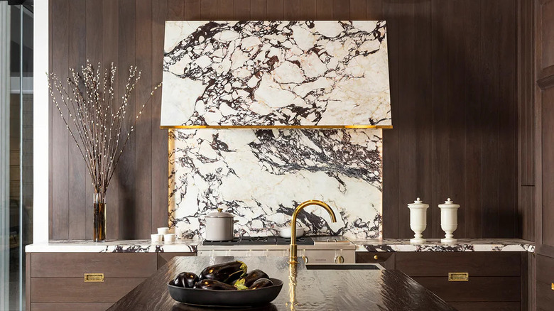
Brent's last curated color palette includes deep browns, gray, and a healthy serving of natural materials such as leather and dark marble. He pairs dark American walnut with the moody Calacatta Viola Marble Slab by Artistic Tile. It's an expansive color palette fit for a vintage-inspired parlor or home bar — elevated and elegant with a touch of romantic intrigue. This is just the first set of inspirational palettes from Jeremiah Brent in 2026. We're sure to see plenty more skillfully crafted offerings as the year goes on.