Erin Napier Loves Color. Here's How She Uses It To Keep Small Spaces Fresh

Color is a quintessential part of any interior design, setting the stage for the mood you wish to capture in your space. While neutrals are a good go-to for many, since they are relatively easy to style and look great in almost every aesthetic, HGTV designer Erin Napier and her husband say folks shouldn't avoid bolder colors entirely. Rather than playing it safe, the "Home Town" star suggests utilizing unique, eye-catching colors, even in small spaces. However, before incorporating, say, this year's trendiest paint colors that will be taking over, Erin Napier suggests starting small by pairing pops of color with grounding neutrals.
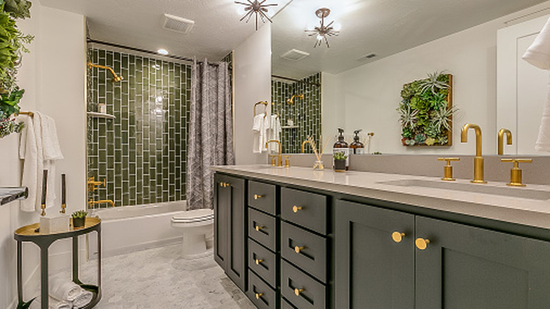
In small spaces like bathrooms, Napier suggests choosing colors that feel spa-like or relaxing. Hues like soft blues and warm greens can work wonders in these spaces. Napier also suggests expressing these accent colors through the use of bold tile or a painted vanity. Of course, you want to avoid bathroom color options that will make your space look smaller than it is. Experts often suggest avoiding darker and overly-saturated colors in places like small bathrooms, as these colors absorb a lot of light and can feel visually heavy. Although, there are some exceptions. For example, designer Kaitlin Madden used a dark olive paint color called Palm Leaf by Sherwin-Williams in her powder room, arguing that dark hues can work in some small spaces, based on functionality. If bright lighting isn't necessary when using the space, there's no reason to shy away from bolder tones.
Don't avoid color, embrace it
The common mistake everyone makes with color in the bathroom or other small spaces is overdoing it or adding too many different hues to the color palette. Alternatively, a room with little color variation is also unappealing. Some designers suggest striving for one to two main colors and one or two accessory colors for the best outcome. "When looking for subtle ways to add color in bathrooms," said Ben and Erin Napier, per Reader's Digest, "installing a patterned tile backsplash or even unique and unexpected fixtures can bring life to a bland space."
For example, in a 1950s remodel done on HGTV's "Home Town," the Napiers swapped the busy yellow and blue wallpaper and bright blue midcentury tile for softer yet impactful colors like sage green and cream. The gentle green and cream floral Gwendolyn Wallpaper by York Wallcoverings paired beautifully with the sage and olive shaded vertical shower tile. Alternatively, you could employ a subtle splash of color. In one bathroom design, Napier color-matched the bathroom door and trim to a hue within the powder room wallpaper. This allowed the space to feel more cohesive. Another idea could be to paint the vanity in a pop of color, as seen on Napier's Instagram page, where she featured a pale green hue called Herbal Wash by Sherwin-Williams. The green color centers the space and invites a bit of flavor to an otherwise neutral room.