Ditch Dated Contrasting Bathroom Trim For A More Streamlined Look
You walk into your bathroom, and something just feels off. Maybe it's the lighting. Maybe it's the hardware. Or, maybe what your bathroom truly needs is a trim refresh. For years, white trim has dominated interiors. While white can offer a clean, simple aesthetic, it now feels outdated. Designers note that stark trim, like white, alongside walls of a different color, can appear visually harsh. However, the problem isn't necessarily with the white paint color itself but rather the highly contrasting look that feels abrupt and disjointed in the space. So, if you happen to be searching for stunning trim color ideas to use in your home that aren't a tired white, you might want to pause and reflect on whether it's the color itself or the high contrast aesthetic that is weighing down your design.
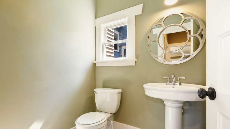
To curate more flow and cohesiveness in a bathroom color palette, designers have shifted away from contrasting trim towards solutions that mimic color-drenching. Matching trim and doors to wall colors elevates the space and gives bathrooms a more modern and fresh look. And with trends like the jewelry-box powder room, homeowners are highlighting how small-space color-drenching tricks can make any shade work, even on something as subtle and overlooked as trim. Aside from better design cohesion, designers say painting your trim the same color as your walls can help reduce visual breaks, increase the visual height of your ceiling, or allow other design features, like statement light fixtures or unique architectural details, to shine.
Use inspo from the color-drenching trend when painting bathroom trim
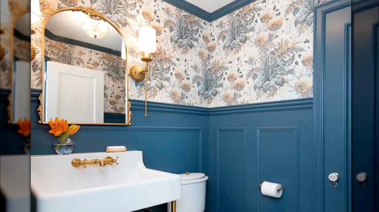
Though many designers are ditching things like outdated contrasting or white trim, they're using other tones instead, often inspired by the color-drenching trend. One such technique is to pull a color from your wallpaper and color-match it to paint your bathroom trim. HGTV designer Erin Napier features this clever idea in a bathroom reno on Instagram, where the powdery dark blue in the wallpaper was also utilized on the bathroom door and surrounding trim. Another way you can lower the contrast of your bathroom trim but still achieve that separation is by choosing two colors with subtle variation. For example, your wall paint color might be one or two shades lighter than the trim. This still introduces contrast without being too harsh.
Alternatively, some designers suggest using the same color in different sheens to achieve the same look. For example, you might choose a satin wall finish paired with an eggshell sheen on the trim. Or, other experts suggest semi-gloss paint on trim for maintenance ease.
However, contrasting trim still has its place. Designers like Julie Jones Designs on TikTok point out that trim adds dimension to the room. She notes that if you intend to draw attention to that dimension, you might prefer a contrasting trim. Alternatively, if your room already includes other busy features, like a patterned wallpaper or striking fixtures, a subtle trim painted in a similar shade to your walls could better serve your design scheme.