Say Goodbye To White Paint: 15 Alternatives For A Fresh, Fun Makeover
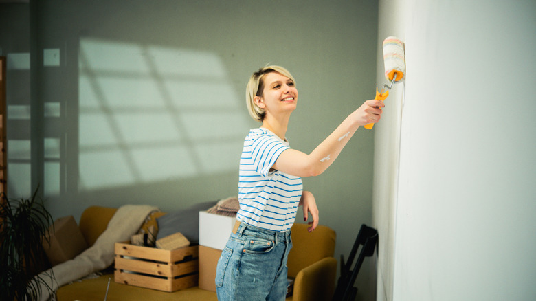
Color can be a game-changer in the home. Just getting a new set of linens in a bold color feels exciting and daring. But when it comes to walls, many people are afraid to experiment with color. All-white interiors have become very normalized in recent years, especially in kitchens and bathrooms. But we've got some suggestions for neutral and not-so-neutral colors to try out, to move past the tired trend of white walls.
The main thing to keep in mind when choosing paint colors for a room is to imagine yourself living with this color and to consider whether it aligns with your use of the room. Will it help make the room bigger and lighter, or more cozy? Does the color work with your furniture? How will it feel in the morning, or after a long workday? Do you want the color to feel relaxing or invigorating? And then there's the most important question: Do you actually like this color?
One good approach is to consider neutral wall colors as alternatives to white, as they offer the most flexibility. However, neutral these days goes well beyond gray and beige. It can include colors that are neither too bright nor too dark, not too pale, and not too saturated or vivid. Neutral colors are often muted shades that span the spectrum from warm (oranges, reds, yellows) to cool (blues, greens, purples). Charcoal gray can be neutral, but so can burgundy! Forest green is a terrific neutral; so is terra cotta. Spend some time looking at color swatches. Bring them home to see how the light in your room hits them. Spend time with color to discover what speaks to you.
Pale neutral blue is calming
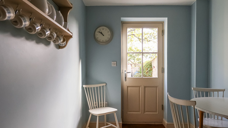
Light blue is a common accent color with an interesting history. In the American South, a color known as "haint blue" was painted on ceilings, intended to ward off evil spirits and ghosts. It was also once a common ceiling color in Catholic churches, as a stand-in for the skies of heaven. This calming, unobtrusive color is a perfect neutral for a hallway or entryway, lending light in a narrow space, or for a tranquil bedroom. Try Benjamin Moore's 'Morning Sky Blue' (hint of green) or 'Lake Placid' (wintry blue-gray) for classic pastel blues.
Neutral pastels are a more interesting alternative to white
If you're not quite ready to make a bold color choice but are tired of white, a good stepping stone is to try pastel neutrals. This includes colors such as oyster (creamy gray-white with gray), mushroom (pale taupe, sometimes with a pinkish hue), or celadon (very light gray-green with a hint of yellow). These are neutral enough to work with almost any color palette, and the subtle shift from white to a whisper of color won't feel like a dramatic change.
Pale neutral pink is versatile
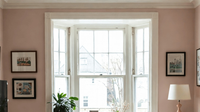
To freshen up a white-walled room, try a coat of pale pink. Many people assume pink must be for a feminine space only, but this is a tired social construct. Pale pinks are versatile and often have a very neutral character. They're similar to beige but more uplifting and with less of a "muddy" feel. For a neutral backdrop that's friendly to many other colors, try a slightly cool pale pink, like Benjamin Moore's 'Misty Rose' or Farrow & Ball's 'Middleton Pink.'
Brighten the room with sunny yellow
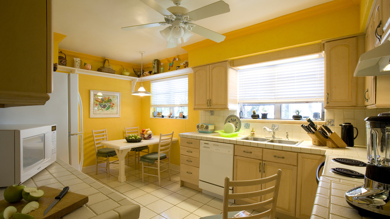
Though it's not starkly different from white, sunny yellow has a perennial appeal for the kitchen. Its bright, joyful nature feels vibrant and upbeat. It's such a cheerful upgrade to all the solid white kitchens we've been seeing, and not as drab as the charcoal gray that's also been a popular kitchen color. Yellows can have green or orange undertones, so consider what works with your other furnishings and your tastes.
Rose pink brings a touch of nostalgia
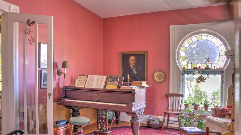
Rose pink may be one of those "eye of the beholder" colors: some may picture it with warm coral or blush undertones, while others may see it as a cool pink with orchid or lilac undertones. It's usually a medium pink, not a pastel, and not a "hot" or saturated pink like fuchsia or raspberry. In a well-lit room, rose pink glows; in a dimmer space, it projects a cozy comfort. It's stunning with dark blue, medium gray, burgundy, and most green tones. Some delicious rosy pinks to try: Little Greene's 'Carmine,' Benjamin Moore's 'Old World,' and Sherwin-Williams' 'Rosedust.'
Navy blue elevates your space
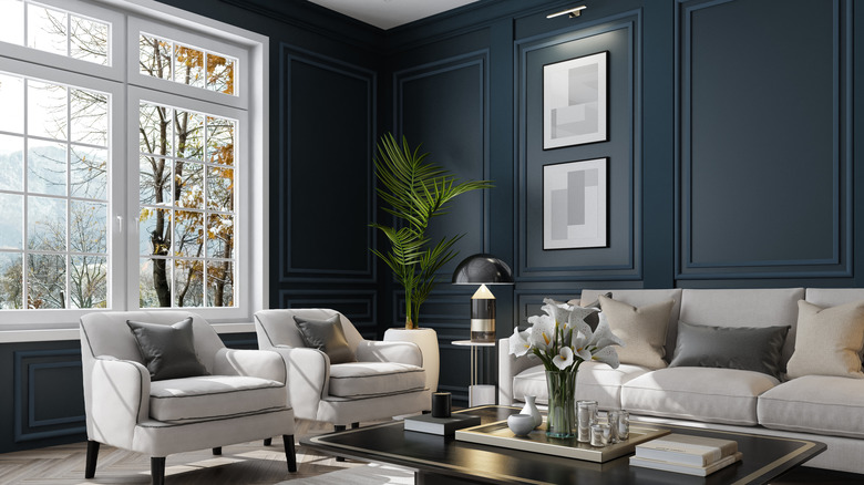
For a classic, sophisticated look, navy blue walls can make a real statement. Navy blue can have either green or violet undertones, and tends to look great with white or pale-gray trim, to lend it some light. Furnishings in warm, earthy colors like terracotta or butterscotch also contrast well with navy blue, but try out some swatches first to see how the undertones look. Try regal 'Naval' by Sherwin-Williams, Little Green's 'Thai Sapphire' (with lush violet undertones), or rich, inky 'Blue Grotto' by Benjamin Moore.
Light orange warms up your room
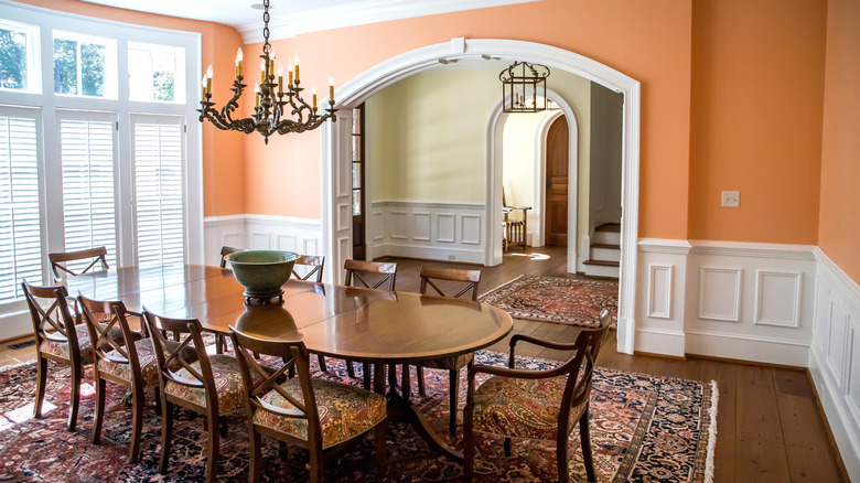
Shades of orange are perfect for rooms where social gatherings happen: It's a stimulating color that encourages conversation and hospitality. Painting your dining room, kitchen, or living room in a cheery light orange can make the room feel lively and warm. From pink-tinged salmon or coral to yellow-tinged peach or apricot, this is a bold but balancing color choice. For some mid-range orange hues, try Benjamin Moore's 'Vivid Beauty' (soft cantaloupe), 'Fruity Cocktail' (cheery, slightly bright), or 'Sausalito Sunset' (a lovely pale coral).
Go for feel-good pale aqua
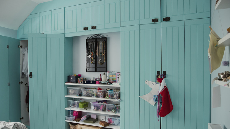
If your wooden closets take up an entire wall, lucky you! If you need a change but don't want to redo wall colors, why not refresh (rather than replace) your closet doors with a feel-good color? For some folks, pale aqua and teal are their go-to mood enhancers. Brighter or saturated shades like turquoise can feel a little too electric, but muted pastel shades of blue-green have a cheery yet calming effect. Benjamin Moore has a few great ones in this palette: try 'San Clemente Teal' (sparkling, refreshing), 'Anderson Blue' (calm and muted), or 'Oceanic Teal' (cool, classic).
Dusty plum: the unexpected shade
How to describe this neutral purple: "dark mauve," perhaps? But I refer to it as "dusty plum." It's not overly bright or saturated, so it works well with many hues and can form the backbone of a pleasing neutral palette. The undertones matter: Brown undertones make it earthy, blue undertones feel classy, while red undertones give it a bit of warmth. This shade pairs well with grays, blues, and neutral pinks. Benjamin Moore has some delicious versions of this color, including 'Black Raspberry' (brown undertones), 'Bonne Nuit' (gray undertones), and 'Purple Lotus' (a smoky plum hue).
Choose slate blue for its flexibility
Slate blue seems like it's been a popular neutral color for decor for ages. Its classic appeal is partly due to its calming energy and flexibility. The mix of blue, green, and gray tones pairs well with off-white or cream trim, natural wood, and warm hues in fabrics and furnishings. Try Benjamin Moore's 'Atmospheric' (gray-blue with a touch of green), 'Denim Wash' (soft gray-blue chambray), or the classic 'Slate Blue' (also known as 'Early Morning'), which is light yet solid.
Rust orange turns up the cozy factor
There's nothing like orange tones to create a cozy, warm feel. Deeper shades like rust, cinnabar, and chestnut provide a rich but neutral backdrop for many purposes, but work especially well in spaces meant to feel welcoming: living room, guest room, dining room, and kitchen. Add some metallic decor for cool, shimmery contrast. Little Greene's 'Heat' is a luscious cinnabar with red tones, or try Farrow & Ball's 'Charlotte's Locks' (deep autumnal orange), or Benjamin Moore's 'Fiery Opal' (vivid but muted rust-orange).
Pale yellow will forever be in style
Pale, warm yellow (often called "butter yellow") is one of those vintage wall colors that everyone paints their walls, because it never goes out of style. Like white, it makes a space feel large and bright. It has warmth, but is not overpowering, and works well with neutral furnishings and earth tones, as well as bold blues and greens. Yellow can also have warm (pink) or cool (green) undertones. Benjamin Moore has a great assortment of pale yellows to try, like 'Lemonade' (light and airy), 'Candlelit Dinner' (with a subtle peach undertone), and 'Shooting Star' (a luminous pastel).
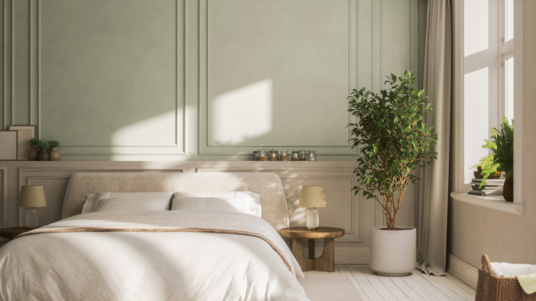
Sage green adds luxury
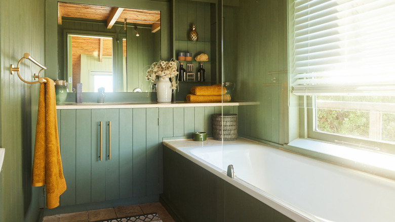
Having a large, luxurious bathtub is a good reason to choose a calming yet inspiring color for the bathroom. Neutral sage-green walls invoke nature and calm, helping bathers unwind. There are also lots of colors that go well with sage-green walls, including warm or cool color accents. Here, the deep-gold towels and warm wood create a harmonious, relaxed feeling. Other good pairing colors include burgundy, indigo blue, or terra cotta. These sage-green paints from Benjamin Moore are versatile and appealing: 'Etched Glass' (pale, luminous), 'In the Garden' (rich, medium olive), and 'Cedar Mountains' (gray-green touched with blue).
Neutral peach works well with lots of other shades
Though "peach" may not feel like a neutral color, or even a neutral word (it's a juicy, colorful, delicious fruit!), it can be a surprisingly versatile neutral for walls. Think of it as somewhere between beige (but slightly brighter) and terra cotta (more subdued). Dark wood trim or brown leather furniture creates a warm, luxurious feel. It also works well with muted blues and greens for a calm, modern look. Try Farrow & Ball's 'Dutch Pink' for a medium neutral peach, or Benjamin Moore's 'Peach Nectar' for a pale, pink-toned but neutral peach.
Go for an artistic feel with lavender gray
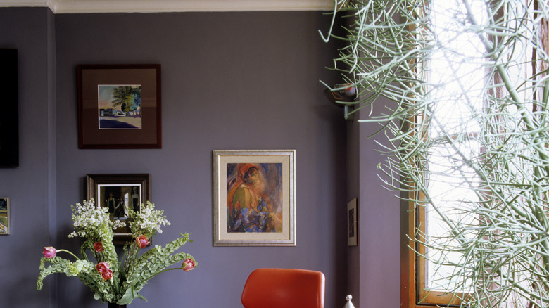
Gray can be a very complex neutral color. Its undertones really determine the energy it imparts to a room: Warm grays may feel earthy, while cool grays may feel sophisticated. Furnishings and trim colors affect this, too, so consider the overall color scheme before choosing a gray wall paint. Lavender gray is a terrific neutral because it can feel warm, neutral, or cool depending on the light and adjacent colors. With these bright persimmon chairs and pale-green plants, the effect is striking and artistic. Sherwin-Williams has some nice lavender grays, including 'Ash Violet,' 'Mythical,' and 'Mauve Finery.'