13 Common Design Rules You're Actually Better Off Breaking
With so many possibilities, designing and decorating the interior of a home can feel overwhelming. Many homeowners and renters alike can agree that there's a huge relief in having a figurative design handbook to help lead the way. Such guiding principles are meant to inform how to assemble, curate, and adorn a space so that it's both as functional and aesthetically pleasing as it can be. From adhering to the "kitchen triangle" to painting small rooms in light shades to limiting the number of patterns, surprisingly, many of these concepts work well only in theory. And often, the result lacks the soul that makes a place truly feel like home.
If you dig a little deeper, or ask any interior designer, you'll discover that embracing a bit of design rebellion is what leads to warmth and true style. The most impressively designed rooms are born out of prioritizing your intuition over "the right way." So, forget everything you think you know, and dare to be different. Start by tossing out these 13 common design rules you're actually better off breaking.
Paint small spaces in light colors
You've likely heard it time and time again, spoken like a law: Don't paint a small room a dark color. The idea is that sticking to whites, neutrals, and lighter colors will give off the illusion of more space in a room with limited square footage, and bring about a brighter, airier feel. Proponents of this rule advocate for colors like pale grays, soft beiges, light blues, and muted pastels. With these types of shades, they say, you get a sense of openness, arguing that darker or bolder colors, on the other hand, can feel claustrophobic.
But they're wrong. Leaning into deeper, richer hues can actually make a small room feel bigger by creating unexpected depth. These colors make walls appear to recede further back than they actually are. Plus, painting in your heart's desire gives you a chance to incorporate a little bit of drama into a small space, resulting in a design that feels more intentional. To make it work well, wrap the color all around, so that the eye never breaks, blurring edges and corners. For this "jewel box" effect, all you need are a few small-space color drenching techniques, like opting for a lacquer finish and choosing the right color. Some shades to consider include deep navy blues, bright blues, warm terracottas, blue-toned grays, wine reds, jewel-toned teals, olive greens, forest greens, caramel browns, and rich burgundies. And if you've been eyeing a large-patterned wallpaper, it can have the same enlarging effect, so don't hold back.
Ceiling and trim should be painted white or neutral
Keeping ceilings white or neutral is rooted in the belief that it helps lift and heighten a room. The rule also suggests that painting a ceiling otherwise will make it appear darker than the walls, given its location and supposed failure to pick up natural light. Meanwhile, the purpose behind matching trim is that it provides a clean, seamless look and border. It's a default intended to ensure architecture doesn't compete with the wall colors, furniture, and decor of a room.
However, this convention can result in a space that feels uninspired and sterile. It may also clash with or feel disconnected from the overall color palette of a room. Straying from this rule injects personality, creates a cozier atmosphere, and helps soften harsh lines. Chuck the rule out the window by painting your ceiling, walls, baseboards, molding, and other trim the same color as your walls. This color drenching approach will give you an immersive, dramatic aesthetic, and works especially well in rooms with low ceilings. In taller rooms, a ceiling darker than the walls, can make it feel more intimate. Or you can always go for an accent ceiling to introduce a pop of color, pattern, stripes, or print. To make a big statement, consider a bold color for your trims and play it safer with your walls and ceiling. For something more subtle, you can paint trims and ceiling a few shades lighter than walls.
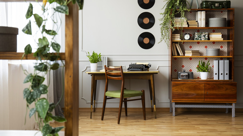
Avoid using more than one or two patterns
The fear of visual clash has led to the safe design rule of sticking to just one or two patterns paired with solids. It's largely favored because it's believed that using more than this number of patterns can overwhelm a space and make it feel at odds. Advocates claim that when too many patterns are present, they compete for attention, resulting in disarray. Just a single or a couple of patterns, they argue, keeps a space serene and forms defined focal points.
If you've been itching to forget this guideline, do it — it will imbue your space with more character, depth, and a lived-in charm that's hard to replicate. Luckily for you, there are ways interior designers mix patterns so they don't clash, and you can easily try these in your own home. The trick is to stick to three or four patterns and vary the scale. So, use different sizes, whether you're mixing stripes, abstracts, geometrics, or florals. Most importantly, incorporate a unified color palette to maintain balance. Do this by picking three to five colors, and choosing one of those to act as the main color to build your design around.
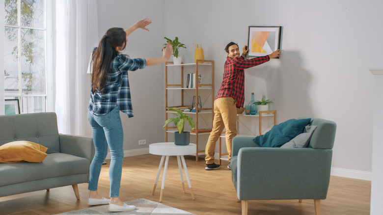
Hang artwork at eye level

They say artwork should be hung about 57 to 60 inches from the floor, or at eye level, to maintain visual consistency. This is the same practice used at art galleries and museums. In the home, it's supposed to create that gallery-like rhythm and assure pieces appear unified, rather than scattered. According to the rule, it provides a balanced focal point that works in almost any room.
Like with many common design rules, you're better off breaking this one. Not only does it grant you more creative expression, but it builds a more dynamic, curated environment. Plus, it allows you to play around with scale and verticality, rather than forcing every piece into a rigid, horizontal line. When breaking it, consider the size of the artwork, sightlines, and how you can align each piece with the furniture and architecture of a room. If, for instance, you want to emphasize a tall ceiling or make a low room appear taller, hang a piece high to draw the eye upward. Hang lower in spaces you want to create intimacy, like in dining rooms or near sofas. And don't be afraid to mix sizes and heights.
Artwork belongs only on the walls
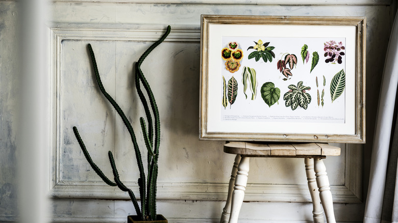
Speaking of hanging frames, traditional interior design has conditioned us to see walls as the only appropriate canvas for artwork. People fall back on this precedent time and time again to create a focal point in a room, but also with the intent of maintaining a neat, organized, and functional environment. Horizontal surfaces are kept clear for daily use and sparsely adorned with only a few decorative pieces and trinkets.
You might think that this common design rule helps prevent clutter, but it just veers into bland territory. Oftentimes, it can make a room feel stuffy. Additionally, restricting yourself to hanging frames is a missed opportunity for adding depth and character to a space. Be a little daring and lean your artwork instead to evoke a look that's effortlessly chic and curated. What are some good leaning spots? Pretty much everywhere: bookshelves, dressers, floors, mantels, backsplashes, sideboards — you name it. And there are so many ways to have fun breaking this rule. For example, you can build a vignette by layering different sizes. Or, you can stick to one oversized piece for a striking effect that makes a statement or draws the eye where you want it to go. Feel free to mix in other objects and decor, like books, a vase, or a houseplant, especially for more intimate displays. This, dear reader, is a unique aesthetic that a flat wall could never replicate.
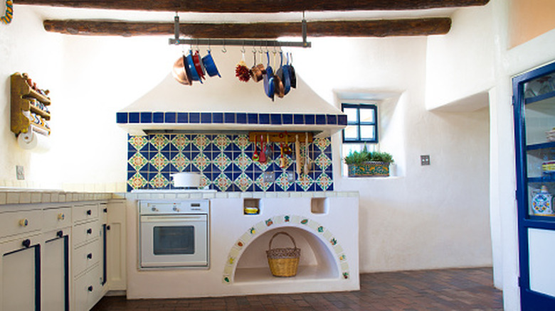
Wall tile is exclusively for kitchens and bathrooms
Do a walkthrough of any house or apartment, and for the most part, you'll only peep wall tile in kitchens and bathrooms. For too long, it has been strictly reserved for wet zones. Mostly, this is due to pure utility. As a cold, hard, durable surface that's easy to clean, it's been designated to where messes happen. And because design standards suggest living areas require warmer materials, like wood, natural textiles, wallpaper, or paint, to make a room cozy and inviting, most people wouldn't dream of placing wall tile anywhere else.
The thing is, they're highly mistaken. Extending wall tile to entryways, a dining room, or even as a floor-to-ceiling accent wall in a bedroom invites a sophisticated, textural element that paint or wallpaper simply cannot match. In unexpected areas like these, it's a distinctive way to add a pop of color or pattern and elevate your interior design. If you're worried that it will make a space feel too hard or cold, balance it out with soft textiles, such as a plush rug, cushions, linens, throw pillows, or curtains. Don't fret if a big project isn't currently in your budget, because you can always play around with a peel-and-stick version to bring your vision to life.
Don't mix different eras and styles
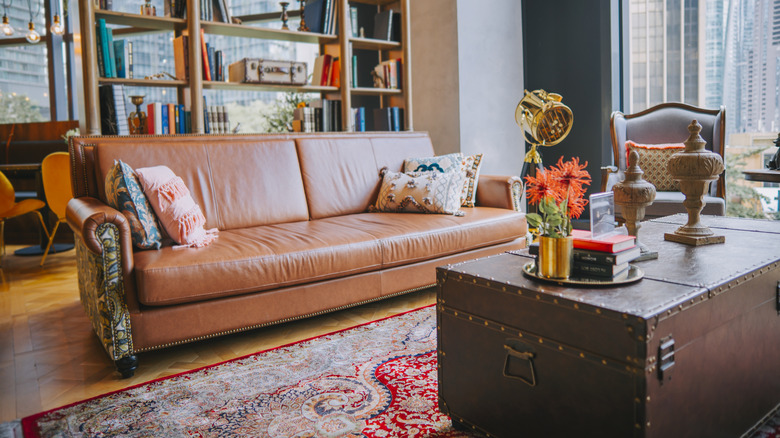
There might be nothing more irritating than a design purist who recommends picking a single era or style for a room. The reasoning is that staying loyal to one cohesive look — be it mid-century modern, rustic, or bohemian — maintains visual consistency. Having a clear theme, according to this outlook, establishes a unified aesthetic and is the way to foster an atmosphere that feels intentional.
Unfortunately for those who follow this stylistic blueprint, the opposite is true. It's when you mix and match that the design of a room feels more deliberate. Staying true to this outdated convention results in spaces that feel impersonal and staged. In contrast, borrowing from different design styles and eras invokes a collected-over-time, personalized vibe that comes off as more authentic. To successfully decorate your interior with a mixture of styles and avoid chaos, select a unifying element, like a consistent color palette. For example, an 18th century portrait can look stunning above a sleek, contemporary sofa if they both share the same deep, moody tones. And don't be afraid to get eclectic and incorporate pieces you love. Pair your modern dining table with those antique chairs you scored at an estate sale. Bring warmth to metal and glass pieces by combining them with raw, rustic wood. Blend boho textiles and greenery with mid-century modern furniture. Your options are endless!
Buy matching furniture sets
The customary furniture shopping model is built on the matching set. People buy a complete suite for the bedroom, living room, or dining room to guarantee a perfect fit in terms of color, wood grain, hardware, and proportions. For many, it's a one-and-done solution for space that looks polished and coordinated.
While sticking to this practice forgoes the effort of picking individual pieces, it's exactly this easy route that will make a home feel bland. Rather than achieve harmony and cohesion, matching furniture sets make spaces look plucked out of a showroom. It's through contrast and conversation between pieces that a room feels truly alive and well-designed. As mentioned above, get experimental with different styles and eras. Mix textures and finishes, like a leather armchair paired with a velvet sofa, or a wrought-iron bed frame with a refurbished wooden vanity or dresser. Even mismatched dining chairs can make a statement when done right. For balance, blend old and new. And to tie it all together, make sure you have a common thread, like recurring materials or an overarching color palette.
You shouldn't mix wood tones
There's a widespread misconception that you shouldn't mix wood tones. This means trim, furniture, floors, accents, and even objects like picture frames should match, if not identically, then as closely as possible. Complying with this code is believed to prevent a cluttered look where different stains and grains compete for attention. Purportedly, by keeping wood tones uniform, a room looks more put-together, and you realize a seamless flow and a sense of visual calm.
Contrary to what you might have heard, it's a rule that shouldn't exist at all. Aside from being extremely difficult to abide by, and frequently ending up as a miss, sticking to one wood tone makes your home feel monotonous and one-dimensional. Alternatively, incorporating various shades enhances a space with complexity and dimension. To perfectly mix wood tones, pick a dominant wood and go with similar undertones for the rest, but with a clear contrast. For example, stick to warm tones, but do a light warm tone piece alongside a dark warm tone piece. An eyedropper tool can always help you identify undertones.
Stick to one metal finish and color
The matchy-matchy concepts in the classic design handbook continue with the rule that says you should stick to one metal finish and color. Theoretically speaking, if you have chrome hardware, then your light fixtures and every other metal in the room should also be chrome, or another light metal. Like with the aforementioned wood tone rule, the idea is that this consistency makes a room feel coordinated.
Just like with other common design rules on this list meant to promote cohesion, what you end up getting is a flat, overly manufactured appearance. Allowing yourself to mix metals can generate a layered richness that makes a space look like it has evolved over time. However, there is a right way to mix different metals in your home decor. It involves picking a primary metal and incorporating no more than two additional metals for accents. And yes, it's okay to mix warm and cool metals.
Bedrooms should be symmetrical
The common rule of thumb in bedroom design is symmetry. Usually, it's achieved by matching nightstands and identical lamps flanking the bed, with both sides of the room mirroring each other. This setup ensures neither side of the room feels neglected. Moreover, it's a formula intended for a sense of balance and calm in a room meant for rest and relaxing.
But a bedroom is so much more than a place where you retreat to de-stress and get sleep — it's your personal sanctuary. It should feel like you and be filled with pieces that bring you joy — it should have true character and style. Perfect symmetry is too rigid and cookie-cutter for such a precious area. And despite what you've heard, balance is possible with asymmetry. Just focus on the visual weight of the items on either side of the room, meaning one side of the room doesn't feel heavier or more crowded than the other. To do this, vary heights, scales, and textures. For instance, you can lean a large, dramatic piece of art on one side, and balance it with a curated gallery display of various smaller frames on the other. Or, you might place a bedside lamp on a wooden nightstand, and adorn the opposing side of the bed with an upholstered reading chair and floor lamp. There's really no wrong way, as long as you follow your intuition.
Fill small spaces with small pieces
The logic seems sound: A small room needs to be filled with small pieces to keep it from feeling cramped. People will often choose apartment-sized sofas, tiny coffee tables, and minute decor in the hopes of leaving as much floor and wall space visible as possible. Filling a restricted space with compact furnishings, they believe, will trick the eye into taking it in as larger than it actually is.
Although this sounds like a good case, the effect of this rule is actually the opposite. Usually, it results in a sea of small items that makes the room feel overcrowded and cluttered, emphasizing its limited square footage and, often, making it appear smaller than it is. It might feel counterintuitive, but introducing just a few large pieces can open up the space. A sofa that fills the room, a tall wardrobe, an oversized mirror, or a fully anchored rug will make it feel more expansive by grounding the room. The key is choosing furniture with character that is proportionate to the space to not overwhelm the footprint, while making the most of it.
Follow the kitchen triangle rule
With roots tracing back to the 1940s, the "kitchen working triangle" was originally developed by researchers at the University of Illinois School of Architecture to reduce construction costs by standardizing architecture. The layout forms a triangle between the sink, refrigerator, and stove, with each side measuring between 4 and 9 feet, and a total perimeter of 13 to 26 feet. This minimizes steps taken between each space, creating a flow in kitchen work. Because of its efficiency, the principle became popular in interior design, and was strictly followed for decades after.
These days, however, the work triangle is an outdated kitchen layout you should stop relying on. The modern kitchen has evolved far beyond just a workspace. It's a place that often hosts multiple cooks, where households gather for connection, where kids plop down to do their homework, and is a room for hosting guests. Thus, observing the kitchen triangle can be restrictive. You're better off designing your kitchen layout based on how you actually live and move. To implement functionality and practicality, dedicate different zones for prepping, cooking, and clean-up. If you're a passionate baker, a specialized area near storage for cake pans, mixing bowls, cookie sheets, and other baking supplies matters more than your distance to the fridge. Work with your own needs, not a silly little rule.