8 Color Capping Paint Combos That Show This Beautiful Trend Is Here To Stay
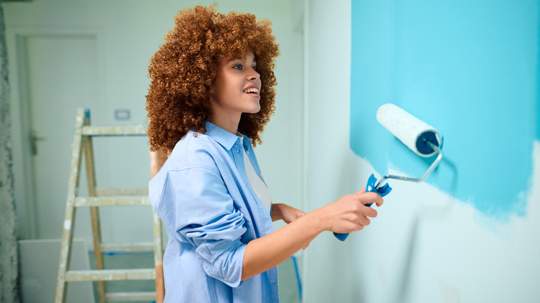
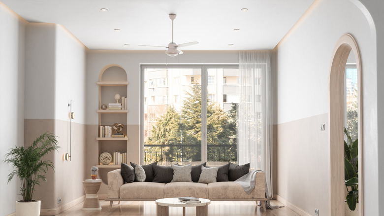
When none of the current paint trends are calling your name, color capping can be the one that finally screams it. Sure, you've probably heard of color drenching and maybe even tried it out in your home, but color capping is different. Instead of painting an entire room from head to toe, color capping breaks things up with a horizontal line that separates two analogous shades — and it's the new 2026 paint trend you don't want to ignore. The upper portion of the room, or "cap," is your chance to add contrast, depth, or even some drama, while the lower part keeps the space light and airy. It's a simple shift, but the visual payoff can't be beat.
What makes color capping so fresh is its versatility. You can lean into a bold look that makes a statement the second you walk in, or keep it subtle with layered, tonal variations. The key is to add just the right amount of contrast. Designer Lindsey Putzier tells Better Homes & Gardens, "If you pick two colors that are too similar, you'll just end up looking like your room has awkward shadows." So, she recommends going at least three shades lighter or darker. Color capping can give your traditional home a more classic vibe, making it look like your walls have crown molding or paneling. When you're ready to get inspired, these pretty color-capping combos prove you can add personality and depth to a space without overcomplicating things.
Blues
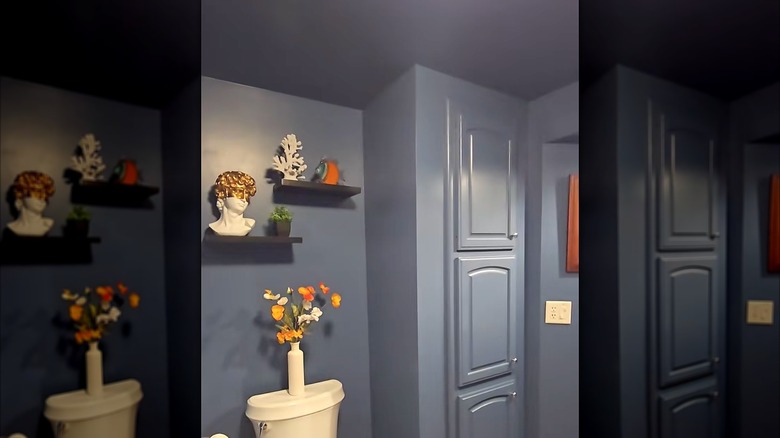
Blue color capping helps produce a serene vibe, especially when you use a deeper, inky navy on the ceiling and a couple of shades lighter on the walls. The look isn't as jarring as combining high-contrast hues. It can make spaces feel more open while pulling the whole room together without coming across as if you've tried too hard. Stick to blues that share similar undertones, and the result looks intentional — like it was always meant to be that way.
Pinks
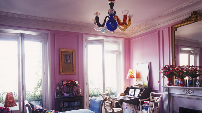
Pink color capping can go one of two ways: you either get an overly cutesy look, or something surprisingly posh and elegant. The difference comes down to the shades of pink you pick. For example, a pale blush paint on top adds an airy vibe without coming across as too bubble-gummy, while pairing it with several shades darker, like dusty rose, to bring the warmth — or vice versa. It's not about making a statement but creating a mood you fall in love with.
Teals
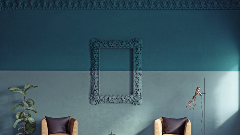
A paint color that's having a moment and works for creating a more serene living room – or pretty much any room — is teal. Then, when you color cap it in richness and a hint of drama, the space feels fresh and inviting. Whether it's a deeper teal on the upper walls and softer shades below, like pale aqua or muted blue-green, the room becomes instantly more layered and dynamic. Teal also works with brass, wood, and white tones.
Beiges
Beige can be anything but ordinary when you add color capping, proving a neutral doesn't have to mean boring. It's a minimalist move that adds a subtle degree of contrast to give the room some oomph without diverting from your overall aesthetic. Deep beiges or warm taupes paired with lighter, creamy tones keep everything feeling open and airy. The shift can be as subtle or as dramatic as your mood takes you.
Grays
Gray is a classic hue that doesn't demand attention. So, when you incorporate grays into your color capping, it makes a room feel instantly upgraded. A darker, cooler gray up top adds a bit of edge, while a lighter, warmer shade below adds just enough contrast to make the walls more interesting. It's also one of the easiest palettes to work with, since gray goes with almost anything.
Browns
You will bring a quietly refined and cozy feel to any room with paint in brown color-capping gradients. Rich chocolate or mocha tones on walls bring depth and structure, while lighter shades on the ceiling, including creams, sands, or muted beiges, keep the space lighter. Or, in reverse. It's a pretty combo that embraces earthy, timeless elements rather than an uber-trendy look that will likely fade over time. Browns also work well when you have natural materials like wood, leather, and linen.
Yellows
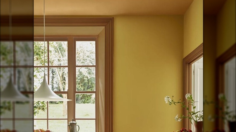
Yellow color capping walks the line between looking bold and barely-there restraint. Using a warmer yellow on the top and/or ceiling can make a small room feel brighter with a subtle glow. Pairing it with earthier yellows creates an inviting, cozy aesthetic on your walls. The lasting effect is natural and more of a quiet lift than a statement, but enough to make the room feel noticeably lighter.
Greens
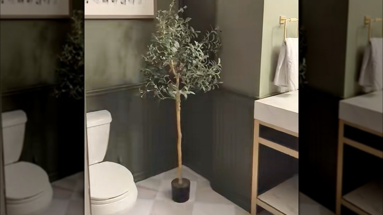
When you bring the color green indoors, it's like adding a little slice of the outdoors. A deeper green up top, like olive, moss, or forest, makes a bold statement. For the lower portion, skip sage in favor of a designer-approved green that's a few shades lighter, to keep the room from feeling boxed in. Greens with natural textures like wood and stone, which help the whole space feel cute and cozy.